Preview image. Unlock full-res
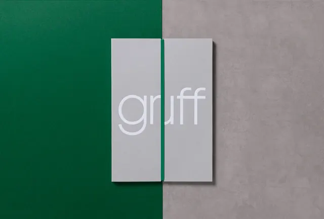
Minimalist corporate identity with a split-panel composition bridging forest green and concrete grey.
Summary
A contemporary brand identity for "Gruff" using a clean split-panel layout dividing rich forest green and neutral grey tones.
Visual description
Two vertical panels stand side by side: the left is a deep forest green, the right is a soft concrete grey. Centered across the boundary is the wordmark "gruff" in thin, modern sans-serif, rendered in white on a light-grey rectangular background. A small shadow beneath the panel adds depth. The overall composition is restrained and architectural, with a clear geometric logic to the two-color division.
Key takeaway
Effective use of color blocking to suggest duality or balance. The thin, lowercase sans-serif reinforces contemporary minimalism. The off-center split creates visual interest without sacrificing professional restraint. The muted color palette (forest green + grey) reads as trustworthy and sophisticated.
Reuse notes
Ideal for corporate, agency, or B2B brands seeking a mature, composed identity. The split-panel technique scales well to applications (business cards, websites, packaging). The green-grey pairing is seasonless and gender-neutral, suitable for diverse industries. Keep typography minimal and centered for maximum impact; busy compositions would undermine the geometric discipline.
More like this



Keep what you find
A free account saves references to boards and can send you a weekly email of picks based on what you save.
To see every result, go Pro.