Preview image. Unlock full-res
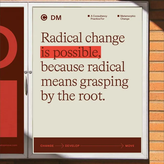
A printed poster for a consulting firm using serif typography, high contrast between cream and deep red, and a linear process diagram at the base: CHANGE > DEVELOP > MOVE.
Summary
A printed poster for a consulting firm using a large serif headline "Radical change is possible" with a highlighted phrase in red, over cream background with red accent bar and a linear process flow diagram.
Visual description
A framed cream and white poster mounted on red brick features a "DM" logo mark at top left with consultant credential lines. The main headline is set in a serif face, predominantly deep brown-red, with "is possible" reversed out in white on a red highlight bar. Below, a process flow reads left-to-right in all-caps: CHANGE > DEVELOP > MOVE, connected by arrow dividers and set in a sans-serif. The overall composition is vertical and centered, balancing stark typography against the cream background and framed with a white border. Natural light and brick backdrop contextualize this as a real-world displayed piece.
Key takeaway
The restraint of using only two fonts (serif for voice, sans for process). The bold use of a single accent color (red) for emphasis and framing. The arrow-based process diagram that suggests momentum and sequential thinking. The white-on-red reversal that draws the eye to the most important claim.
Reuse notes
Strong for management consulting, strategic transformation, organizational change communications, and B2B marketing. The serif + red palette reads authoritative and forward-thinking. Works well in printed collateral and institutional settings. May feel corporate for consumer or creative brands.
More like this





Keep what you find
A free account saves references to boards and can send you a weekly email of picks based on what you save.
To see every result, go Pro.