Preview image. Unlock full-res
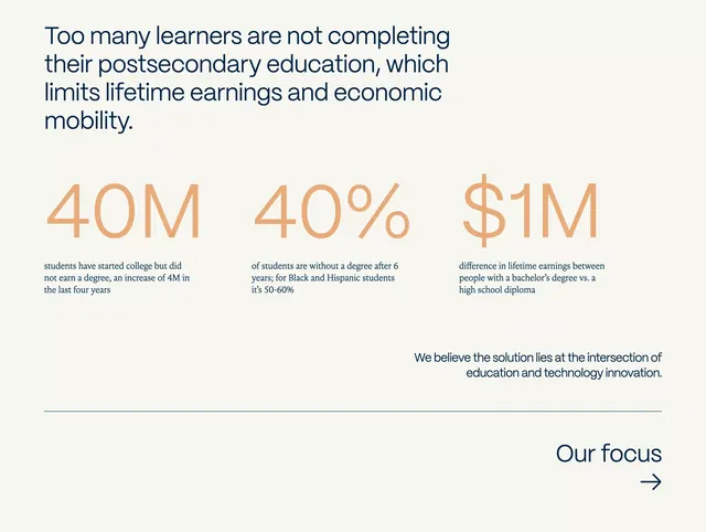
A single-page data infographic presenting three key statistics on postsecondary education outcomes using large typography and minimal layout.
Summary
A minimalist educational-impact infographic with a beige background that centers three bold statistics (40M, 40%, $1M) in a symmetric three-column layout with supporting text and a mission statement.
Visual description
A light beige page with a problem statement at the top in dark navy serif type. Below, three oversized numbers in warm tan/orange: "40M", "40%", and "$1M", each anchored by smaller supporting text explaining the stat (e.g., "students have started college but did not earn a degree"). A horizontal divider separates this section from a centered statement in dark text: "We believe the solution lies at the intersection of education and technology innovation." At bottom right, a "Our focus" heading with a right arrow in navy, implying continuation or navigation. All typography is clean and legible sans-serif, with warm orange as the primary accent color drawing focus to the numbers.
Key takeaway
The use of dramatically oversized numbers as the visual anchor, with supporting context underneath. The symmetric three-column structure creates balance and clarity. The warm orange numeral color creates focus without competing with the neutral background. The problem-statement-first approach grounds the data in narrative context before presenting the solution.
Reuse notes
Ideal for policy briefs, nonprofit impact reports, educational institution materials, and social-cause presentations. Works well when the audience needs to quickly grasp scale and consequence. The muted palette and serif/sans-serif pairing convey seriousness. Scale down the numbers proportionally for smaller canvases; the visual hierarchy depends on the magnitude of the type.
More like this





Keep what you find
A free account saves references to boards and can send you a weekly email of picks based on what you save.
To see every result, go Pro.