Preview image. Unlock full-res
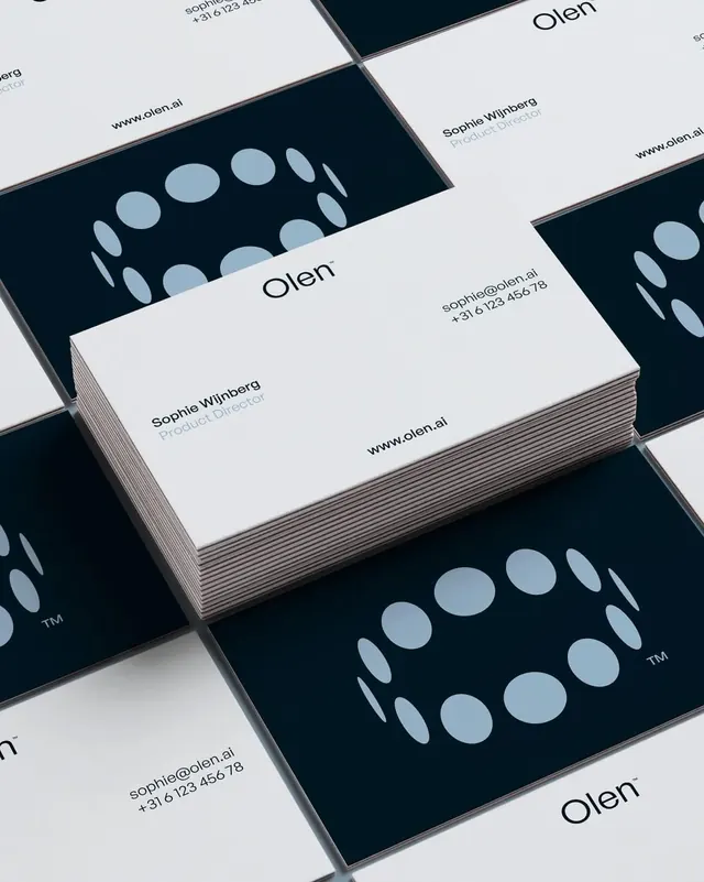
Brand identity system for Olen featuring high-contrast navy and white business cards with geometric circular mark and minimal sans-serif typography.
Summary
Brand identity system for Olen featuring high-contrast navy and white business cards with geometric circular mark and minimal sans-serif typography.
Visual description
Stacked business cards in navy and white are arranged at isometric angles. The cards feature the clean Olen wordmark in black sans-serif, contact details (name, title, email, phone, website), and a bold geometric mark on the reverse: concentric circles and ovals arranged in a circle, rendered in light blue-gray against dark navy. The overall design is symmetrical and structured, using a strictly controlled two-color palette (navy, white, with light-gray accents) and generous negative space. The typography is sparse and modern, allowing the geometric mark and color blocking to carry the visual identity.
Key takeaway
The bold geometric mark that works as both logo and pattern, easily scalable and memorable. The strict color discipline creating maximum contrast and visual clarity. The use of generous whitespace on business cards to let key information and the mark command attention without clutter.
Reuse notes
Excellent reference for professional B2B and agency branding, particularly consulting and creative services. The geometric circular mark system is highly adaptable across applications. The navy-and-white palette conveys trust and sophistication; works well for luxury and corporate contexts.
More like this
Keep what you find
A free account saves references to boards and can send you a weekly email of picks based on what you save.
To see every result, go Pro.