Preview image. Unlock full-res
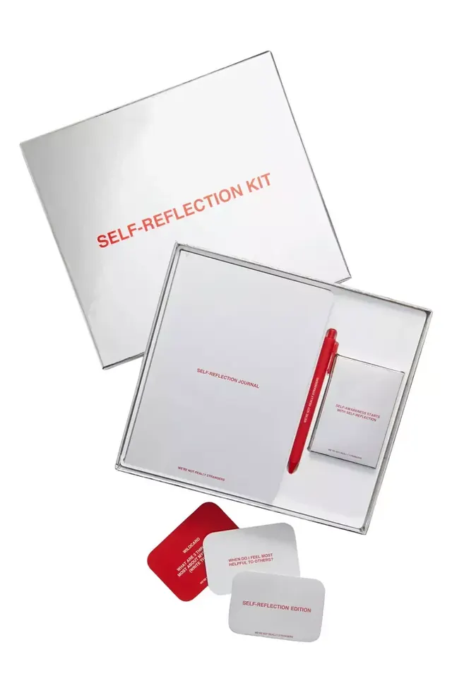
A minimalist product kit for personal journaling with white and grey surfaces anchored by a single red pen and coordinated card collateral.
Summary
A self-reflection product kit arranged in flat-lay showing a journal, coordinated cards, and a red pen against white and grey surfaces.
Visual description
Arranged flat against a white background: a white cover box with red "SELF-REFLECTION KIT" text tilted diagonally upper left; an open white inner box below showing a white journal cover, red pen, and a smaller business card or companion card, all aligned in a grid layout; and two separate rounded-corner cards in grey and red at the bottom, each stamped with red text. The typography is minimal sans-serif in red or black only. The palette is intentionally restricted to white, grey, and a single red accent used consistently across all elements. The arrangement suggests careful product organization and intended contents.
Key takeaway
The red pen as a single strategic accent color that unifies disparate product pieces (box, journal, cards, pen itself). The flat-lay grid organizing varied rectangular and square formats into a cohesive set. The minimal typography and white space making the small product details legible without clutter.
Reuse notes
Effective for wellness, self-help, or education product packaging and pitch photography. Works equally well for stationery, journaling, or mental-health app collateral. The red-on-white color scheme reads as confident and approachable. Scale down the concept for gift sets or starter kits where a single accent color unifies heterogeneous items.
More like this








Keep what you find
A free account saves references to boards and can send you a weekly email of picks based on what you save.
To see every result, go Pro.