Preview image. Unlock full-res
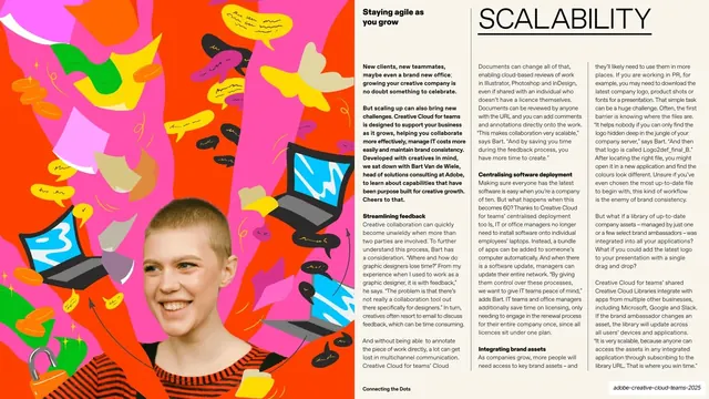
Magazine-style spread with an oversized thin "SCALABILITY" header, three columns of justified body copy with bold sub-heads, and a vivid collage of a cut-out figure under flying laptops on the left third.
Summary
A magazine spread on scaling: an oversized thin all-caps "SCALABILITY" header sits top-left, three columns of justified body copy with bold sub-heads fill the page, and the left third is a vivid collage of a cut-out woman beneath a cascade of flying laptops and speech bubbles.
Visual description
Left-image / right-text split on a cream-white field. The left third is a full-bleed maximalist collage: a short-haired woman in a red-and-navy striped top, cut out and placed below a shower of tumbling laptops, speech bubbles, padlocks and scribbles over a magenta and orange ground. The text side opens with a small bold lead line top-left ("Staying agile as you grow") and the section word "SCALABILITY" in oversized hairline-thin black all-caps under a thin rule. Below sit three columns of small justified body copy broken by bold run-in sub-heads ("Streamlining feedback", "Centralising software deployment", "Integrating brand assets"), with a short bold intro paragraph leading the first column. The running footer carries "Connecting the Dots" center and a section label bottom-right.
Key takeaway
Holding to the exact same interior template (lead line, giant thin section word, three justified columns, bold run-in sub-heads) while only swapping the illustration and topic, so a multi-benefit deck stays visually unified slide to slide. The falling-laptops collage is a literal but effective way to picture an abstract idea like scaling.
Reuse notes
Use for the third or fourth in a series of parallel feature slides where consistency matters more than novelty. The bold-intro-then-three-columns structure suits a single topic broken into three supporting points. Small dense body copy and a heavy reliance on commissioned illustration make it a PDF-read layout rather than a projection one.