Preview image. Unlock full-res
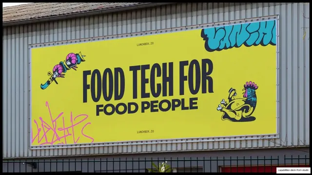
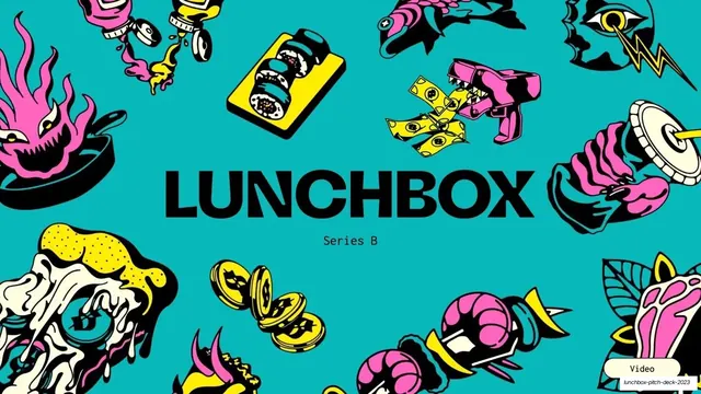
An 8-slide Series B pitch for Lunchbox, a restaurant operating system, built on a loud yellow-black-pink-teal palette, heavy condensed black headlines, and punk tattoo-flash illustration.
Summary
An 8-slide Series B investor pitch for Lunchbox, an all-in-one operating system for restaurants. The deck's personality is loud and unmistakable: a near-fluorescent yellow brand color, heavy black condensed all-caps headlines, and a recurring punk tattoo-flash illustration style that frames the data with attitude.
Visual description
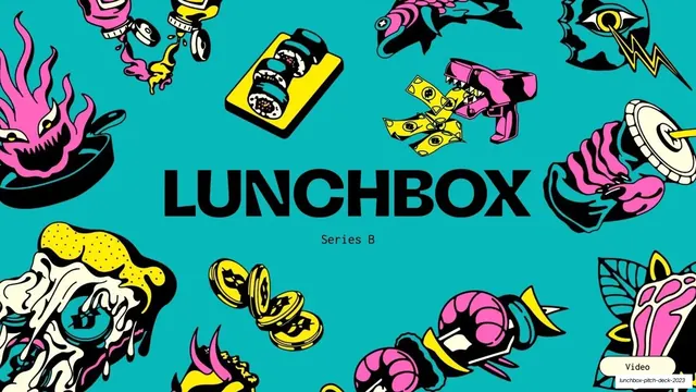
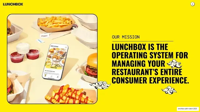
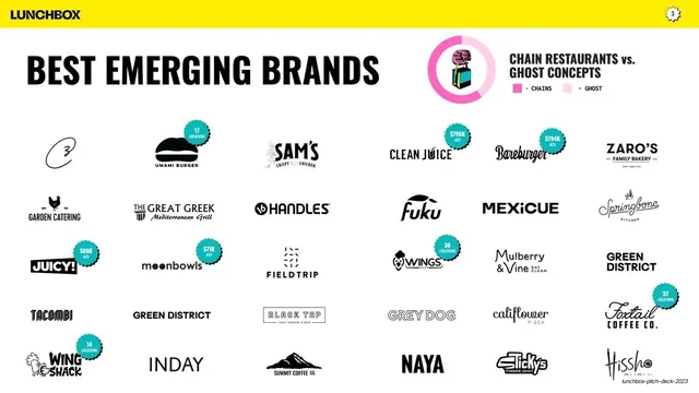
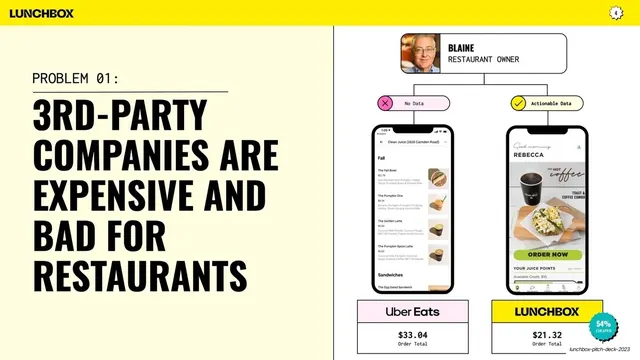
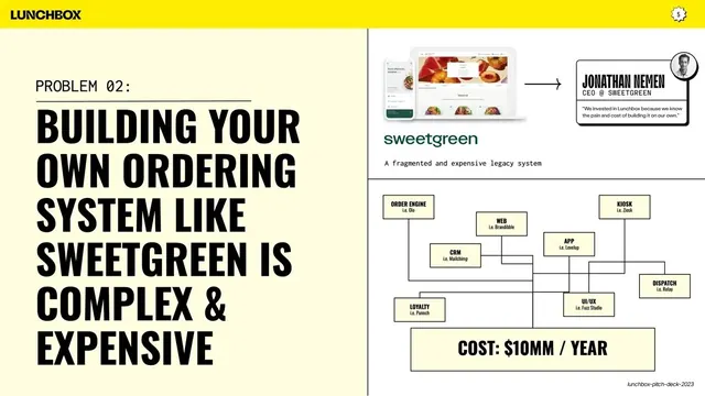
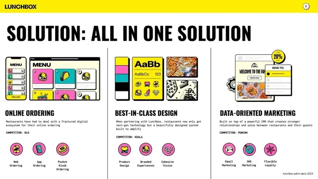
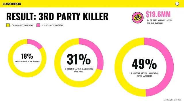
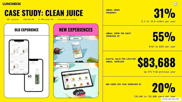
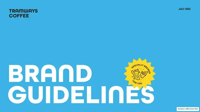
Slides are 16:9. The palette is built on a single saturated yellow (#FFE600) carried as either a full-bleed field or a thick top chrome bar, paired with near-black (#0E0E0E) type and two hot accents, magenta-pink (#FF2DAA) and teal (#2BC4C4); content slides sit on white or a pale cream (#FBF6D9). Headlines are a tall, tightly-set condensed grotesque in black all-caps run very large, while body copy and labels switch to a small monospace, often as all-caps eyebrow labels ("OUR MISSION", "PROBLEM 01:", "COMPETITOR: OLO") sitting above a short hairline rule. A consistent chrome appears on every slide: a small black "LUNCHBOX" wordmark top-left and a scalloped circular badge holding the page number top-right; on the yellow content slides this rides a yellow bar, on white slides it is set directly on white. The deck's signature is its illustration: thick-outlined, acid-colored tattoo-flash drawings (flaming food, dripping pizza, coins, hands, a brain) ring the cover and recur as spot icons, decorative cloud motifs, and the chunky pink line-icon sets on the solution slide. Recurring layouts: a tattoo-flash cover with a centered wordmark; split text-left / image-right statement and problem slides anchored by realistic phone and tablet UI mockups; a dense client logo wall with teal "locations / ACV" starburst badges; three-column comparison and pillar grids divided by thin vertical rules; a full-width donut-chart progression for results; and a yellow case-study slide pairing phone mockups with a stacked numbers-right ledger.
Key takeaway
The conviction of committing to one aggressive brand color and a punk tattoo-flash illustration set, so even a data-heavy pitch feels like a brand. The pairing of a heavy condensed black display face with a small monospace label face gives instant hierarchy and a tech-but-irreverent tone. And the scalloped page-number badge plus monospace eyebrow labels create a tight, repeatable chrome that holds a varied deck together.
Reuse notes
A strong reference for a consumer-facing or restaurant/food-tech startup pitch that wants energy and a memorable brand over corporate restraint. The problem/solution/result spine (named problems, three pillars, donut-chart proof, then a single case study) is directly reusable for Series A/B decks. Needs real product UI mockups and a genuine illustration system to land; the loud yellow and tattoo art are bespoke to Lunchbox's brand and would need swapping for a different identity. The high-saturation yellow is hard on the eyes at length and best for a short deck like this one.