Preview image. Unlock full-res
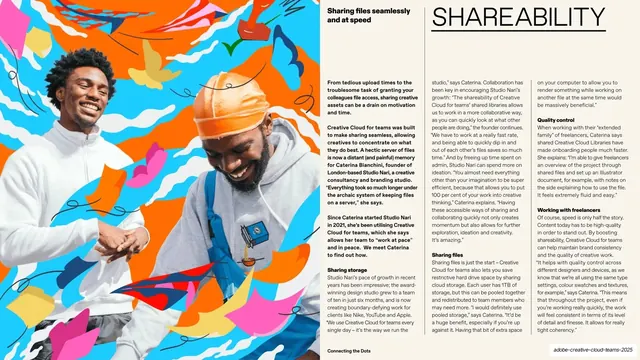
Magazine-style spread with an oversized thin "SHAREABILITY" header, four columns of justified body copy with bold sub-heads, and a vivid collage of two cut-out figures on the left third.
Summary
A magazine spread on file sharing: an oversized thin all-caps "SHAREABILITY" header runs across the top, four columns of small justified body copy sit beneath it, and the left third is a loud collage of two photographed cut-out figures against confetti shapes.
Visual description
The layout splits left-image / right-text on a cream-white field. The left third is a full-bleed maximalist collage: two smiling photographed men, cut out and placed over a busy orange, cyan, pink and yellow background of scattered paper shapes, scribbles and small icons. The right two-thirds open with a small bold lead line top-left ("Sharing files seamlessly and at speed") and the section word "SHAREABILITY" in oversized hairline-thin black all-caps, underlined by a thin rule. Below, four columns of small justified body text are broken by bold inline sub-heads ("Sharing files", "Quality control", "Working with freelancers", "Sharing storage"). The running footer carries "Connecting the Dots" center and a section label bottom-right.
Key takeaway
The fixed editorial grammar: small lead line, one giant thin section word, then disciplined justified columns with bold run-in sub-heads. It makes a copy-heavy slide feel like a designed magazine page instead of a wall of text. Anchoring the energy in a single edge-collage frees the type side to stay calm and orderly.
Reuse notes
Ideal for longform, copy-dense benefit or feature slides where you still want a publication look. Works best in a read-at-leisure PDF, since the body copy is genuinely small. Needs strong cut-out photography and commissioned collage to carry the image third; the layout would feel bare without it.