Preview image. Unlock full-res
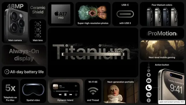
A 4-slide bento-grid recap of Apple's September 2023 event, each slide packing one product's features into rounded tiles of mixed sizes on a single dark or light field.
Summary
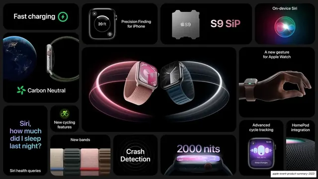
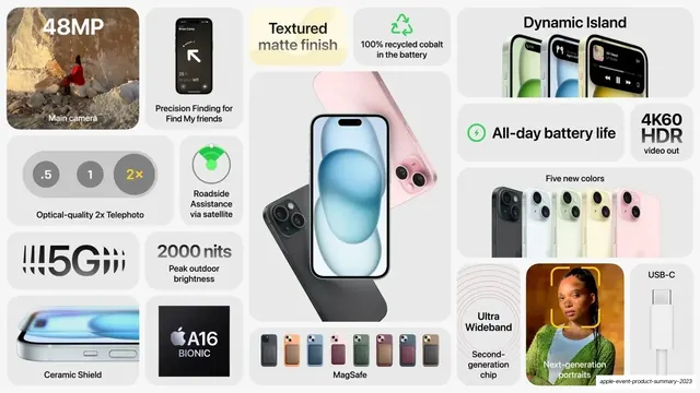
A four-slide visual recap of Apple's September 2023 event, one slide per product (iPhone 15 Pro, Watch Series 9, iPhone 15, and the Pro camera system). Every slide is a single bento grid of rounded tiles in many sizes, each tile carrying one feature with a label and a product render or photo.
Visual description
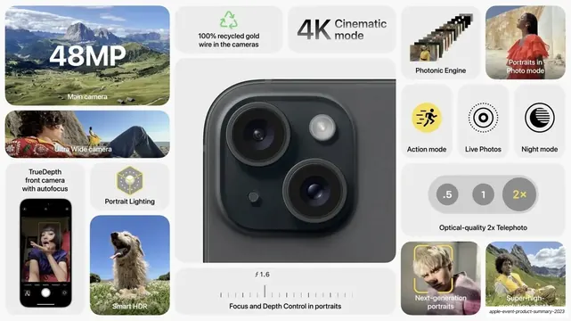
All four slides are 16:9 and built on the same grammar: a tight grid of rounded-corner tiles in varied sizes (small squares, wide banners, one or two large hero tiles) that tile a full-bleed background edge to edge with even gutters. Two visual modes alternate by product: the two iPhone Pro / Watch slides sit on pure black with charcoal tiles, near-white labels, and dramatic dark product renders; the iPhone 15 and Pro-camera slides flip to a light grey field with off-white tiles and dark labels. Type is a clean sans (Apple's SF) used two ways: small centered feature captions inside most tiles, and oversized hero treatments where a spec carries the tile ("48MP", "5x", "2000 nits", "Titanium" embossed in textured metal, "ProMotion", "ProMax"). Each tile is self-contained: a glossy product render (cameras, titanium frames, color lineups), a real photo sample, a UI screenshot (Dynamic Island music player, sleep tracking, Action button menu), an icon, or a chip shot (A17 Pro, A16 Bionic, S9 SiP). Accent color is sparse and functional: a green recycling/charging glyph, a colored Siri orb, a yellow "2x" toggle. The result reads as a dense but calm feature inventory where the grid does all the organizing.
Key takeaway
The bento grid as a summary device: cramming a full product's worth of features onto one slide without clutter, because every fact lives in its own rounded tile and tile size sets the hierarchy. The move of letting a single oversized spec number or word fill a tile, mixed in among small captioned tiles, so the eye lands on the headline features first. And alternating a black-tile and a light-tile treatment from product to product to signal a new section while keeping one identical layout system.
Reuse notes
The strongest reference in the library for a product feature-recap or launch-summary slide: hardware, consumer apps, or any product with many specs to show at once. Directly reusable for a "everything new" or end-of-keynote summary slide. It lives or dies on asset quality: it needs polished product renders, clean UI screenshots, and real photo samples to fill the tiles, so it suits well-resourced product teams. The dense grid is great for a recap but too busy for an opening or a single-message slide. Works equally on dark or light, but pick one per slide and keep tiles and labels consistent within it.
From this deck: Apple September 2023 Event Bento Summary
View deck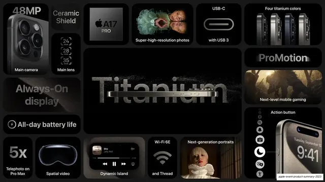
More like this









Keep what you find
A free account saves references to boards and can send you a weekly email of picks based on what you save.
To see every result, go Pro.