
Preview image. Unlock full-res
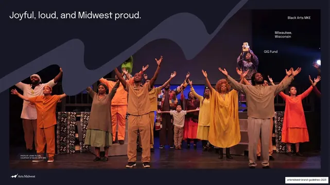
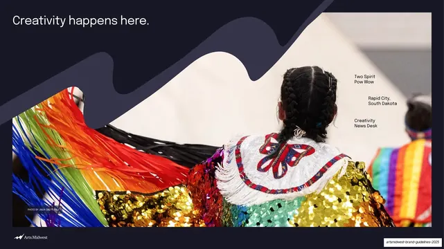
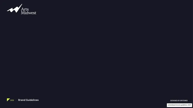
A 45-slide nonprofit identity manual that pairs dark navy section dividers, a single bold accent color per section, and a signature wavy "amplify" ribbon over community photography.
Summary
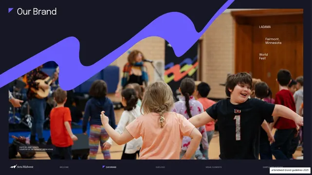
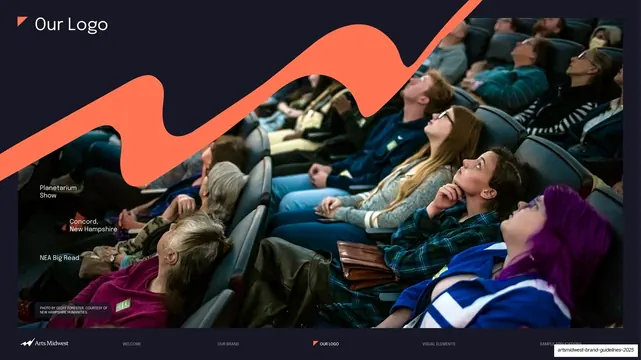
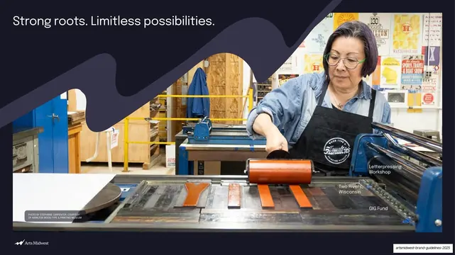
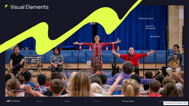
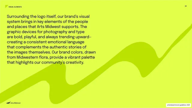
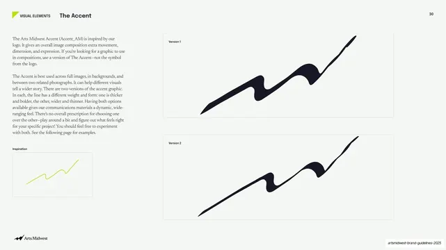
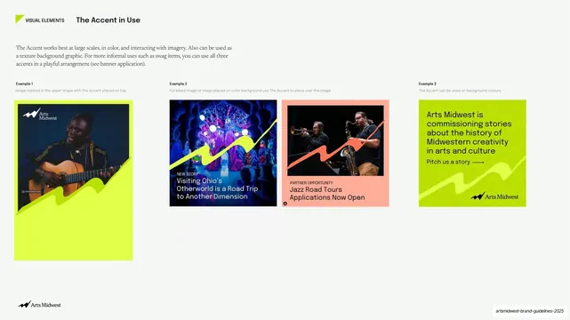
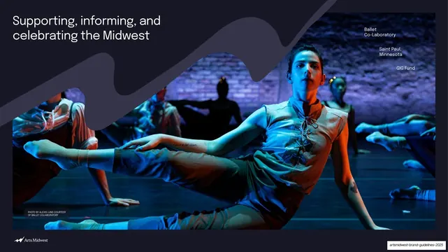
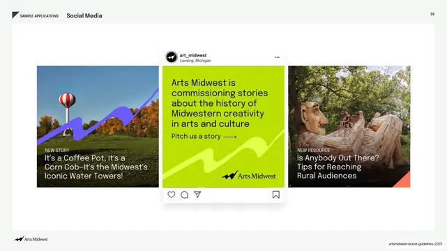
A 45-slide brand identity manual for Arts Midwest, a regional nonprofit arts organization spanning nine Midwestern states and Native Nations. Its personality comes from three moves: dark navy section dividers, one saturated accent color assigned to each section, and a signature wavy "amplify" ribbon (an abstracted M/W derived from the logo) laid over full-bleed community photography.
Visual description
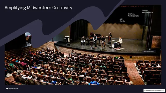
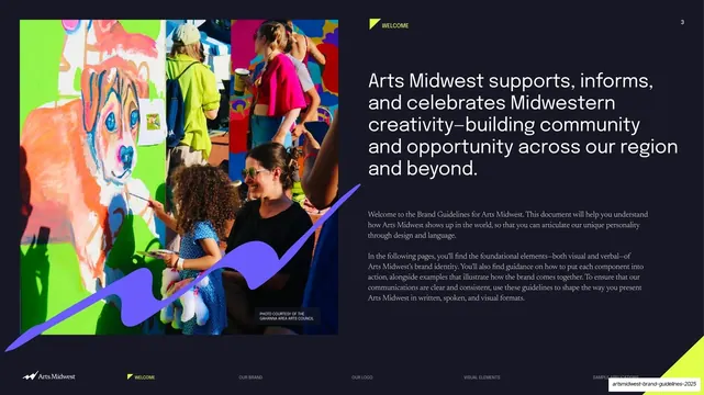
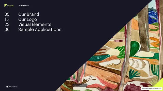
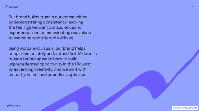
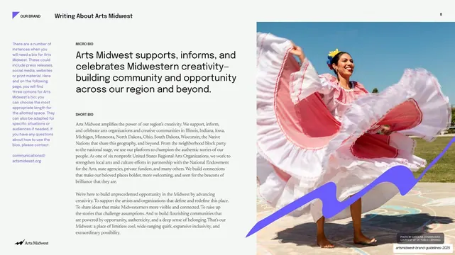
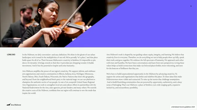
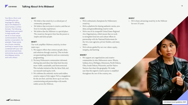
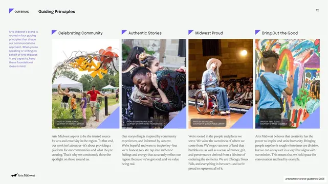
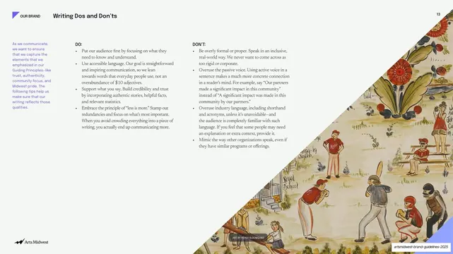
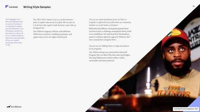
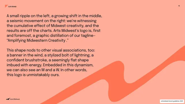
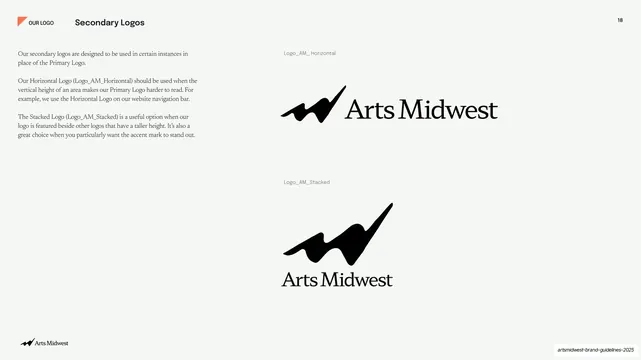
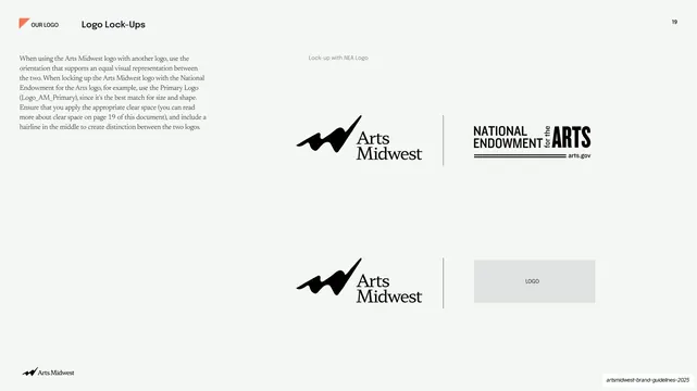
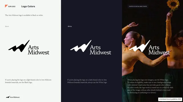
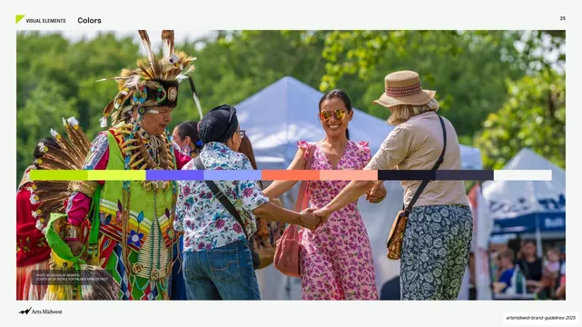
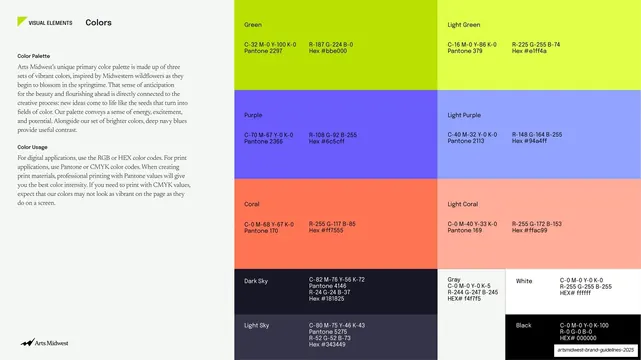
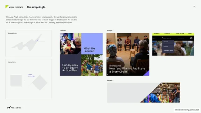
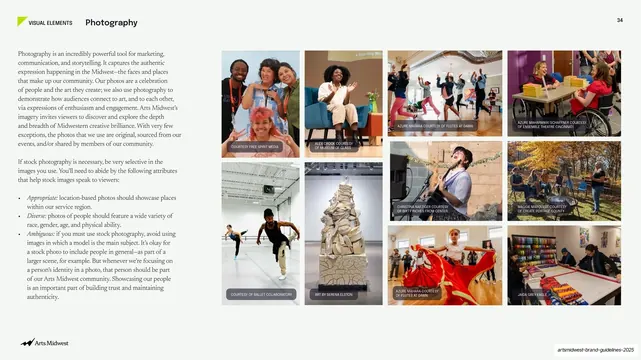
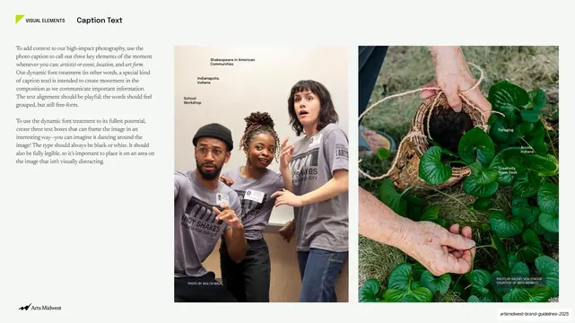
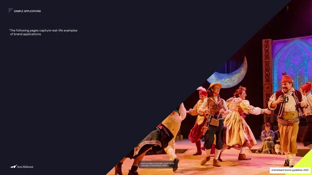
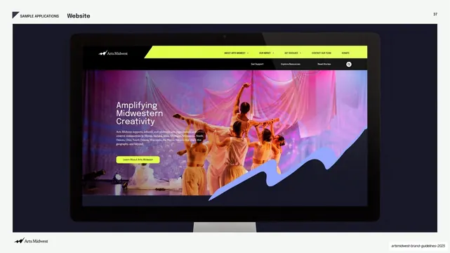
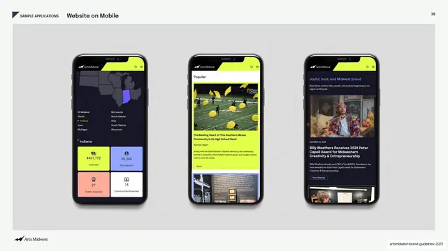
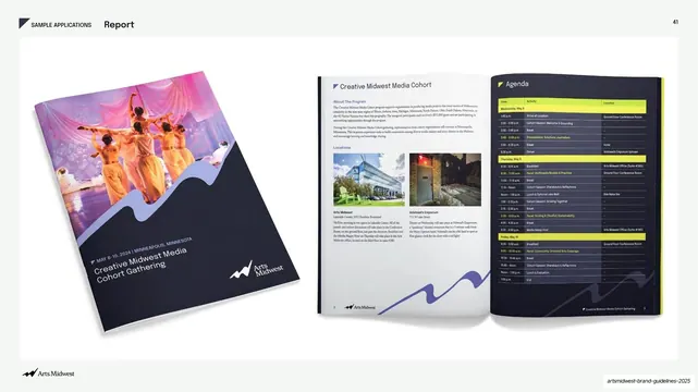
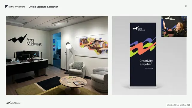
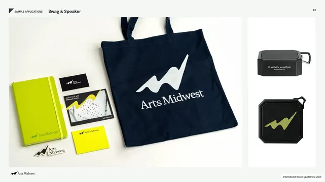
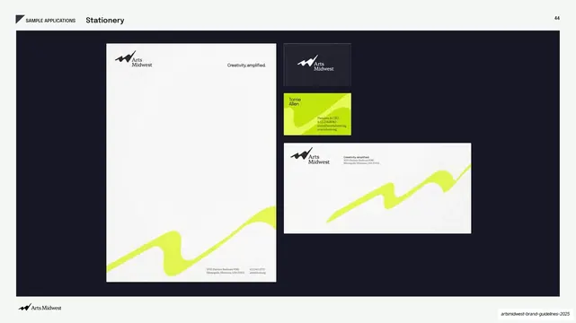
Slides run 16:9. The structure alternates between dark and light: each new section opens on a near-black navy (#1B1B2F) full-bleed photo divider, then content pages sit on a warm off-white (#F4F3EE). Sections are color-coded by a single accent: chartreuse lime (#C6F035) for Welcome, periwinkle blue-violet (#6C63FF) for Our Brand, and coral orange (#FF6B4A) for Our Logo. The recurring hero graphic is a thick wavy ribbon that climbs left-to-right like a rising line chart, rendered in that section's accent color and overlaid on or beside a photograph. Type mixes a geometric grotesque sans for large headlines and section labels with a transitional serif (Newsreader) for running body copy, plus the Arts Midwest serif wordmark and its swoosh mark. Persistent chrome: a small angled flag/leaf tab sits beside an all-caps section label top-left, a page number sits top-right, and a footer nav strip runs the four section names (Welcome, Our Brand, Our Logo, Visual Elements, Sample Applications) with the current one marked by the accent flag. Photography is documentary, community-sourced, and high-color, with tiny all-caps photo credits and dynamic floating labels naming artist, location, and event. Recurring layouts: full-bleed photo dividers with the ribbon; oversized headline statement slides; multi-column text frames (mission/vision/values, why/what/how/where, do/don't); four-up guiding-principle card rows; and clean logo presentation pages on near-white.
Key takeaway
The section-as-color system: keeping one fixed dark/light template but reassigning a single bold accent color per section, so the deck stays unified while each chapter gets its own identity. The wavy "amplify" ribbon doing double duty as logo echo and rising-chart metaphor. And the discipline of pairing a grotesque sans for display with a serif for body, which keeps long copy pages readable without going flat.
Reuse notes
A strong reference for nonprofit, arts, civic, or community-organization brand guideline decks, and for any identity manual that needs warmth and energy without losing structure. The color-coded section system and footer nav are directly reusable for any long, navigable document. Leans heavily on genuinely good, diverse community photography to carry the dark dividers; weak photo libraries will undercut it. The wavy ribbon is bespoke to this logo; swap it for your own brand device.
From this deck: Arts Midwest Brand Guidelines 2025
View deck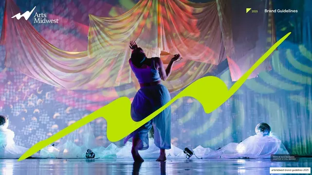




More like this





Keep what you find
A free account saves references to boards and can send you a weekly email of picks based on what you save.
To see every result, go Pro.