
Preview image. Unlock full-res
A 22-slide investor earnings report that pairs clean white data slides built on blue/navy bar charts with full-bleed black section slides showcasing 3D product mockups.
Summary
Wix's Q2 2023 investor earnings report across 22 slides. Its grammar is a deliberate split: data and financials live on bright white slides driven by a tight blue/navy chart language, while section breaks and the cover go full-bleed black with glossy 3D renders of Wix-built sites floating on a dark surface.
Visual description
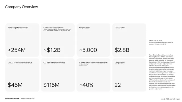
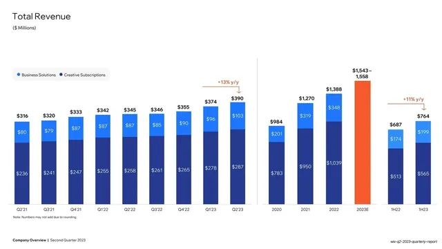
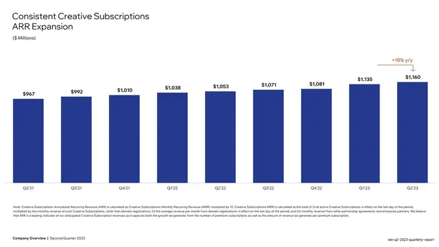
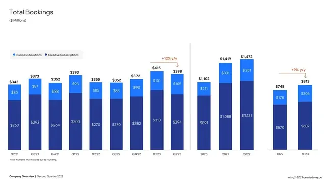
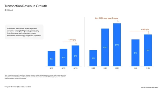
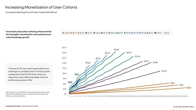
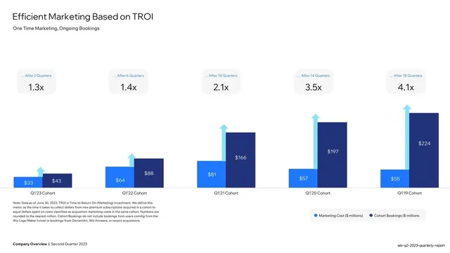
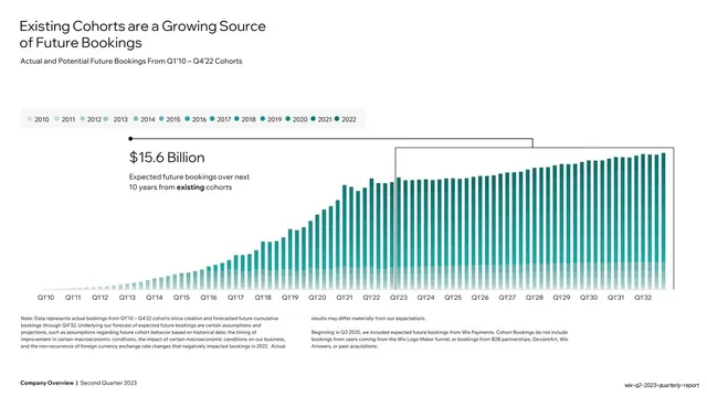
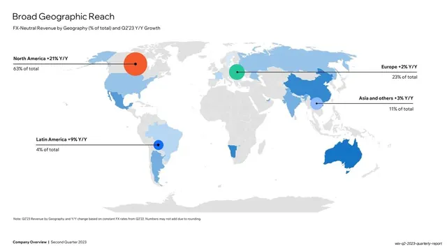
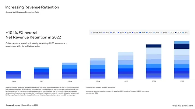
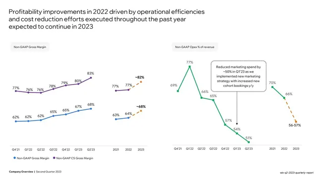
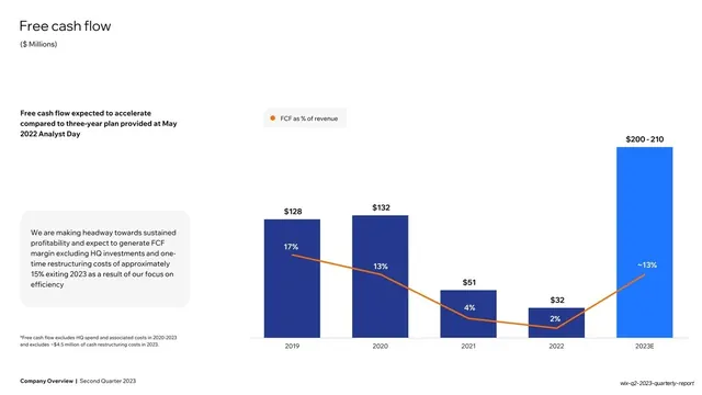
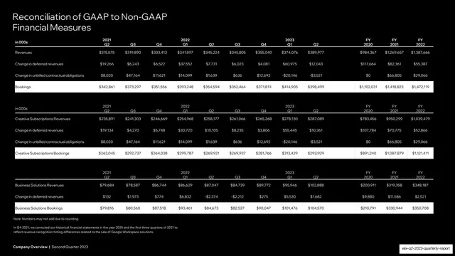
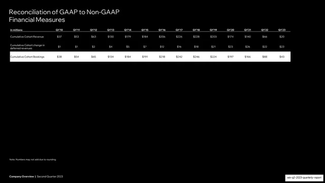
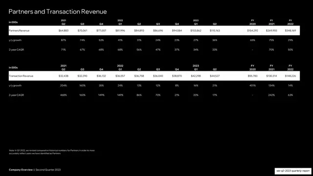
Slides run 16:9. Two opposing slide modes alternate. White mode: a thin charcoal headline (regular-weight geometric sans) set top-left, a small grey subtitle beneath it, and the body given over to data: stacked vertical bar charts in two blues (bright #2E7DF6 over navy #1A3FAA), single-series navy or blue bars, multi-line cohort charts, a teal world map, and rounded grey KPI cards holding oversized numbers (">254M", "~$1.2B", "$2.8B"). Orange (#F25C26) is the consistent accent: y/y growth callouts, trend lines over bars, and one highlighted forecast bar. Soft grey rounded rectangles hold supporting paragraphs and legends. Black mode: the cover, the "Our Vision" and belief statements, and the section dividers ("Financial Overview and Update", "Appendix") place near-white headline type on the left and bleed a dark, photographic 3D montage of phone and desktop mockups (e-commerce sites, the Wix editor color picker and text-settings panels) off the right or bottom edge. The three closing reconciliation tables invert to white text on solid black. A persistent footer rule carries bold "Company Overview | Second Quarter 2023" left, on every slide.
Key takeaway
The clean/loud rhythm: keep dense financial slides calm and white so the data reads, then punctuate with full-bleed black mockup slides for vision and section breaks so the deck breathes and shows the product. The disciplined two-blue stacked-bar system with a single orange accent reserved only for growth deltas and trend lines, so the eye always knows where the "story" number is. And the rounded-grey "annotation card" that parks narrative commentary beside a chart without crowding it.
Reuse notes
A strong template for any quarterly earnings or board/investor report, especially for a SaaS or payments business reporting revenue, bookings, ARR, cohort and margin data. The chart-on-white plus statement-on-black structure scales cleanly past 20 slides. The black 3D-mockup slides depend on having genuinely good product renders; without them, fall back to a solid black statement slide. Reserve the orange accent strictly for deltas or it loses its signal. The dark reconciliation tables are a tidy pattern for dense appendix data.
From this deck: Wix Q2 2023 Quarterly Earnings Report
View deck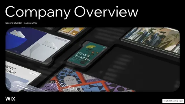






More like this









Keep what you find
A free account saves references to boards and can send you a weekly email of picks based on what you save.
To see every result, go Pro.