Preview image. Unlock full-res
A 9-slide freelance motion-designer capabilities deck on warm cream and deep forest-green, pairing a serif headline voice with a clean grotesque body, with colorful illustrated work samples carrying the case-study slides.
Summary
A 9-slide capabilities deck for Andreas Maris, a freelance Senior Motion Designer. Its personality comes from a restrained palette of warm cream and deep forest-green plus a two-voice type system: a high-contrast serif for every slide headline and a clean grotesque for body copy. Colorful illustrated and animated work samples supply all the color; the layout itself stays quiet.
Visual description
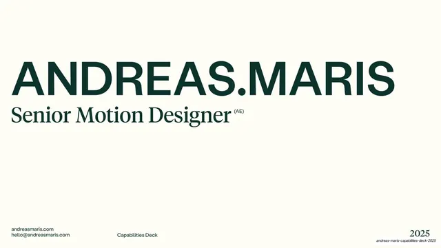
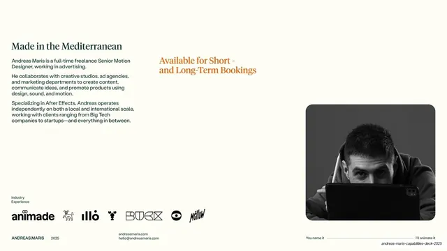
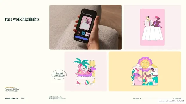
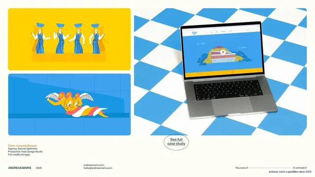
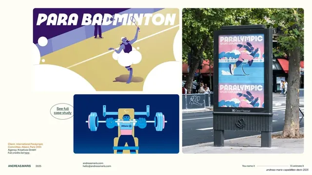
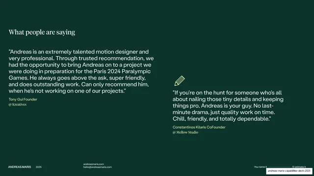
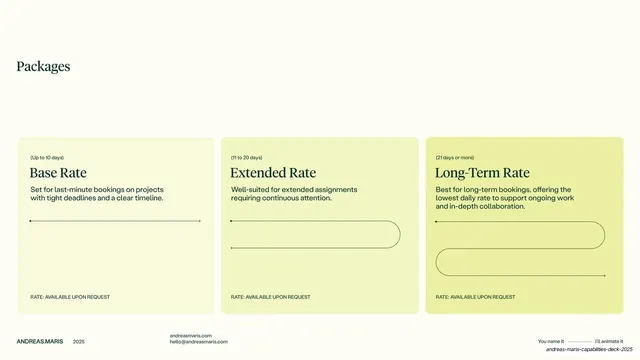
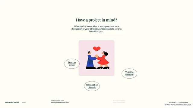
Slides run 16:9. The base is a warm off-white cream (#FBFAEF) with a deep forest-green ink (#163A2E); two slides invert to a full green field with cream type. An orange (#E8662A) accent flags client credits and the occasional secondary headline, and a soft chartreuse (#E9EE9A) fills the pricing cards. Type is consistently dual: slide titles and the closing line are set in a high-contrast transitional serif ("Made in the Mediterranean", "Past work highlights", "Packages", "Have a project in mind?", "Thanks For Stopping By"), while body paragraphs, captions, and credits use a neutral grotesque sans. The cover breaks the rule with an oversized sans wordmark, "ANDREAS.MARIS", over a serif role line, "Senior Motion Designer (AE)". Every interior slide carries the same chrome: a small "ANDREAS.MARIS 2025" lockup bottom-left, a centered "andreasmaris.com / hello@andreasmaris.com" contact block, and a bottom-right tagline "You name it -- I'll animate it" split by a thin connecting rule. Recurring layouts: title-left with body-right text slides; bento-style grids of work samples (mixed phone mockups, flat character illustrations, OOH photos, and a laptop mockup); a two-column testimonial slide on green; a three-card pricing row on cream; and a centered contact slide with hand-drawn ellipse pill links ("Send an email", "Visit the website", "Connect on LinkedIn", "See full case study") scattered around an illustration. The closing slide is a full green field with a large serif "Thanks For Stopping By" and a small scrambled monogram of the name.
Key takeaway
The serif-headline / sans-body pairing that gives a one-person freelance deck an editorial, gallery-like calm. Keeping the whole layout neutral cream-and-green so the colorful client work provides every bit of saturation. And the recurring hand-drawn ellipse "pill" used as a link affordance, a small playful counterpoint to the otherwise sober system.
Reuse notes
A strong reference for a freelance creative, motion designer, or small studio capabilities deck, and for any portfolio where the work itself is loud and the container should stay restrained. The fixed running header/footer plus the "You name it / I'll animate it" tagline strip is a clean way to brand every slide without decoration; swap the tagline for your own. The bento work-sample grids and the credit-block pattern (Client / Agency / Production / full credits link) are directly reusable for case-study slides. Needs genuinely good work samples to carry the grids.
From this deck: Andreas Maris Capabilities Deck 2025
View deck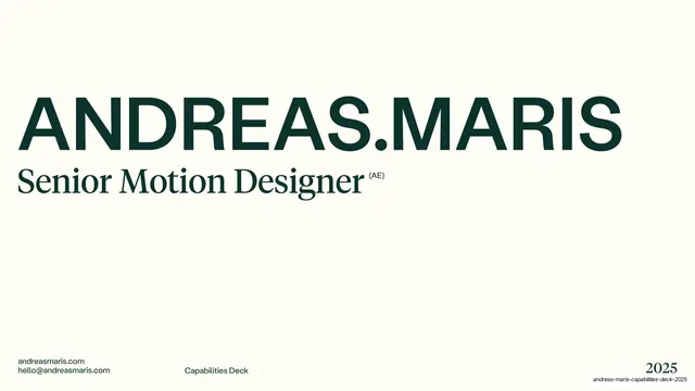

More like this







Keep what you find
A free account saves references to boards and can send you a weekly email of picks based on what you save.
To see every result, go Pro.