Preview image. Unlock full-res
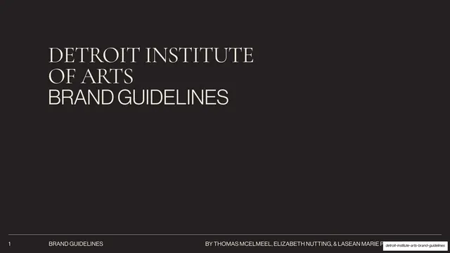
A 47-slide museum brand guideline deck on a dark charcoal base with cream type, pairing Cormorant Garamond serif with Neue Haas Grotesk sans and using full-bleed accent-color section dividers.
Summary
A 47-slide brand guideline deck for the Detroit Institute of Arts, built on a near-black charcoal field with warm cream type. Its identity rests on two ideas: a "neutral container" philosophy that keeps the system quiet so the art leads, and full-bleed accent-color section dividers that color-code each part of the museum experience.
Visual description
Slides run 16:9 on a dark charcoal base (#231F20) with cream "Gesso" text (#F1EEDB). Two type families do the work: Cormorant Garamond, a high-contrast serif, and Neue Haas Grotesk, a geometric grotesque sans, deliberately paired to connect past and present. Section-title slides are full-bleed in an accent color (dark magenta for Brand Strategy, olive deep-green for Brand Assets) carrying one oversized sans headline; subsequent content slides in that section keep a thin band of that accent color across the very top edge. Content slides follow a consistent two-column grammar: a left column with an all-caps Neue Haas section label and justified body copy, and a right column holding a photograph, color chips, type specimens, or a diagram. A persistent footer sits on a hairline rule: page number far left, then "BRAND GUIDELINES", a centered section name ("BRAND STRATEGY", "BRAND ASSETS", "TABLE OF CONTENTS"), and credits at right on the cover. The DIA wordmark is a bespoke thin geometric monogram in which the "A" crossbar is drawn from the brand's golden-rectangle device. The color system is unusually broad for a museum: two neutrals (Charcoal, Gesso) plus seven accents (Deep Red, Dark Magenta, Deep Green, Teal, Medium Yellow, Light Blue, Light Purple), each documented with Pantone, hex, and RGB and assigned to a wayfinding level. A golden-rectangle / Fibonacci grid underpins layout.
Key takeaway
The "neutral container" idea made literal: a restrained dark-and-cream system that recedes so the content (here, the art) carries every slide. The accent-color section coding, where each chapter owns a full-bleed divider color that then survives only as a thin top band on its content slides, paces a long document and aids navigation at once. And the two-typeface serif-plus-grotesk pairing as a stated metaphor (old meets new) rather than mere decoration.
Reuse notes
A strong reference for cultural-institution, museum, and nonprofit identity decks, and for any long, content-heavy guideline that must stay legible and calm across dozens of pages. The two-column content template (label plus justified body left, specimen or image right) and the accent-color chapter system are directly reusable. The broad seven-accent palette is specific to a wayfinding need; trim it for simpler brands. Depends on genuinely good photography to carry the image columns, and the bespoke geometric wordmark is unique to DIA.
From this deck: Detroit Institute of Arts Brand Guidelines
View deck














































More like this








Keep what you find
A free account saves references to boards and can send you a weekly email of picks based on what you save.
To see every result, go Pro.