Preview image. Unlock full-res
A 19-slide exhibition catalogue from SPACE10 (IKEA's research lab) that alternates pure-black text slides with soft-focus full-bleed photo slides, all set in a single neutral grotesque sans.
Summary
A 19-slide project catalogue from SPACE10, the IKEA-backed research and design lab, made to help galleries and exhibitors browse and reuse its open-source projects. Its personality comes from a single restrained grotesque typeface, oversized lowercase headlines, and a rhythm of pure-black text slides traded against soft-focus full-bleed lifestyle photography.
Visual description
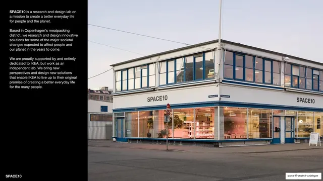
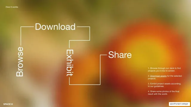
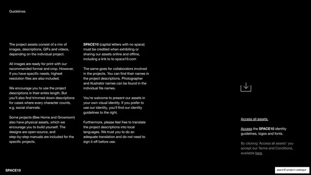
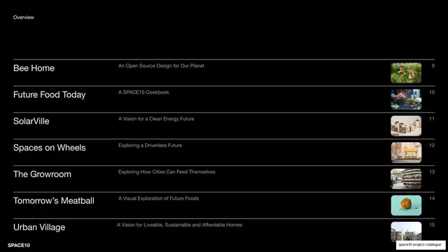
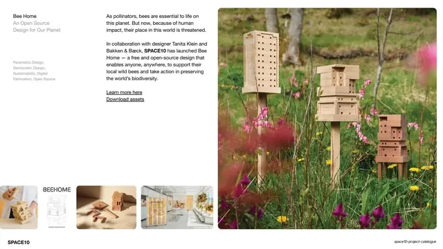
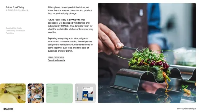
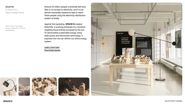
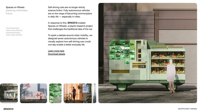
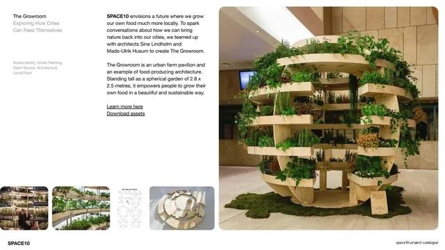
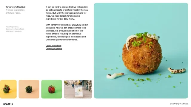
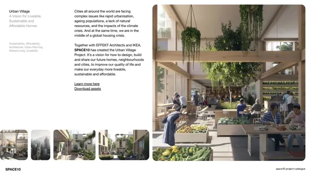
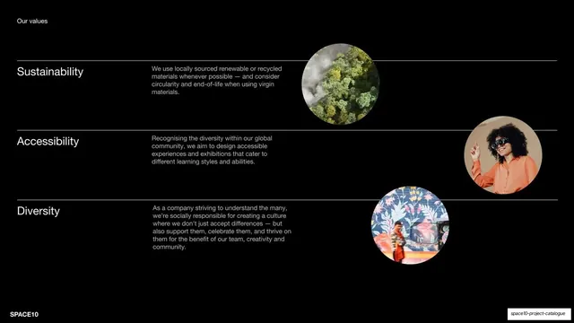
Slides run 16:9. The system uses one neutral grotesque sans (Helvetica/Neue-Haas character) across every slide, with only weight and size for hierarchy. Two slide modes alternate: pure-black (#000000) slides with white body copy, and full-bleed photographs deliberately thrown out of focus so that white headline type stays legible over them. Headlines are oversized and lowercase ("Hej + welcome", "to our open-source project drive", "Many thanks for your interest in our work!"). A persistent "SPACE10" wordmark sits bottom-left on every slide; section dividers carry a small all-caps label top-left ("Intro", "How it works", "Guidelines", "Overview", "Our values"). The deck has a clear three-part structure: an intro/welcome run, a Projects section, and a values/closing run. The Overview slide and the "Our values" slide use full-width hairline rules to separate stacked rows, each row pairing a large project name with a one-line subtitle and a small thumbnail or circular photo at the right. The seven project slides share one fixed template: a narrow left column with the project name, a muted subtitle and a list of small grey theme tags, a multi-column body-copy block with underlined "Learn more here / Download assets" links, a large hero image bleeding off the right edge, and a strip of four small supporting thumbnails along the bottom. Color is almost entirely black/white plus whatever the photography brings (earthy greens, warm oranges, a few saturated product shots); there is no decorative graphic language beyond the type and the rules. The deck closes on a black slide with the large white "SPACE10" wordmark centered.
Key takeaway
The single-typeface discipline: one grotesque doing the entire deck, hierarchy from size and weight alone. The black-slide / soft-focus-photo alternation that paces a long catalogue and keeps every headline readable without overlays or scrims. And the strongest reusable idea: one fixed project template (name + theme tags + body + hero + four thumbnails) repeated across every project so a browsable catalogue reads as one system.
Reuse notes
A strong reference for exhibition catalogues, open-source project drives, portfolio overviews, and any content-led deck that must stay calm and legible across many entries. The project template is directly liftable for case-study or product-catalogue decks. The soft-focus full-bleed photo trick only works when the imagery is genuinely atmospheric and the headline is short; it fails on detailed or high-contrast photos. Leans heavily on a good Helvetica-class typeface and strong photography to carry slides that are otherwise almost bare.