
Preview image. Unlock full-res
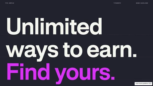
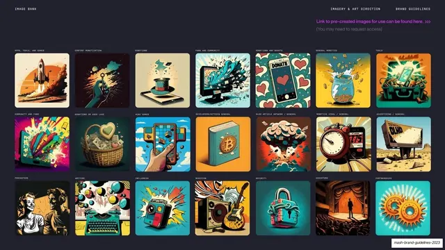
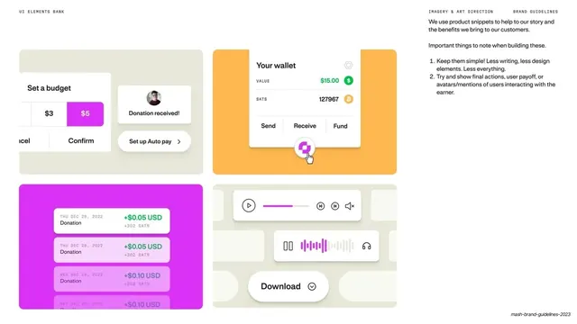
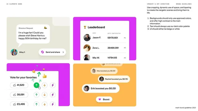
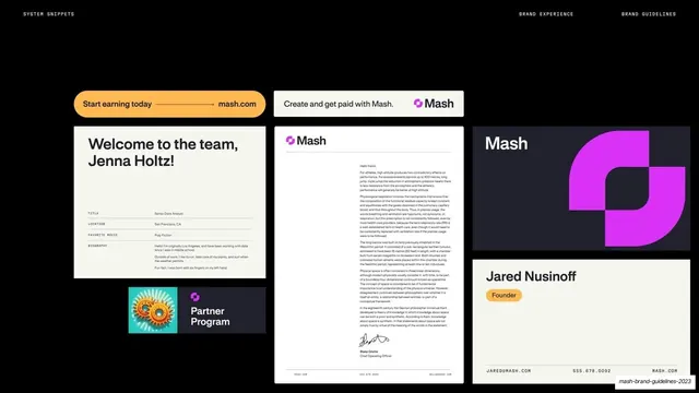
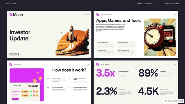
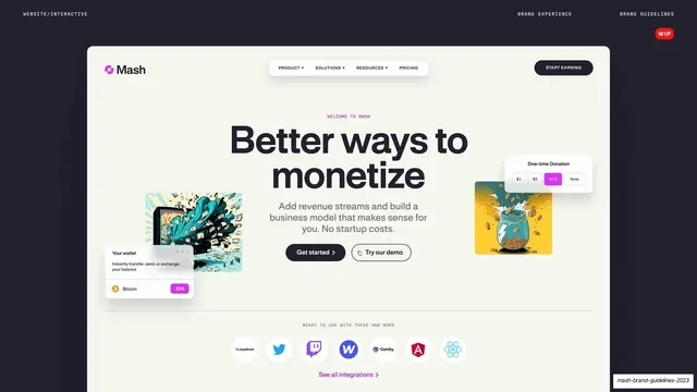
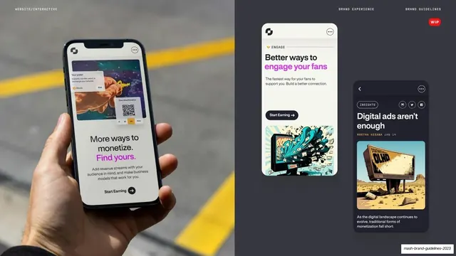
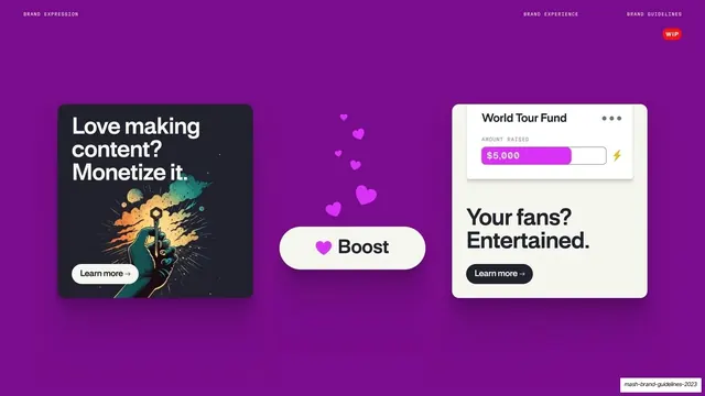
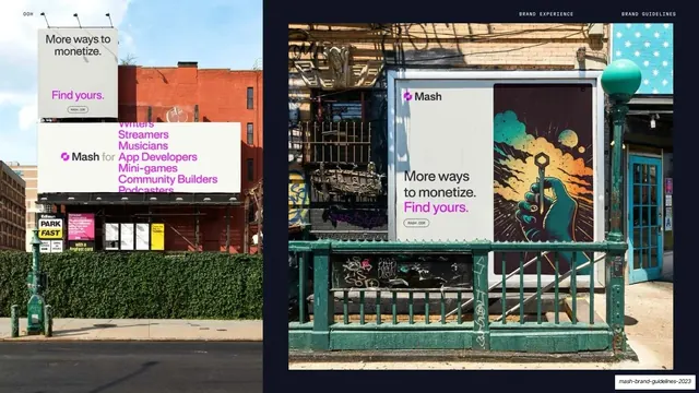
A 62-page brand guidelines deck for Mash that alternates warm-cream and near-black navy pages, sets oversized bold sans statements with a single magenta highlight, and threads tiny monospace utility labels and a magenta tab-bar nav throughout.
Summary
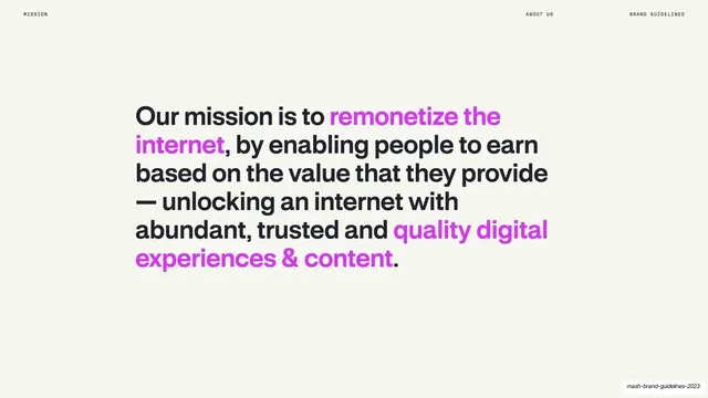
A 62-page brand guidelines presentation for Mash, a creator monetization platform whose mission is to "remonetize the internet." Its personality comes from three moves: alternating warm-cream and near-black navy full-bleed pages, oversized bold sans-serif statements that carry a single hot-magenta highlight, and a consistent monospace utility layer (running headers, section numbers, page labels) tying every page together.
Visual description
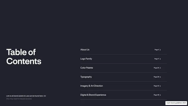
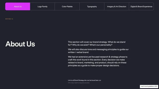
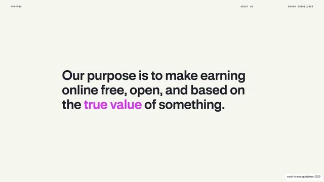
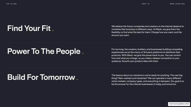
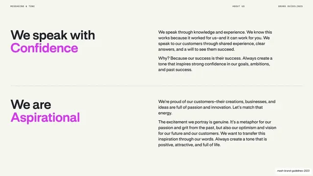
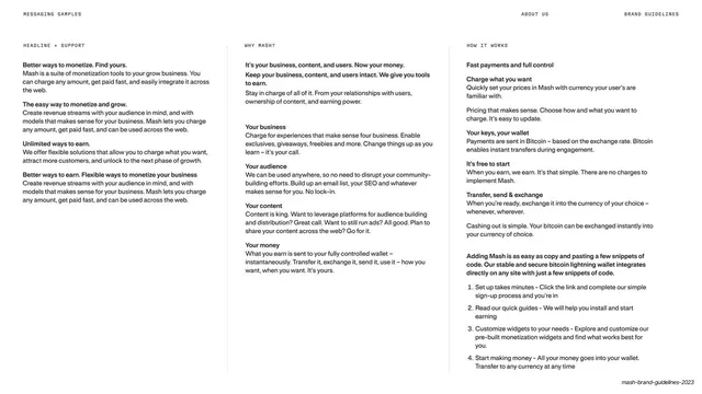
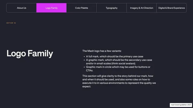
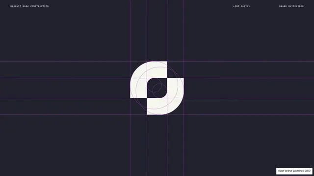
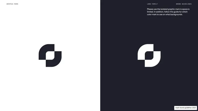
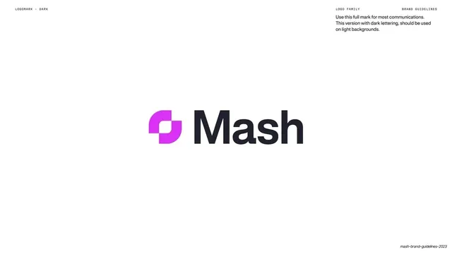
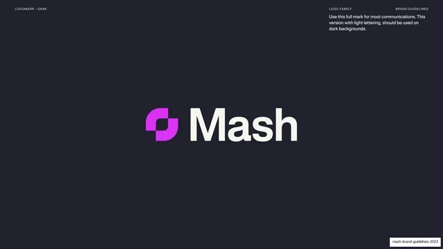
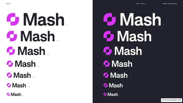
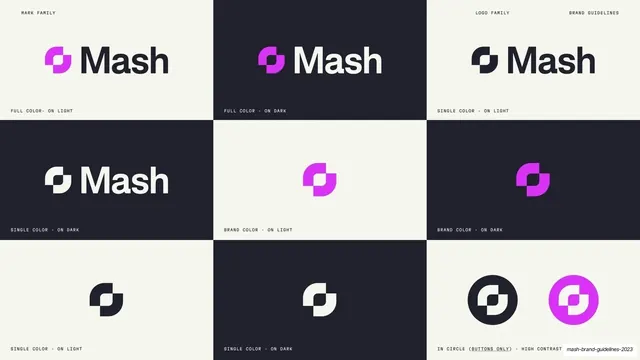
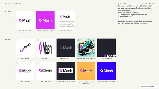
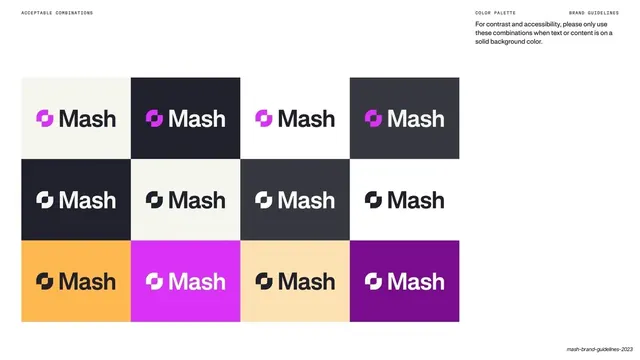
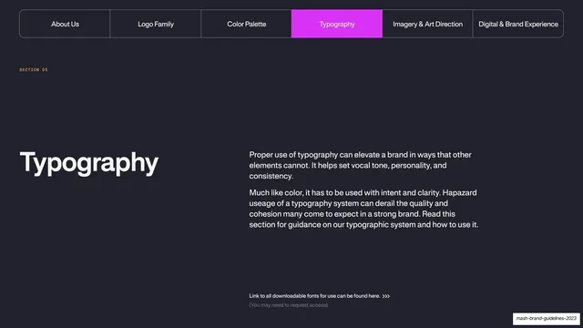
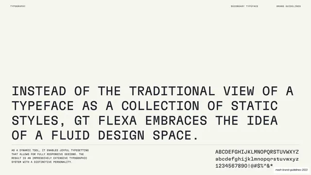
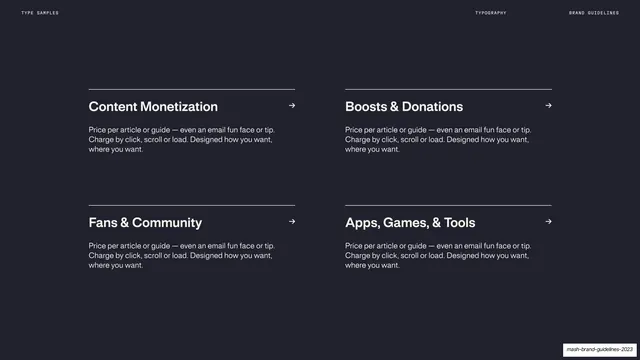
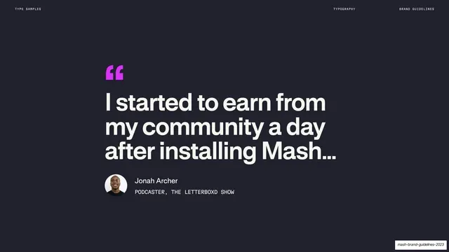
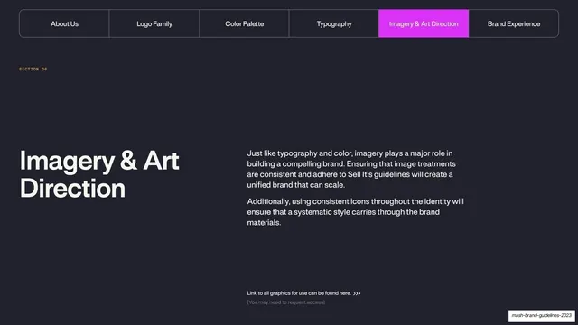
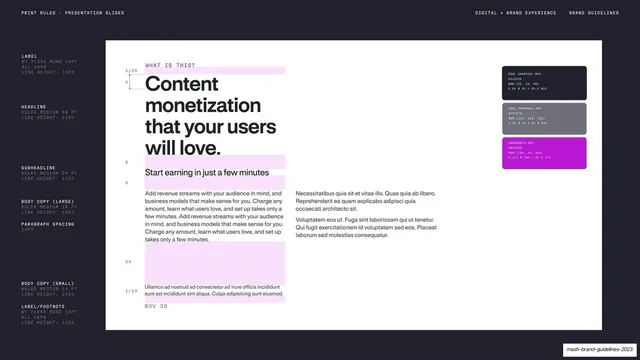
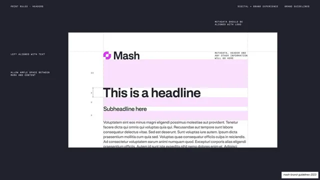
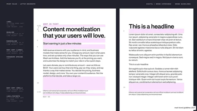
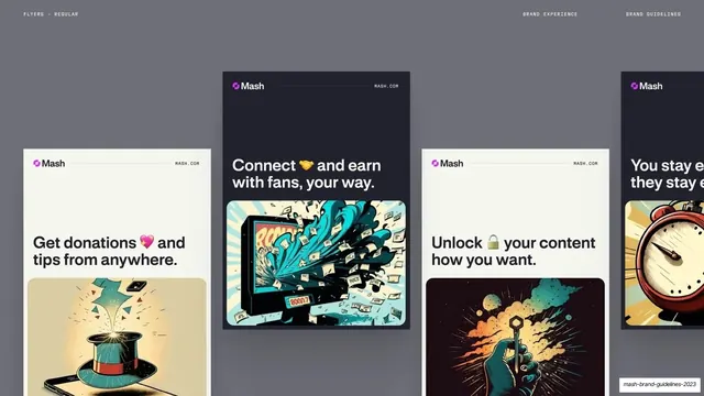
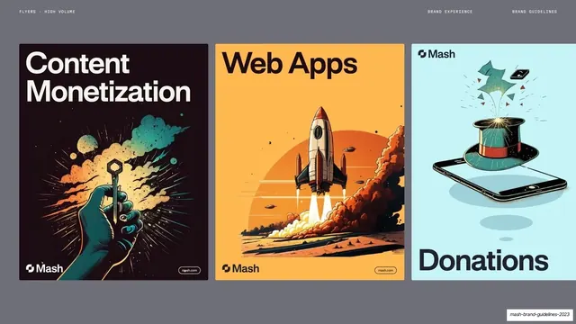
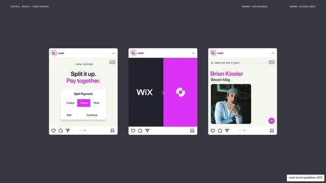
Pages run 16:9. The system swaps between a warm off-white cream (#F4F3EC) and a near-black desaturated navy (#1E1E2D), with one loud accent: a hot magenta (#D633F0) used to highlight key words in headlines, to flag the active tab, and as the logomark's gradient. Type is a clean geometric grotesque sans, set very large and bold for statements and switching to small all-caps monospace for labels. Every page wears a tiny monospace running header (a left section label like "PURPOSE" or "MISSION", and "ABOUT US" / "BRAND GUIDELINES" right). Recurring layouts: a split cover (logo left, title right); centered oversized statement pages with one magenta phrase; section dividers carrying a six-item rounded tab-bar nav at the top with the current section filled magenta and a big bottom-left section title; stacked split rows pairing a big display title (magenta second line) against a right body column on hairline rules; numbered grids using magenta index numerals; three-column text tables; and a full logo system: construction grids with purple guides, clearspace diagrams, dark/light mark pairings split white-and-navy, and large centered full-mark lockups. The logomark is an abstract two-square interlocking form with rounded corners in a violet-to-magenta gradient.
Key takeaway
The alternating cream/navy rhythm that paces a long guidelines deck without decoration. The discipline of one oversized bold statement per page with exactly one magenta phrase doing all the emphasis. And the monospace utility layer (section labels, page numbers, tab nav) that makes 60-plus pages feel like one coherent document.
Reuse notes
A strong reference for brand guidelines, identity systems, and design-system decks, especially for SaaS, fintech, or creator-economy products. The statement-page pattern (huge bold sentence, single accent highlight, mono header) is directly reusable for mission, purpose, and values pages. The tab-bar section nav is a tidy way to show "where am I" across a long deck. Depends on a strong single accent color and a good geometric sans; the magenta is bespoke to Mash, swap it for your own accent.
From this deck: Mash Brand Guidelines 2023
View deck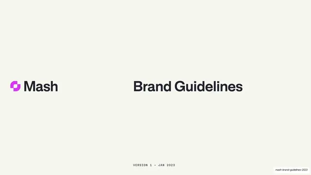






















More like this









Keep what you find
A free account saves references to boards and can send you a weekly email of picks based on what you save.
To see every result, go Pro.