Preview image. Unlock full-res
A 46-slide architecture-and-interiors partnership pitch built on a red, black, and slate system with oversized lowercase grotesque headlines, full-bleed render section dividers, and number-led stat grids.
Summary
A 46-slide partnership pitch from McKinley Studios, an integrated architecture and interior design firm, proposing an end-to-end retail-rollout partnership (pitched to "Wilson"). Its personality comes from a strict three-color system, oversized all-lowercase grotesque headlines, and a rhythm that alternates full-bleed architectural renders with black number-led stat grids.
Visual description
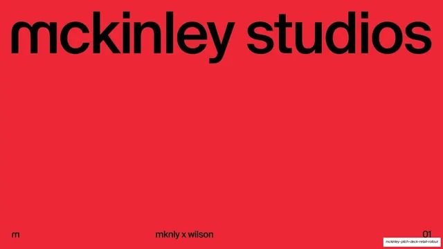
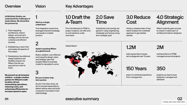
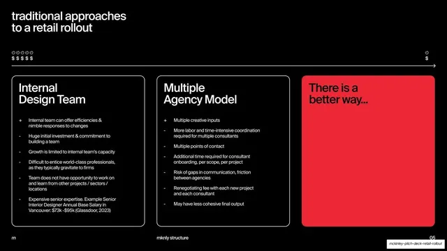
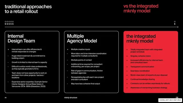
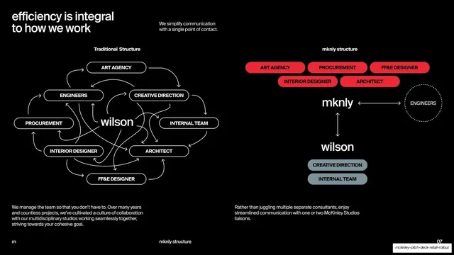
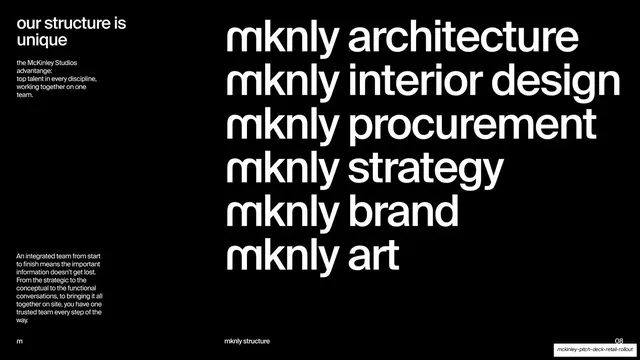
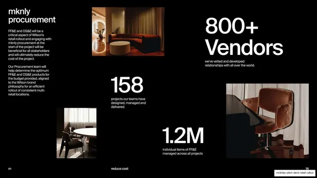
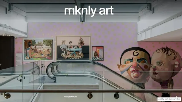
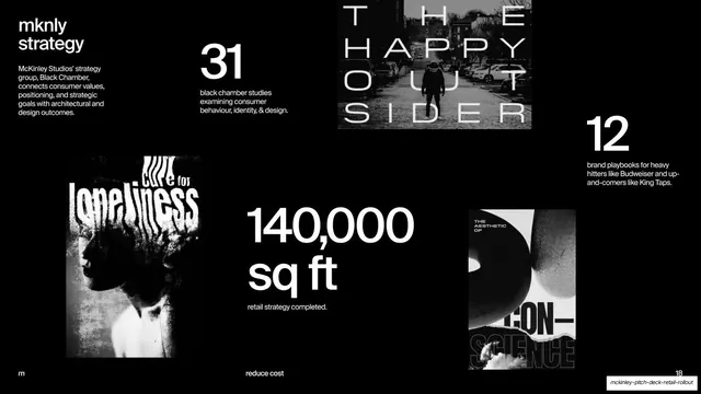
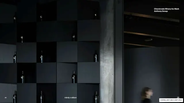
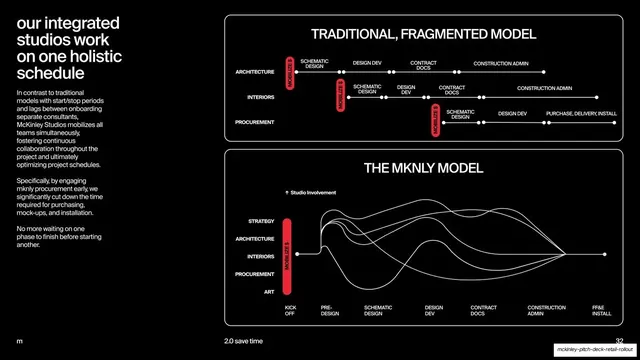
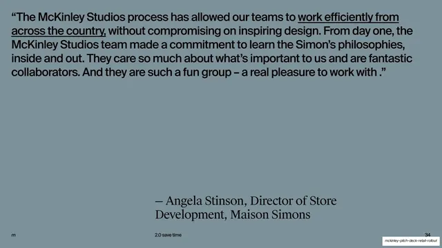
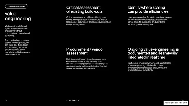
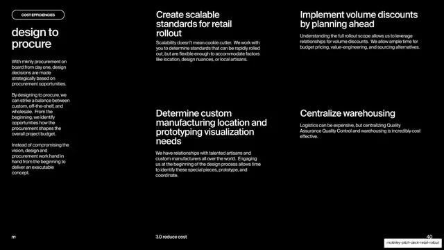
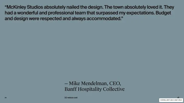
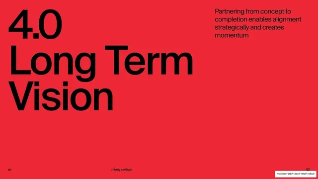
Slides run 16:9 on a tight palette: pure black, a single saturated signal red (around #F23842), a muted slate blue-grey, and pure white type. The headline face is a tightly-set grotesque (Helvetica/Neue Haas family) used very large and almost always lowercase; the brand "m" has a distinctive squared double-storey opening and appears as a tiny monogram bottom-left on nearly every slide. A consistent running footer carries that "m" left, a centered all-caps running label (for example "mknly structure", "executive summary", "the challenge", "reduce cost"), and a two-digit page number right, sitting on a thin hairline rule. Recurring layouts: a red full-bleed cover with the lowercase wordmark "mckinley studios"; a dense multi-column "executive summary" board mixing a numbered key-advantages row, a black world map dotted in red, and oversized stat figures; large pull-quote slides in serif attribution over a slate field; a three-card comparison row (two outlined black cards plus one solid-red card) contrasting traditional models with the integrated "mknly model"; bubble-and-arrow org diagrams using red and slate pills; a black list slide stacking six lowercase "mknly [discipline]" service lines; and a repeated discipline grammar where each capability (architecture, interior design, procurement, art, strategy) gets a full-bleed photographic or render divider with the discipline name set large, followed by a black grid slide combining a short intro paragraph, scattered project thumbnails, and giant stat numbers ("3000", "800+ Vendors", "10 Awards", "11 artists"). Imagery ranges from warm CGI store interiors and exterior architectural renders to gritty black-and-white art-direction collage.
Key takeaway
The discipline of a three-color system (black, one red, one neutral) carrying 46 slides without decoration. The rhythm of pacing dense data slides with full-bleed image dividers so the deck breathes. And the comparison move: two restrained outlined cards for the old way versus one solid-red card for the proposed way, so the recommendation is impossible to miss.
Reuse notes
A strong reference for B2B service, agency, architecture, or interiors partnership and capabilities decks, and for any long pitch that needs to stay legible and confident across 40-plus slides. The discipline template (full-bleed divider, then intro plus thumbnails plus oversized stats) is directly reusable for any multi-service firm. Leans heavily on genuinely good renders and photography to carry the divider slides; weak imagery would collapse the whole system. The single-red accent does a lot of work, so keep it scarce.
From this deck: McKinley Studios Retail Partnership Pitch Deck
View deck


























More like this










Keep what you find
A free account saves references to boards and can send you a weekly email of picks based on what you save.
To see every result, go Pro.