Preview image. Unlock full-res
A 15-slide festival brand guidelines deck on near-black navy with electric-blue condensed section titles, a left-text / right-visual grammar, and a sun-bleached surf-and-music palette.
Summary
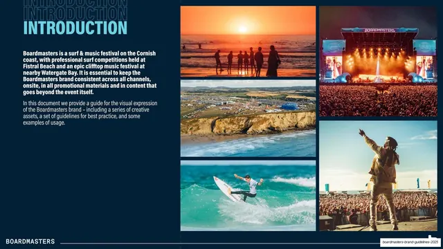
A 15-slide brand guidelines deck for Boardmasters, a surf and music festival in Newquay, Cornwall. Its personality comes from a single dark navy base, an electric light-blue accent, and oversized condensed all-caps section titles that each sit on a ghosted three-deep repeat of themselves. It pairs a tight left text column with a large right-hand visual on almost every interior page.
Visual description
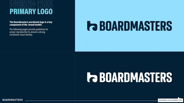
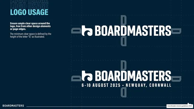
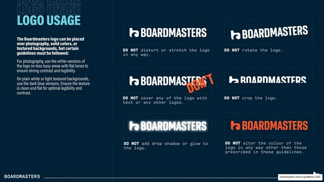
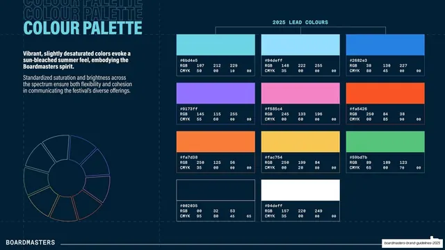
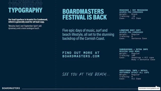
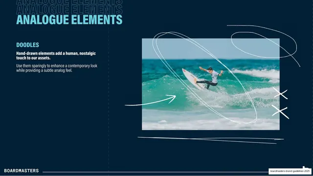
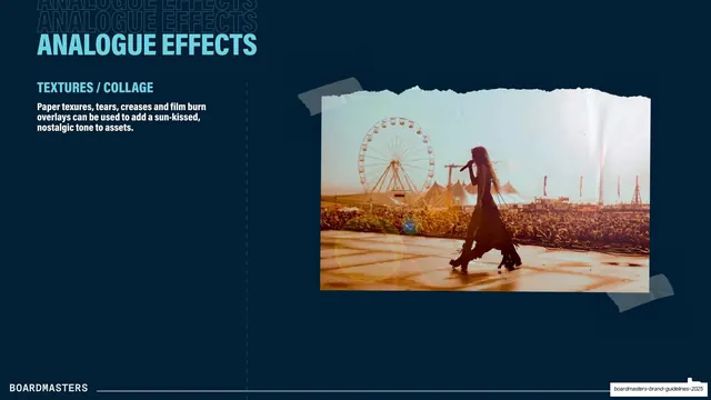
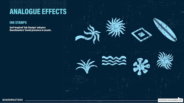
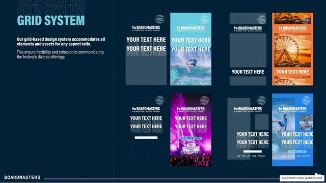
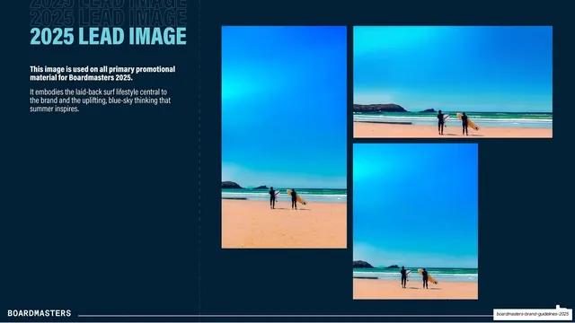
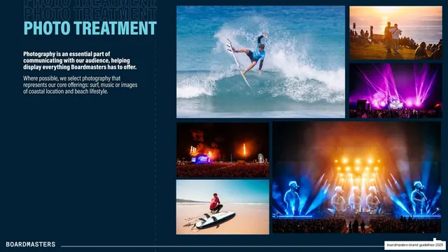
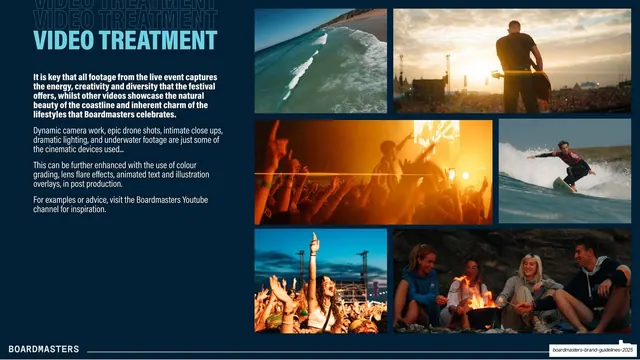
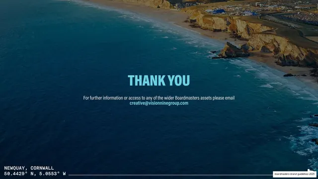
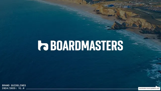
Slides run 16:9 on a near-black navy field (#002035). Section titles are an oversized condensed bold sans in bright light-blue (#94deff), top-left, with two faded ghost copies of the same word stacked behind them. Body copy is a regular sans, white, in a narrow left column: a bold lead line followed by lighter supporting paragraphs. A vertical dashed guide line frequently splits the text column from the visual zone. Every interior slide carries a running footer: a white "BOARDMASTERS" wordmark bottom-left on a thin hairline rule. The right two-thirds holds the content of each page: the logo on light and dark swatches (slide 3), a clear-space and 6-10 August 2025 lockup diagram (4), a six-cell DO NOT misuse grid with monospace captions (5), a twelve-swatch colour palette with hex/RGB/CMYK readouts and a faint colour wheel (6), a typography spec laid out as styled samples plus monospace weight/tracking tables (7), hand-drawn doodle overlays on a surf photo (8), a torn-paper taped film-burn collage (9), eight surf-inspired ink-stamp icons in light-blue on a grunge texture (10), a grid of vertical poster mockups across aspect ratios (11), the 2025 lead surf image shown in three crops (12), and photo and video treatment grids of surf, crowd, and stage imagery (13-14). The cover (1) and closing (15) both use a full-bleed aerial coastline photo with the wordmark or a "THANK YOU" centred, plus monospace utility text (brand title / coordinates) in the lower-left. Accent colours beyond the blue appear only inside content: warm oranges and pinks in the palette and poster mockups, and a single red "DON'T" mark on the misuse grid.
Key takeaway
The ghosted title stack: each section name printed once in bright blue over two faded repeats of itself, giving every page a built-in header texture with zero extra graphics. The relentless left-text / right-visual split that lets a long guidelines deck stay scannable. And the monospace utility layer (hex tables, weight specs, GPS coordinates) used as a deliberate counter-voice to the big condensed display type.
Reuse notes
A strong template for any brand guidelines deck, especially for events, festivals, sports, or lifestyle brands that need to feel energetic but stay legible on dark. The structure (cover, intro, logo, clear space, misuse, colour, type, graphic elements, photo/video treatment, thank-you) is a complete reusable guidelines spine. Needs genuinely good action and lifestyle photography to carry the visual halves. The dark navy plus single bright accent is the whole system; swap the accent and photography for another brand and it still holds.