Preview image. Unlock full-res
Red divider with a pink ten-point starburst and a stacked headline, MAKING outlined and AN IMPACT filled chartreuse.
Summary
The case-studies section divider: a flooded red field with a large pink ten-point starburst behind the stacked headline "MAKING" outlined over "AN IMPACT" in solid chartreuse fill.
Visual description
Full-bleed red-orange background with a big hot-pink many-pointed starburst centered in the lower half. The headline runs across the top: "MAKING" as chartreuse outline letters and "AN IMPACT" just below as solid chartreuse fill, the two lines stacked over the starburst's upper points. A small chartreuse intro line sits bottom-right: "A selection of projects demonstrating our creativity making a po..." (trailing off-frame). Matches the divider system, with a graphic shape added behind the type.
Key takeaway
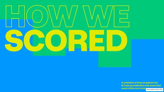
Adding one bold flat shape (the starburst) behind the standard outline-plus-fill divider headline to give a section opener extra punch while keeping the same type rule, so it still reads as part of the family.
Reuse notes
Use to open a more energetic section (here, the project showcase). The starburst is a flat single-color shape, easy to reproduce; swap for any brand shape. Keep the headline rule constant so all dividers stay recognizably related.