Preview image. Unlock full-res
Cream page with a giant pink Collaboration headline overlapping three candid workshop photos and a short serif note about co-designing the brand with young people.
Summary
A process page: the single word "Collaboration" runs huge in pink across the middle, overlapping three candid workshop photos, with a short serif note on co-developing the Salford brand with young people.
Visual description
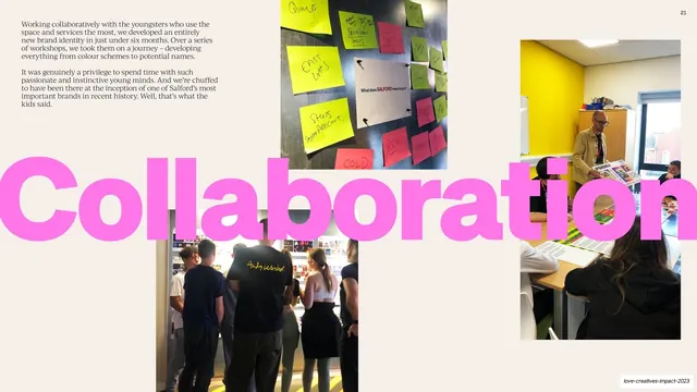
Warm cream background. A short two-paragraph serif note sits top-left about running workshops with the young people who use the space. Dominating the center, an enormous hot-pink grotesque "Collaboration" stretches edge to edge and bleeds off both sides, overlapping the photos. Around it sit three candid documentary photos: a magnetic board covered in colorful sticky notes ("What does SALFORD mean to you?") top-center, a workshop with a man presenting design boards to seated young people at right, and a group gathered at a moodboard wall at lower-center. A "21" page number sits top-right. The giant word ties the photos together.
Key takeaway
The recurring one-word-process-headline move (here "Collaboration") set giant and overlapping candid working photos, which turns behind-the-scenes process documentation into a confident, on-brand statement.
Reuse notes
Use to show process or working method with real, unpolished photos. The giant overlapping word unifies a messy set of candids into one composition. Keep the word short and the photo treatment honest; the rawness is the point.