Preview image. Unlock full-res
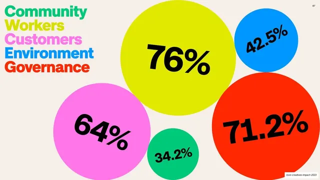
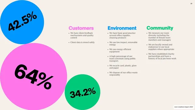
Cream slide with a colored category key at left and five proportional color bubbles holding the B Corp assessment percentages.
Summary
The B Corp assessment scored as a bubble chart: five color circles sized by value, each labeled with its percentage, keyed to a stacked color-coded category list on the left.
Visual description
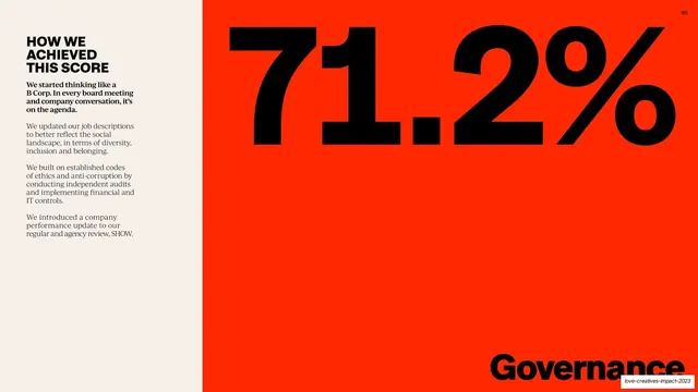
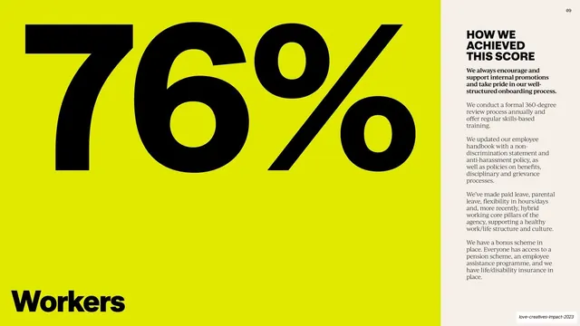
Warm cream background. Top-left, a tight stack of category names sets each in its own brand color: Community (green), Workers (chartreuse), Customers (pink), Environment (blue), Governance (red). To the right float five filled circles in those colors, sized roughly to their scores, each carrying a large black percentage set at a slight tilt: a big chartreuse 76%, a pink 64%, a red 71.2%, a blue 42.5%, and a small green 34.2%. The circles overlap and cluster asymmetrically. A "07" page number sits top-right. Color is the entire encoding, linking each bubble to its keyed category.
Key takeaway
Encoding a small data set as tilted color bubbles sized by value and color-matched to the category key, so a scorecard becomes a playful, instantly scannable graphic instead of a table.
Reuse notes
Good for presenting a handful of category scores or shares where exact precision is secondary to impact. Color-coding the key to the bubbles is what makes it work, so the palette must have enough distinct hues. Tilting the numbers adds energy but can hurt fast reading; keep tilts gentle.
From this deck: Assessment scores by category bubbles
View deck













More like this






Keep what you find
A free account saves references to boards and can send you a weekly email of picks based on what you save.
To see every result, go Pro.