Preview image. Unlock full-res
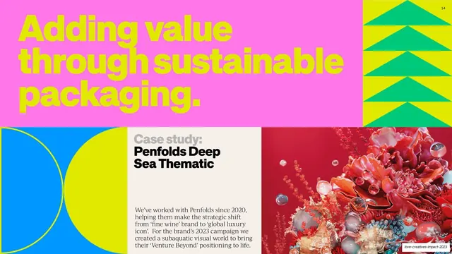
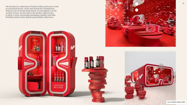
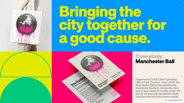
Bento case-study spread with a pink-and-chartreuse headline, green chevron and blue/yellow semicircle blocks, a Case study label panel, and a red 3D coral product render.
Summary
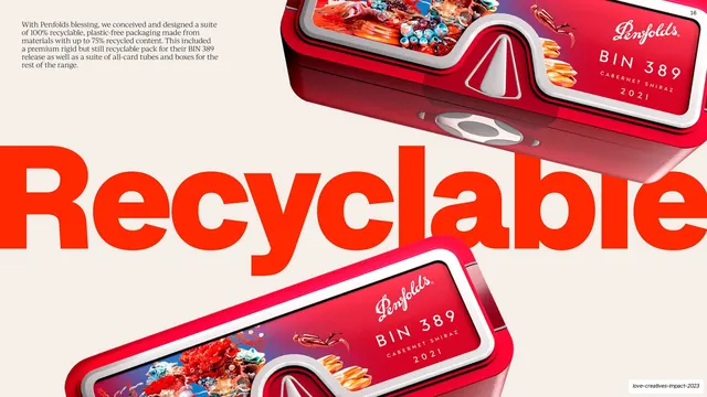
The Penfolds case-study opener as a bento spread: a pink panel with a chartreuse "Adding value through sustainable packaging." headline up top, then a tiled row of geometric blocks, a "Case study: Penfolds Deep Sea Thematic" label, and a red 3D coral-and-bubbles product render.
Visual description
The upper two-thirds is a hot-pink panel carrying a three-line chartreuse grotesque headline "Adding value through sustainable packaging.", with a chartreuse-and-green stacked-chevron block in the top-right corner. The lower third is a bento row: a blue-and-chartreuse block built from two facing semicircles at far left; a cream panel with a gray "Case study:" kicker and bold black "Penfolds Deep Sea Thematic" title plus a serif intro about the brand's Venture Beyond positioning; and a glossy red 3D render of an underwater coral, bubbles, and sea life at the right. This is the recurring case-study intro template: color headline, geometric blocks, label panel, hero image.
Key takeaway
The bento case-study opener: lock a headline panel, a couple of flat geometric blocks, a labeled "Case study:" text cell, and one strong hero image into a fixed grid, then reskin it per project. It makes a varied portfolio feel systematic.
Reuse notes
The core case-study template for the deck and a clean pattern for any portfolio or impact report showing client work. Needs a genuinely good hero image per case (here a polished 3D render). Keep the "Case study:" kicker and title styling identical across cases so the series reads as one system.
From this deck: Penfolds sustainable packaging case study intro
View deck




More like this



Keep what you find
A free account saves references to boards and can send you a weekly email of picks based on what you save.
To see every result, go Pro.