Preview image. Unlock full-res
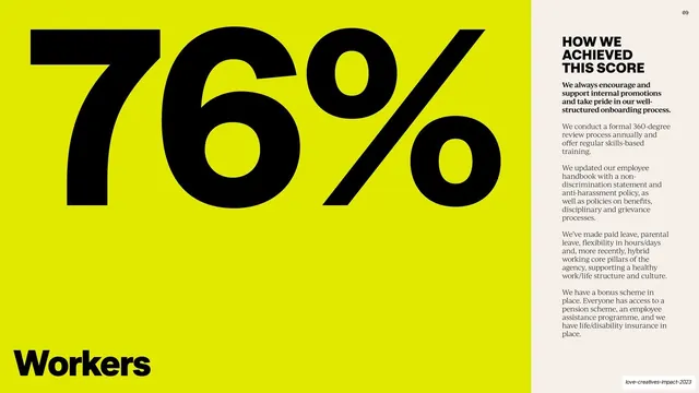
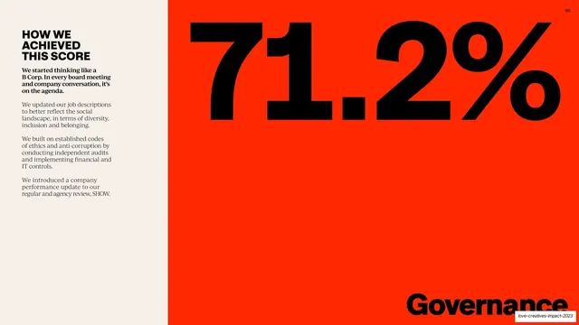
Split spread with a flooded chartreuse panel holding a giant black 76% and the word Workers, beside a serif explainer column on cream.
Summary
The Workers category spread, mirroring the Governance one with colors swapped: a giant black 76% on a flooded chartreuse panel at left, the word "Workers" bottom-left, and a serif explainer column on cream at right.
Visual description
The left two-thirds is a flooded chartreuse-yellow panel carrying an enormous black grotesque "76%" across the top and the category label "Workers" in black at the bottom-left edge. The right third is warm cream with the bold serif sub-head "HOW WE ACHIEVED THIS SCORE" and a longer set of serif paragraphs on promotions, 360 reviews, handbook updates, paid and parental leave, hybrid working, and benefits. A "09" page number sits top-right. Same vertical-split system as the previous spread, with the color panel flipped to the left and recolored chartreuse.
Key takeaway
The consistency move: the same category-spread template reused with the color and side mirrored per category, so the reader learns the layout once and the changing color does the wayfinding.
Reuse notes
Slot this in alongside the other category spreads; alternating which side the color panel sits on keeps a run of similar slides from feeling static. The right column here carries more copy than the Governance spread, showing the template flexes to longer text. Match the panel color to the category's color key.
From this deck: Workers 76% stat spread
View deck


















More like this








Keep what you find
A free account saves references to boards and can send you a weekly email of picks based on what you save.
To see every result, go Pro.