Preview image. Unlock full-res
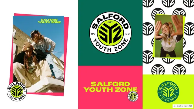
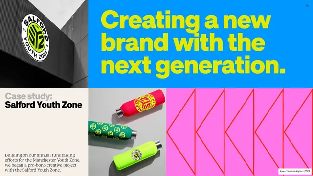
Bento brand-system board for Salford Youth Zone tiling the badge logo, a pattern of marks, lifestyle photos, and green/pink/chartreuse wordmark blocks.
Summary
The Salford Youth Zone identity shown as a bento board: the circular badge logo, a black-and-white pattern of the mark, two streetwear lifestyle photos, and green, pink, and chartreuse wordmark blocks tiled together.
Visual description
A bento grid of brand assets. A large cell shows the full circular "SALFORD YOUTH ZONE EST. 2023" badge, a chartreuse monogram on a green disc with a black ring, on dark green. Adjacent cells: a hot-pink panel with the chartreuse stacked "SALFORD YOUTH ZONE" wordmark, a chartreuse panel repeating the badge, a white field patterned with the black monogram repeated, and two lifestyle photos of young people in branded streetwear, one a portrait pushing hands toward the camera, one a styled rooftop shot with the wordmark. The cells lock into a tight grid with no gaps. A "22" page number sits top-right. This is the logo-reveal / brand-system slide for the case.
Key takeaway
Presenting a finished identity as a tight bento of its parts, logo, monogram pattern, wordmark in each brand color, and lifestyle imagery, so one slide communicates the whole system at a glance.
Reuse notes
A strong brand-system or logo-reveal slide for any identity case study. The gapless grid makes the parts feel like a cohesive kit. Reuse per project: show the mark, a pattern, the wordmark across colors, and applied imagery. Needs real lifestyle shots to sell the application.
From this deck: Salford Youth Zone brand system
View deck














More like this








Keep what you find
A free account saves references to boards and can send you a weekly email of picks based on what you save.
To see every result, go Pro.