Preview image. Unlock full-res
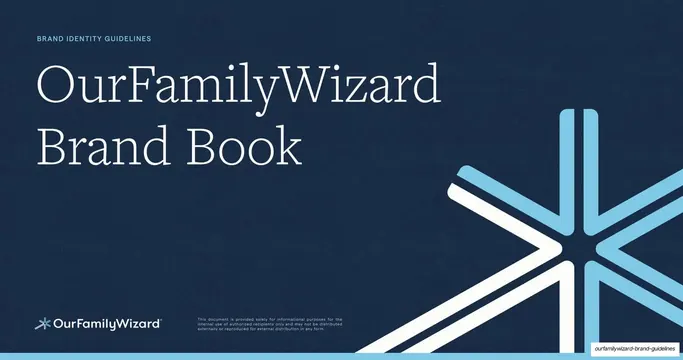
An 86-slide co-parenting-platform brand book with a warm serif voice, alternating cream and pale-blue slides, a navy-and-sky palette, and a six-point spark symbol used as a running mark.
Summary
The complete brand book for OurFamilyWizard, a co-parenting platform, running 86 slides. Its personality comes from a warm high-contrast serif paired with a humanist sans, slides that alternate between cream and pale-blue grounds, a navy-and-sky color system, and a six-point "spark" symbol that recurs as a quiet running mark.
Visual description
Slides are 16:9. The cover is deep navy (#1E3A5F) with a large white-and-sky six-point spark mark anchored bottom-right and a serif title in cream. Interior slides drop onto two alternating grounds: a warm cream (#FAF6EC) and a pale powder blue (#DCEAF4). Almost every interior slide carries the same chrome: a thin "Brand Guidelines" label set vertically up the left edge, a small circular menu or close icon top-left, and the small spark mark bottom-left. Section labels are tiny teal all-caps (VOICE, TONE, OUR MISSION) sitting above an oversized serif headline, with key words italicized for emphasis. Body copy is a calm grey-navy sans in narrow columns. Recurring layouts repeat across the deck: split text-left / arc-image-right slides where a large soft circle or arc holds a photo or a tinted field; floating UI-card collages on a tinted ground (the mission slide); circular cropped-photo collages (the vision slide); a four-card values grid with circular sky-blue icons; section-divider slides pairing one huge serif word with a numbered, hairline-ruled contents list; rule-by-rule and tone card stacks; large centered serif quote example cards inside hairline boxes; and a two-column do / do-not comparison with teal "OurFamilyWizard" and red "Not OurFamilyWizard" labels. The whole system stays soft, rounded, and low-contrast.
Key takeaway
The alternating cream / pale-blue grounds that pace a very long guidelines deck without any heavy decoration. The discipline of one oversized serif headline with one italicized key word per slide against tiny teal utility labels. The consistent edge chrome (vertical sidebar label, corner icon, recurring brand mark) that makes 86 slides feel like one continuous document. And the soft-circle / arc photo treatment that warms an otherwise clinical brand book.
Reuse notes
A strong reference for brand guideline books, voice-and-tone systems, and any long internal document for a healthcare, legal-adjacent, or consumer SaaS product that needs to feel trustworthy and human rather than corporate. The section-divider pattern (giant serif word plus numbered index) and the big centered quote cards are directly reusable for editorial or content-heavy decks. Leans on a quality high-contrast serif and warm photography to carry the tone; swap in a generic typeface and it loses most of its character.
From this deck: OurFamilyWizard Brand Guidelines Book
View deck







































































More like this







Keep what you find
A free account saves references to boards and can send you a weekly email of picks based on what you save.
To see every result, go Pro.