Preview image. Unlock full-res
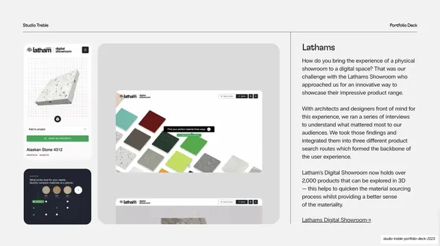
Light-grey case-study split for Lathams with a stacked product-UI image column on the left and a brand name, narrative and arrow link on the right.
Summary
The second case study, for the Lathams digital showroom: the same split template, here showing stacked product-UI screens on the left and a four-paragraph narrative with an arrow link on the right.
Visual description
Light-grey (#F1F1F1) background, standard dark header, vertical hairline near the right third. The left side stacks product-interface visuals: a tall portrait app screen showing a material sample ("Alaskan Stone 4312") with an "Add to project" control, a large rounded grey panel showing a material-grid showroom screen ("Find your perfect material three ways"), a partial lower screenshot, and a small dark compare-materials UI card. The right column reads "Lathams" as a heading, four short paragraphs about bringing a physical showroom online, and an underlined "Lathams Digital Showroom" link with a right arrow.
Key takeaway
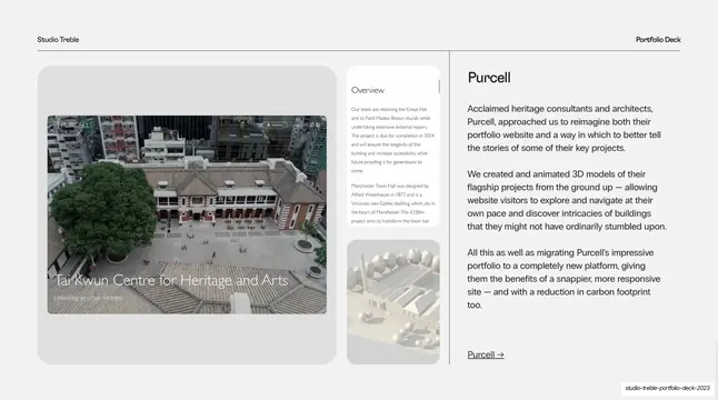
The image stack handling more, smaller UI screens than the previous case study while keeping the identical right-hand narrative structure. It shows the template flexes from architecture photography to dense product UI without changing its grammar. The rounded grey hero panel again unifies multiple screen captures.
Reuse notes
Use as a sibling to the Purcell slide to demonstrate range across project types within one consistent layout. Good when a project is screen-heavy: the stack can hold a hero screen plus several supporting captures. Keep the four-paragraph maximum and the arrow link in the same spot as the other case studies.
From this deck: Case study - Lathams
View deck


More like this


Keep what you find
A free account saves references to boards and can send you a weekly email of picks based on what you save.
To see every result, go Pro.