Preview image. Unlock full-res
A 32-slide editorial trend report by Future Snoops that color-codes three retail themes (powder blue, terracotta, mint) and threads a recurring wavy-line "Key Drivers" map across full-bleed photography.
Summary
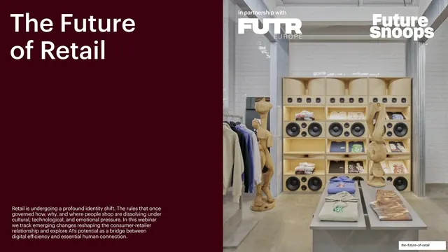
A 32-slide trend-intelligence report from futures agency Future Snoops (in partnership with FUTR Europe) that maps the transformation of retail across three named themes. Its personality comes from two moves: a per-theme background color system (powder blue, terracotta, mint) that signals which section you are in, and a recurring black-and-white photography grammar where oversized grotesque headlines and small stat callouts sit on or beside editorial images.
Visual description
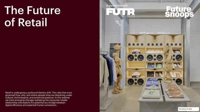
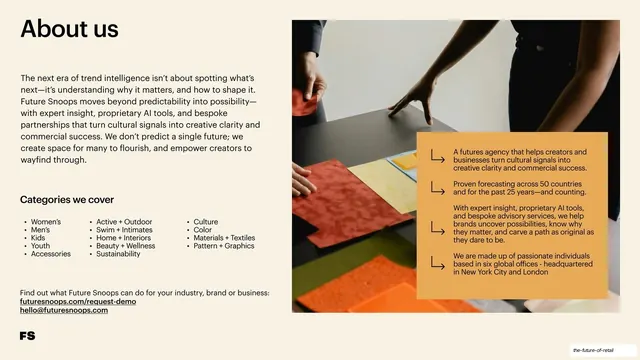
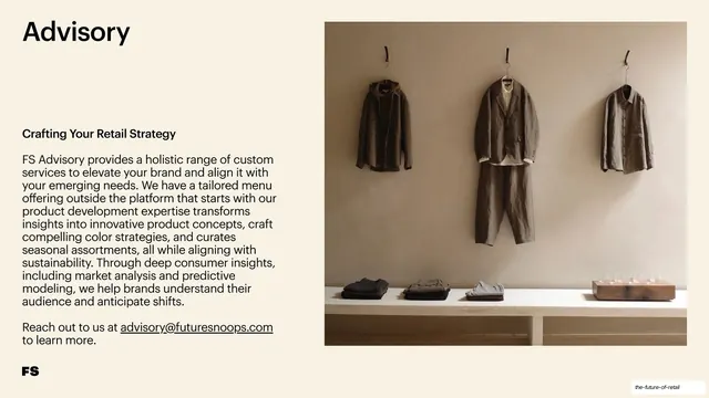
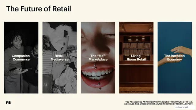
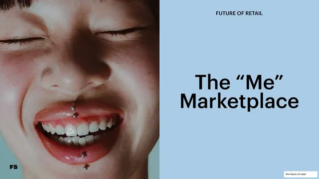
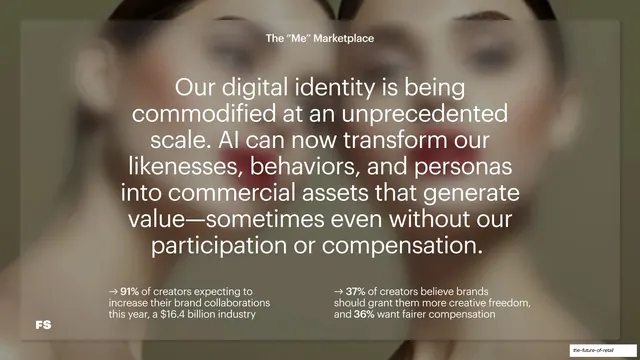
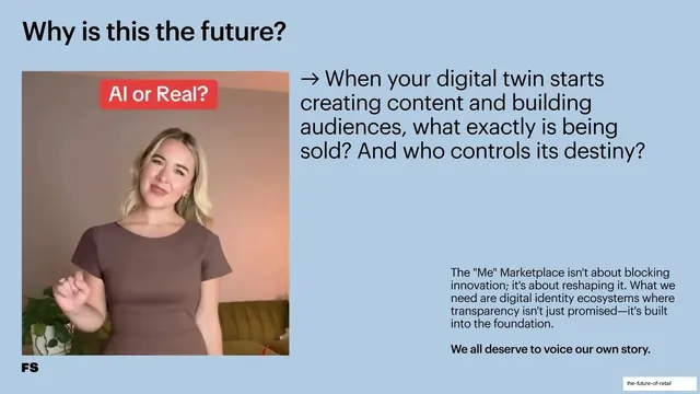
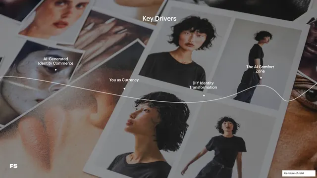
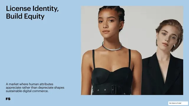
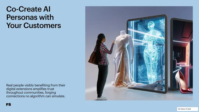
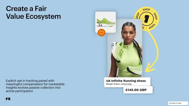
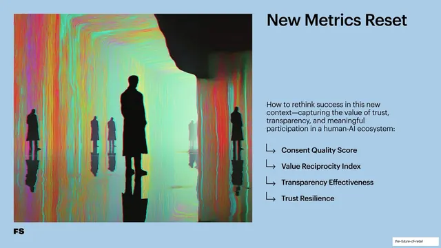
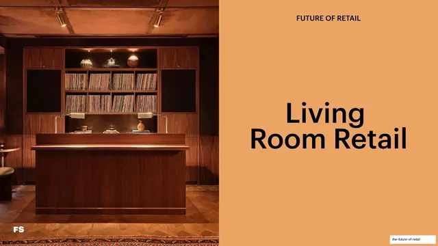
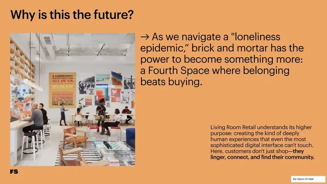
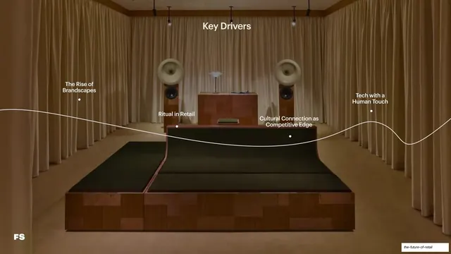
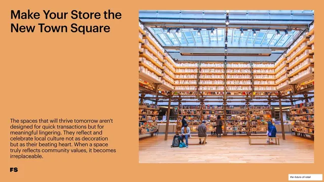
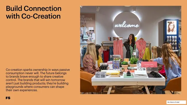
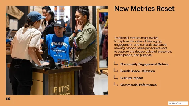
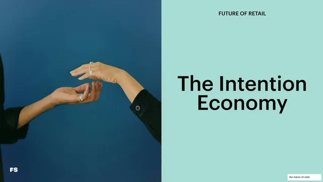
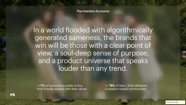
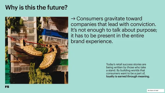
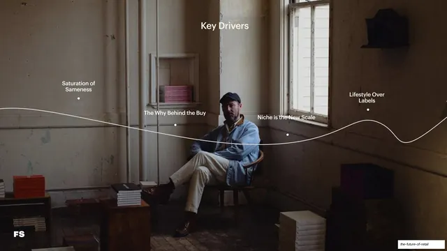
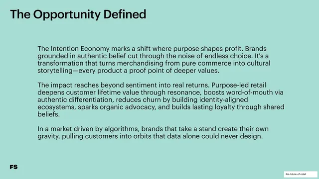
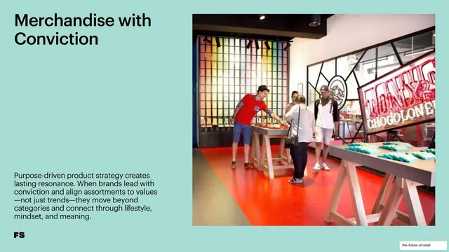
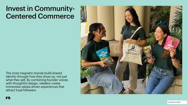
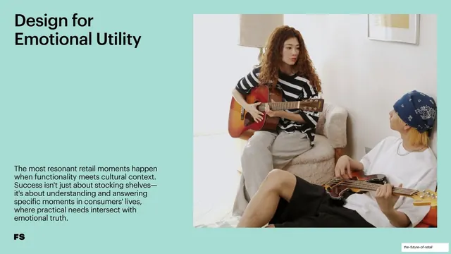
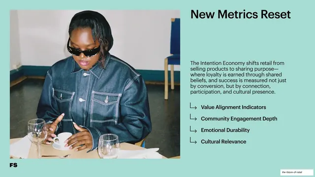
Slides run 16:9. The deck opens on a deep maroon cover and closes on a near-black contact slide, but the body is organized into three color-coded chapters: "The 'Me' Marketplace" in powder blue (#B6D2E6), "Living Room Retail" in terracotta orange (#E5A668), and "The Intention Economy" in mint green (#A9D9C9). Type is a single bold grotesque sans (Helvetica-like) used very large and left-aligned for headlines, with a smaller regular weight for body copy; headlines are title-case and many are the recurring question "Why is this the future?" or label "The Opportunity Defined". A small black "FS" monogram anchors the bottom-left of nearly every content slide. The deck reuses a tight set of slide templates: (1) a five-up overview grid of tall photo cards on cream; (2) section-divider slides that split a full-bleed photo against a solid color panel carrying a big two-line title and a small all-caps "FUTURE OF RETAIL" eyebrow; (3) glassmorphic quote slides where a large centered statement and two arrow-bulleted stats sit on a frosted panel over a blurred photo; (4) "Key Drivers" slides that overlay a thin white wavy line with labeled dot-nodes across a full-bleed photograph; (5) split image-right / text-left slides; (6) text-only "The Opportunity Defined" slides; and (7) "New Metrics Reset" slides pairing a photo with a right-hand arrow-list of four metric names. Photography is mostly desaturated and editorial (portraits, store interiors, still lifes), with occasional AI-rendered or product-card imagery.
Key takeaway
The per-theme background color as a wayfinding device: each chapter owns a color, so a long report stays navigable without page numbers or a visible agenda. The recurring wavy-line node map is a memorable, ownable way to lay out a set of "drivers" over a single image instead of in a boring list. And the frosted-glass quote panel over blurred photography is a clean, repeatable pattern for the punchy statement slides.
Reuse notes
A strong reference for trend reports, foresight decks, and editorial marketing presentations that need to feel premium without heavy graphics. The color-coded-section system is directly reusable for any multi-chapter deck. Leans heavily on a large library of consistent, well-art-directed photography, so it needs genuinely good images to hold up. The wavy-line driver map is distinctive but fiddly to lay out by hand; budget time for it.