Preview image. Unlock full-res
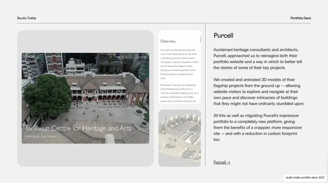
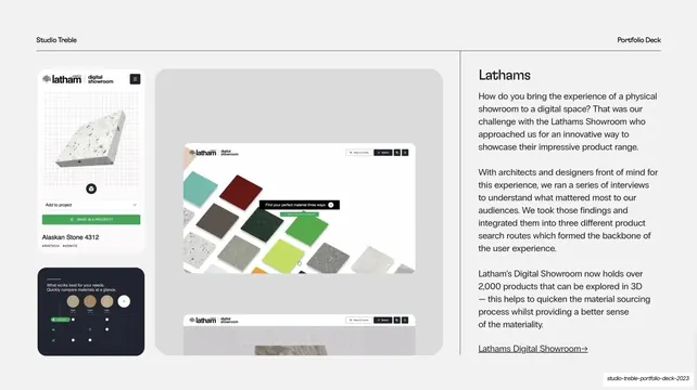
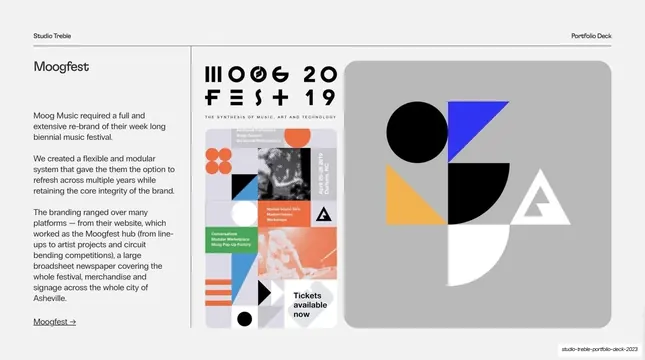
Light-grey case-study split for Purcell with a stacked project-image column on the left and a brand name, narrative and arrow link on the right.
Summary
The first case study, for heritage architects Purcell: a left column of stacked project visuals and a right column with the client name, a three-paragraph narrative and an underlined arrow link.
Visual description
Light-grey (#F1F1F1) background with the standard dark hairline header. A thin vertical rule near the right third separates image from text. The left two-thirds hold an image stack: a large rounded grey panel containing an aerial photo of a courtyard building labelled "Tai Kwun Centre for Heritage and Arts", plus two smaller stacked thumbnails to its right (a white website "Overview" screen and a pale 3D building model). The right column leads with "Purcell" as a large heading, then three short paragraphs of dark body copy describing the project, closing with an underlined "Purcell" link ending in a right arrow.
Key takeaway
The case-study split template: image stack left (one hero panel plus small supporting thumbnails), narrative right (client name, three tight paragraphs, arrow link out). It presents a project as a tidy story unit and reads identically across every case study in the deck. The rounded grey panel acts as a neutral frame for mismatched screenshots and photos.
Reuse notes
The core reusable layout of any portfolio or sales deck. Reach for it whenever you need to present projects as a consistent series. Needs at least one strong hero visual per project; the small thumbnails can carry secondary context (a screen, a model, a detail). Keep the heading, paragraph count and arrow-link position fixed so every case study rhymes.
From this deck: Case study - Purcell
View deck



More like this






Keep what you find
A free account saves references to boards and can send you a weekly email of picks based on what you save.
To see every result, go Pro.