Preview image. Unlock full-res
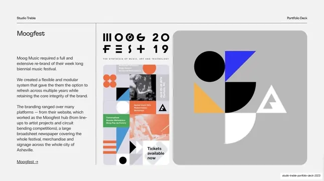
Light-grey case-study split for Moogfest, reversed so the narrative sits left and a branding poster plus geometric shape panel sit right.
Summary
The third case study, for the Moogfest music-festival rebrand: the split template flipped so the narrative runs on the left and the visuals (a busy modular poster and a geometric shapes panel) sit on the right.
Visual description
Light-grey (#F1F1F1) background, standard dark header. A vertical hairline near the left third puts the text column on the left: "Moogfest" heading over three short paragraphs about a flexible, modular festival rebrand, closing with an underlined "Moogfest" arrow link. The right two-thirds hold two visuals side by side: a colorful "MOOGFEST 2019" poster built from a modular grid of triangles, dots, halftone photos and colored cells, and a rounded grey panel with large flat geometric shapes (a black circle and half-circle, blue and yellow triangles, a white outlined triangle) demonstrating the brand system.
Key takeaway
Mirroring the case-study layout (text left, image right) for variety while keeping every other rule intact, so the series still reads as one system. Putting the brand system's geometric kit on its own panel next to a finished poster shows both the toolkit and the applied result in one frame.
Reuse notes
Use the flipped orientation sparingly to break the rhythm of a long case-study run without inventing a new layout. Ideal for branding or identity projects where you want to show both the modular system and a hero application. Keep the heading, paragraph length and arrow link identical to the un-flipped case studies.
From this deck: Case study - Moogfest
View deck
More like this
Keep what you find
A free account saves references to boards and can send you a weekly email of picks based on what you save.
To see every result, go Pro.