Preview image. Unlock full-res
A 27-slide art-market research report built on a strict Swiss grid that turns survey statistics into full-bleed blocks of pastel primary color, each carrying a single oversized percentage.
Summary
Artsy's fifth annual gallery-market research report, 27 slides on a 16:9 canvas. Its identity comes from one move repeated at scale: survey numbers are rendered as full-bleed rectangles of soft primary color, each holding a single huge percentage, so the data itself becomes the layout.
Visual description
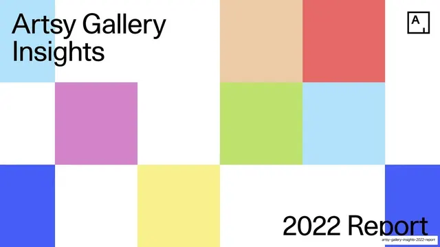
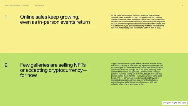
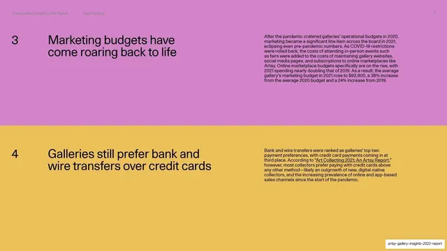
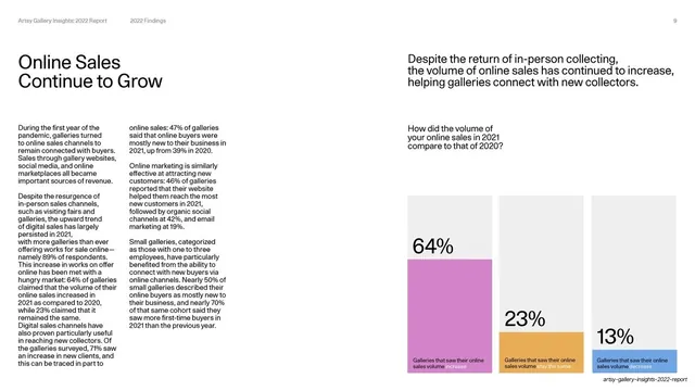
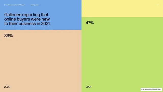
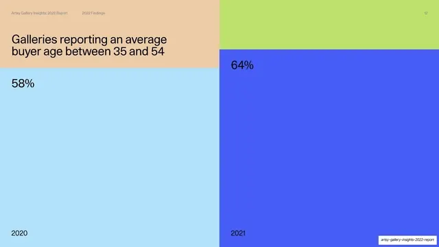
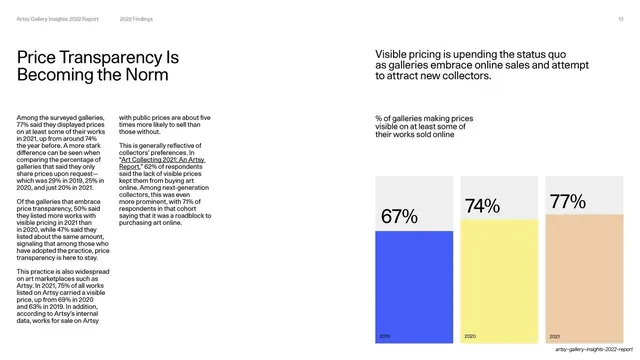
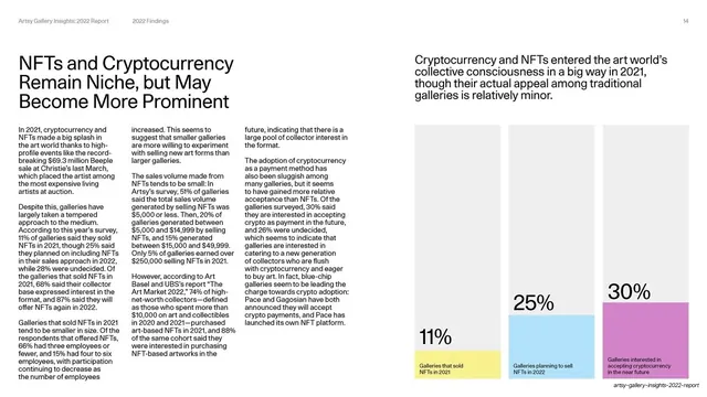
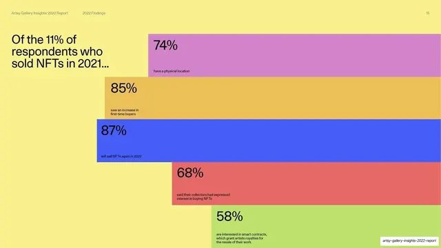
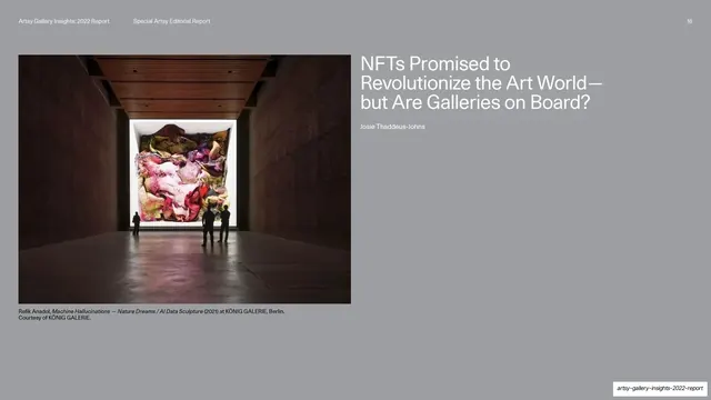
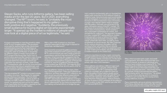
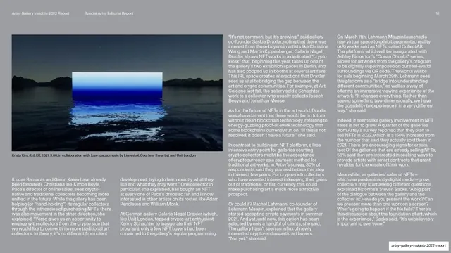
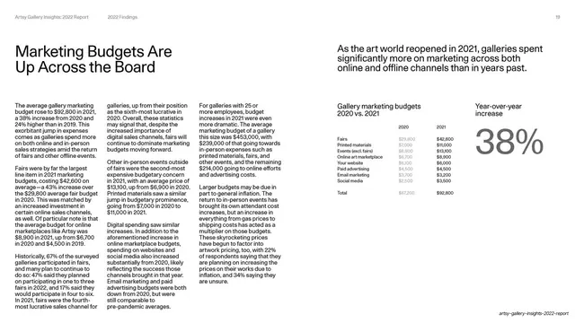
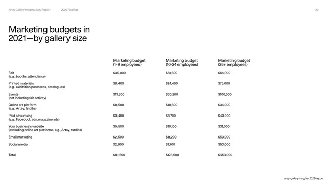
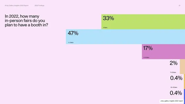
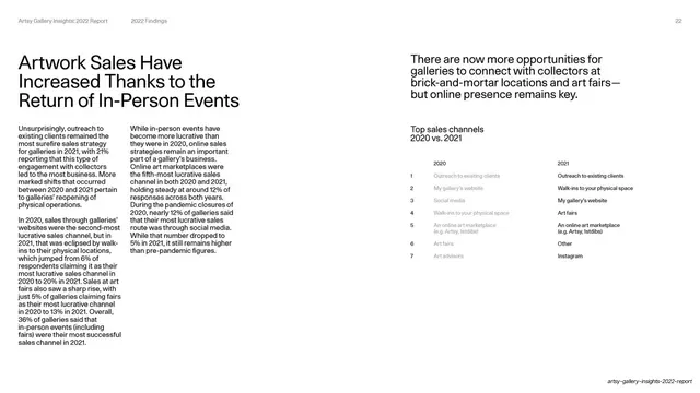
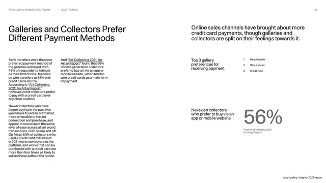
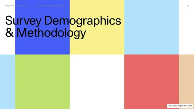
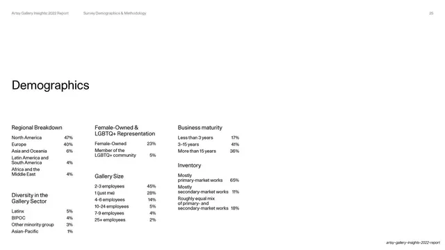
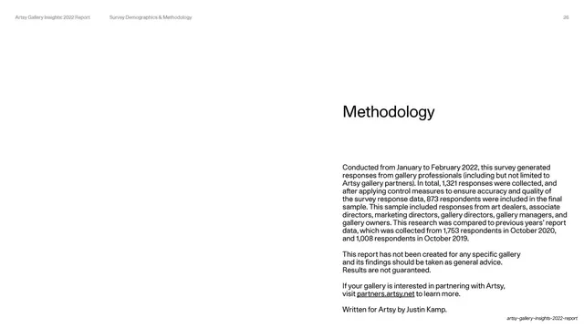
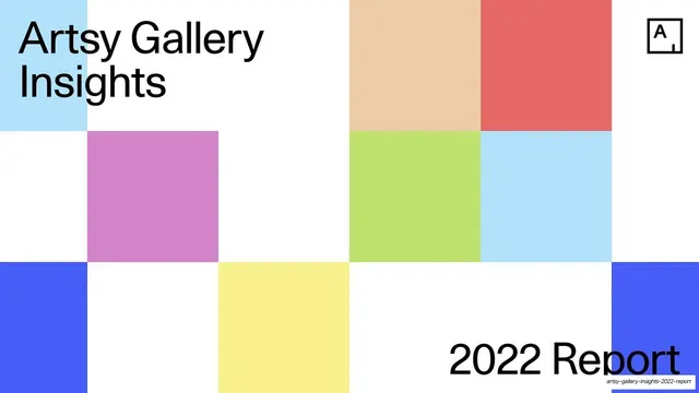
Everything sits on a strict modular grid. The base is white with near-black type; the accent system is a fixed set of saturated pastels (cornflower blue, lime green, orchid pink, butter yellow, coral red, sky blue, peach, marigold). Headlines are a large neutral grotesque sans (Helvetica-like), set sentence case, ranging from oversized on dividers to medium on content slides; body copy is small and packed into tight justified columns. A consistent utility header runs along the top of content slides ("Artsy Gallery Insights: 2022 Report" left, the current section label center, page number right) with no rule. The deck cycles through a few repeated layouts: a Mondrian-style cover and section divider where pastel squares are scattered across a white grid with one oversized headline and a boxed "A" logo; numbered Key Findings slides where a full-bleed color field is split into two horizontal bands, each pairing a big headline with a body paragraph and an index numeral; findings deep-dives with a headline and multi-column body on the left and a takeaway line plus a block-bar chart on the right, where each bar is a solid pastel rectangle labeled with a giant percentage; pure stat slides where the entire frame is two-to-four colored rectangles, each carrying a percentage and a year or category; clean white data tables; and three gray-background editorial spreads with documentary art photography, white text, and a magazine multi-column grid. It closes on the same scattered-square grid as the cover.
Key takeaway
Turning the chart into the page: instead of drawing axes, each data point becomes a full-height block of color sized and labeled with its percentage, so a single slide reads instantly and looks like art. The fixed pastel-primary palette gives 27 slides visual variety while staying one coherent system, and the strict grid plus a neutral grotesque keep a dense data report calm and premium. The Mondrian scatter is a memorable, ownable cover-and-divider device.
Reuse notes
A strong reference for any annual report, market study, state-of-industry, or data-storytelling deck that needs to feel editorial rather than corporate. The color-block stat treatment is directly reusable wherever you have a few headline numbers to dramatize. Works best with a disciplined grid and a single neutral sans; the pastel palette reads creative and arts-adjacent, so warm it or swap hues for a more corporate context. The editorial photo spreads need genuinely good imagery to carry them.