Preview image. Unlock full-res
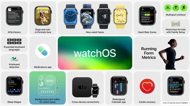
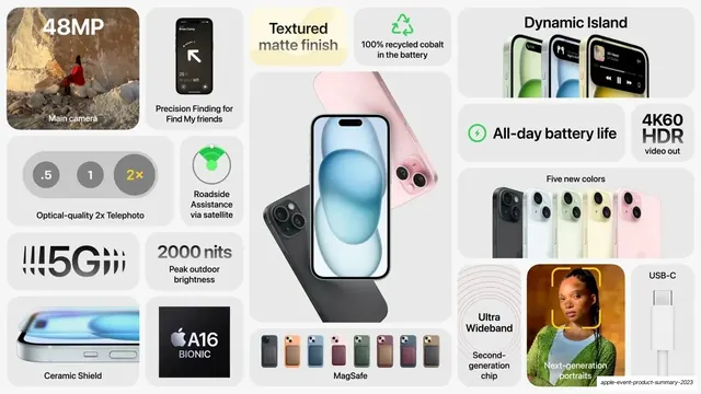
A 7-slide bento-grid recap of Apple's WWDC 2022 keynote, each slide packing dozens of features into rounded cards on light gray with one big platform-name tile per slide.
Summary
A 7-slide product-highlights deck reprising Apple's WWDC 2022 keynote, built entirely on the bento grid: every slide is one dense mosaic of rounded-rectangle cards on a light gray field, anchored by a single oversized platform or product name. It is a clinic in summarizing a huge feature set on one screen without feeling cluttered.
Visual description
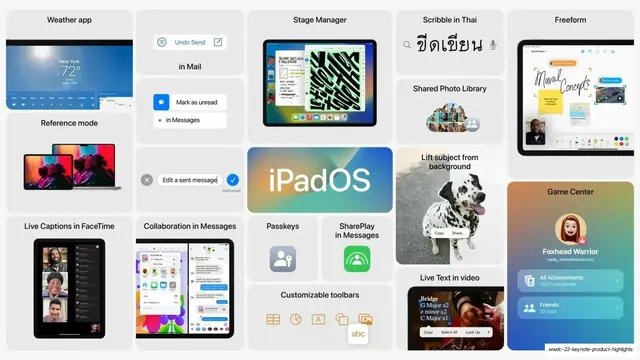
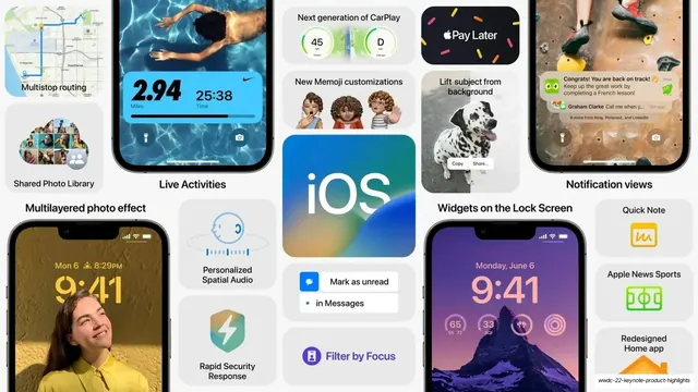
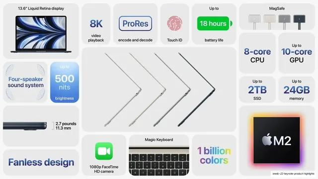
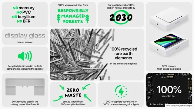
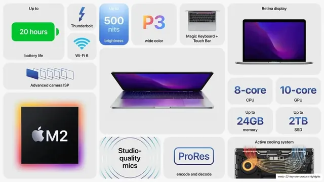
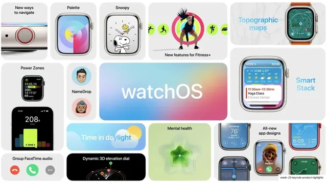
Slides run 16:9 on a near-white to light-gray background. Each slide is a packed bento grid of soft-cornered tiles in two shades of gray, sized irregularly so small feature cards and large hero cards interlock with consistent gutters. One tile per slide carries the headline as oversized type: a glossy spectrum-gradient "watchOS" / "iPadOS" / "iOS" wordmark on the OS slides, and a large dark chip render labeled "M2" on the silicon and Mac slides. Each small card pairs a short label (set in a clean sans, mostly black, regular weight) with a single supporting element: a product screenshot, an app icon, a device render, a green or orange spec number, or a line-art glyph. Color is mostly restrained grayscale chrome with selective punches: Apple's system green for battery, sustainability and health cues, warm orange-to-red gradients for M2 performance specs, and the full-spectrum gradient reserved for the OS wordmarks and "1 billion colors". Recurring grammar across all seven slides: a tile-density layout with no section headers or rules, real product UI captured at small scale inside cards, big numerals (24GB, 15.8 trillion, 20 hours, 100GB/s) as the visual hook for spec tiles, and device-render rows (watch faces lined up, laptops in profile) spanning multiple columns. The whole deck reads as a single visual system applied seven times rather than seven distinct layouts.
Key takeaway
The core move: a bento grid that turns an overwhelming feature list into one scannable mosaic, mixing tile sizes so importance reads through scale alone, with no headers needed. The restraint of an almost fully grayscale palette that lets a few saturated accents (green for health/eco, orange for performance, spectrum gradient for the hero wordmark) carry all the meaning. And the discipline of one rule per card: each tile shows exactly one label plus one supporting visual, so density never becomes noise.
Reuse notes
A strong reference for any "everything new" recap, feature roundup, changelog, or product-highlights slide where you must fit a large number of items on one screen and still let viewers scan. The bento system scales to a whole deck if you keep the background, card radius, gutters, and accent logic fixed and only change the contents per slide. Best with genuinely good small product screenshots and clean device renders, which carry most of the visual weight; weak if the supporting imagery is low quality. The all-caps spec numerals and spectrum wordmark are very Apple, so reskin the type and accent gradient to your own brand.
From this deck: WWDC 22 Keynote Product Highlights
View deck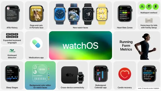
More like this






Keep what you find
A free account saves references to boards and can send you a weekly email of picks based on what you save.
To see every result, go Pro.