Preview image. Unlock full-res
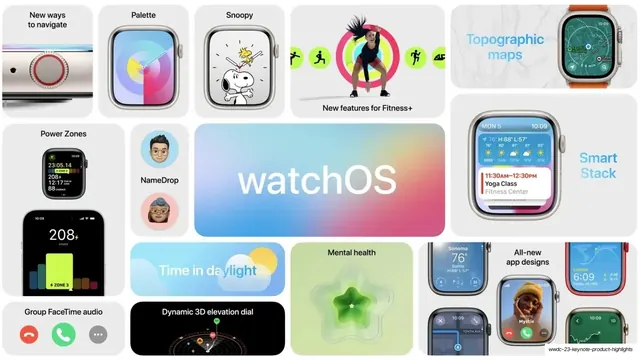
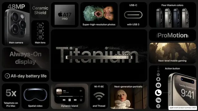
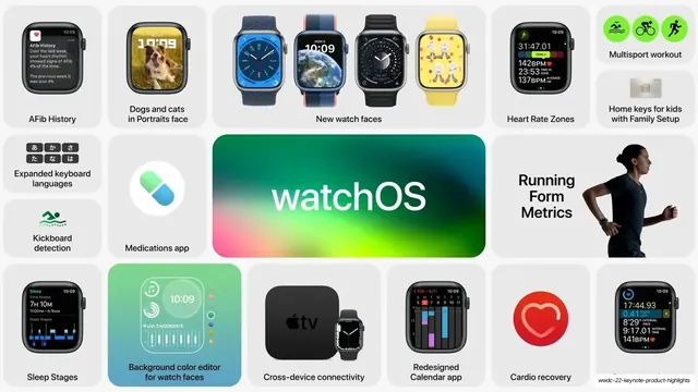
An 8-slide Apple product-recap deck where every slide is a white bento mosaic of rounded tiles around one oversized platform or chip name, mixing product renders, UI shots, icons, and gradient stat callouts.
Summary
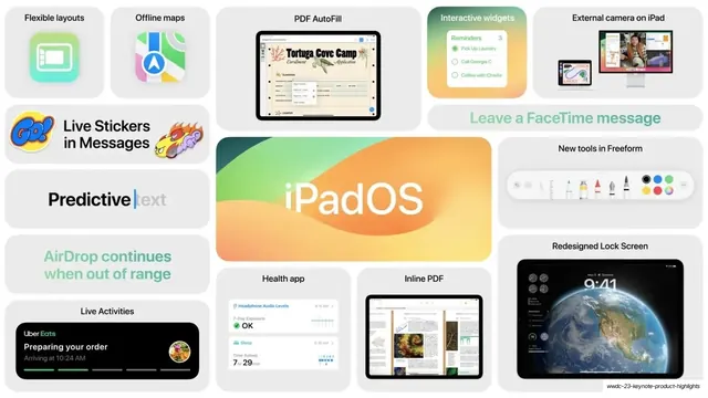
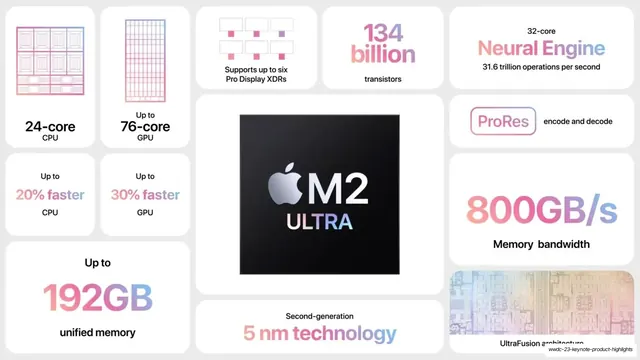
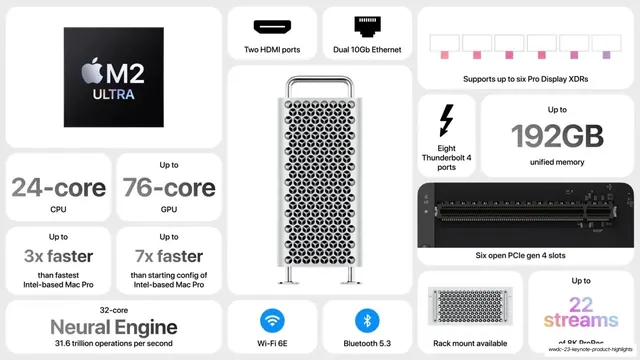
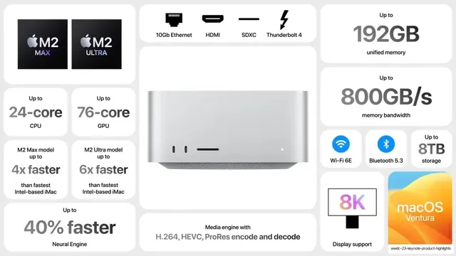
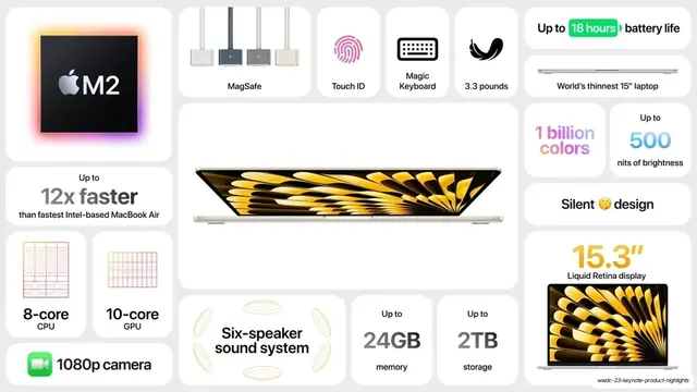
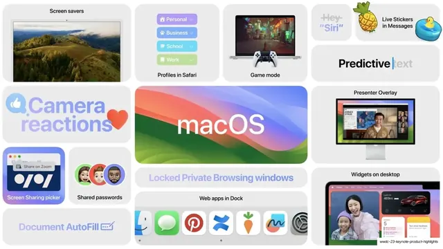
An 8-slide recap of Apple's WWDC 2023 announcements, lifted straight from the keynote's summary moments. Every slide is the same idea: a dense bento mosaic of white rounded-corner tiles, varied in size, packed around one giant platform or chip name (watchOS, iPadOS, M2 Ultra, macOS, Audio & Home). It is the cleanest possible reference for the Apple-style "feature wall" bento layout.
Visual description
All slides are 16:9 on a flat near-white background (#F2F2F4) tiled with white rounded-corner cards in an irregular bento grid, each card a self-contained micro-feature. Card contents rotate through three modes: photoreal product renders on white (Apple Watch, Mac Pro tower, Mac Studio, MacBook Air, HomePod), live UI screenshots (watch faces, iPad lock screen, Safari, FaceTime, CarPlay), and typographic stat tiles where a large number or short phrase is rendered in a pink-to-purple gradient ("134 billion", "800GB/s", "192GB", "1 billion colors") next to a small dark-gray label. Each slide centers on one oversized name tile: the OS slides use a large lowercase wordmark over that OS's signature wavy gradient wallpaper (watchOS pastel rainbow, iPadOS green-orange, macOS Sonoma blue-green-pink, Audio & Home solid orange), while the silicon slides use a black square chip tile with the silver Apple logo and "M2 ULTRA"/"M2 MAX" lockup. Type throughout is SF Pro: heavy oversized weights for headline numbers and names, light-to-regular for labels, set in near-black with selective gradient fills. Small product icons, emoji, glyphs, and feature names (Snoopy, NameDrop, Touch ID, MagSafe, Live Stickers) fill the smaller tiles. Color comes almost entirely from the product imagery and gradient numerals against the otherwise white-and-gray field.
Key takeaway
The whole bento "feature wall" system: one slide can hold a dozen features without feeling busy because every feature is quarantined in its own equal-radius white tile and the eye is anchored by a single oversized center name. The trick of varying tile size to set hierarchy (hero render large, stat tiles small) while keeping corner radius, padding, and background identical. And the gradient-on-white numeral treatment that makes a spec number read as a graphic, not text.
Reuse notes
The default reference for a product-recap, feature-roundup, or "what's new" slide where you need to summarize many features at once, especially for hardware, consumer apps, or developer platforms. Pairs naturally with light-mode, gradient-accented brand systems. It is content-hungry: the layout only works if you have a real mix of clean product renders, UI shots, and punchy stats to fill the tiles; sparse content leaves dead white cards. The wavy-gradient name tiles are Apple's OS wallpapers; substitute your own brand gradient.
From this deck: WWDC 23 Keynote Product Highlights
View deck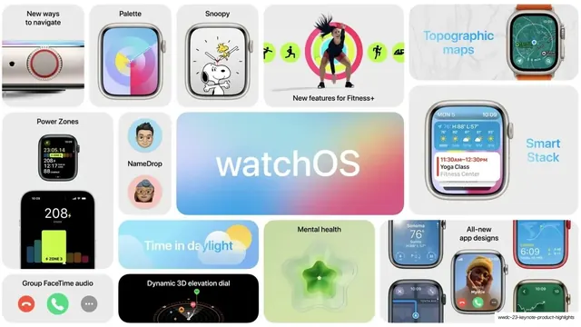

More like this






Keep what you find
A free account saves references to boards and can send you a weekly email of picks based on what you save.
To see every result, go Pro.