Preview image. Unlock full-res
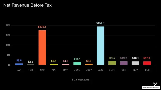
A monthly net-revenue-before-tax bar chart on black, twelve color-coded bars with value labels, spiking in March and August.
Summary
A financials chart: monthly net revenue before tax as twelve color-coded bars on black, each labeled with its value, spiking sharply in March and August.
Visual description
Black background. Top-left headline "Net Revenue Before Tax" in white sans-serif. A vertical bar chart spans the slide with a faint white y-axis scaled $0 to $200 and twelve bars labeled JAN through DEC. Each bar is a different accent color with its dollar value printed above in the matching color, most small ($2.5 to $20.7) except two tall outliers: an orange MAR at $175.1 and a pale-blue AUG at $194.1. A centered monospace caption "$ IN MILLIONS" sits below the month axis.
Key takeaway
Coloring each bar individually and printing the value above it in the same color, so the chart is readable without gridline-counting and the two spike months pop immediately. The faint axis keeps focus on the bars and labels.
Reuse notes
A reusable monthly-performance or revenue-over-time slide. Per-bar color is decorative rather than categorical here; for true categories keep color meaningful. Direct value labels suit a sales or finance audience that wants exact figures. Matches the deck's pie and table palette for a consistent data section.
From this deck: Net revenue before tax bar chart
View deck









More like this





Keep what you find
A free account saves references to boards and can send you a weekly email of picks based on what you save.
To see every result, go Pro.