Preview image. Unlock full-res
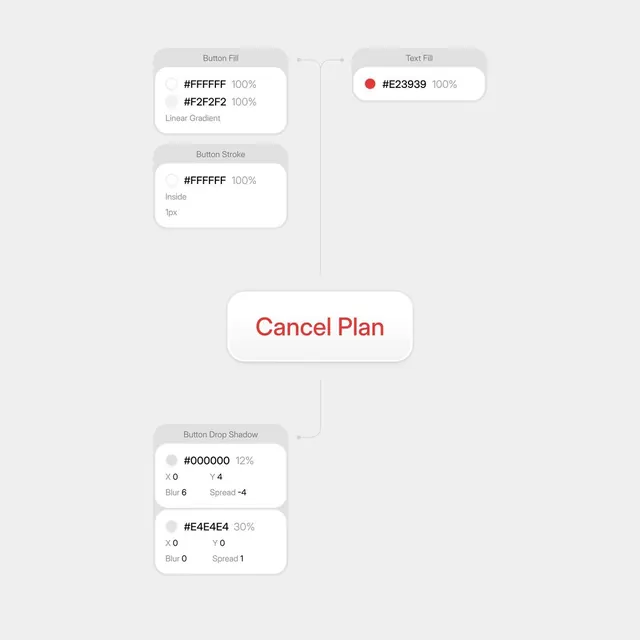
Design tool interface showing layered controls for button fill, stroke, and drop shadow properties with hex color values and numeric parameters.
Summary
A design-tool inspector panel with stacked control cards for customizing button visual properties: fill color (with linear gradient option), stroke color, and drop shadow parameters.
Visual description
Light gray background with three rounded-corner cards arranged vertically on the left, connected to a centered button preview via connection lines. The "Button Fill" card shows two color swatches (#FFFFFF and #F2F2F2 for a linear gradient), each with 100% opacity. The "Button Stroke" card displays a white color swatch (#FFFFFF) with Inside placement and 1px thickness. The "Button Drop Shadow" card shows two separate shadow layers: one black (#000000) at 12% opacity with blur 6 and spread -4, and a light gray (#E4E4E4) at 30% opacity with no blur/spread. On the right, a "Text Fill" card with a red swatch (#E23939). Centered is a preview button labeled "Cancel Plan" in a white rounded container with red text.
Key takeaway
The split-panel pattern separating live preview from control cards; the stacked-card hierarchy for organizing multiple related properties; the use of connection lines to link controls to the element being edited, making relationships explicit without hierarchy.
Reuse notes
Ideal for design-tool UI or any inspector/properties panel. The card stacking scales well for adding more controls. Works best for technical audiences who expect granular numeric inputs and hex color values.