Preview image. Unlock full-res
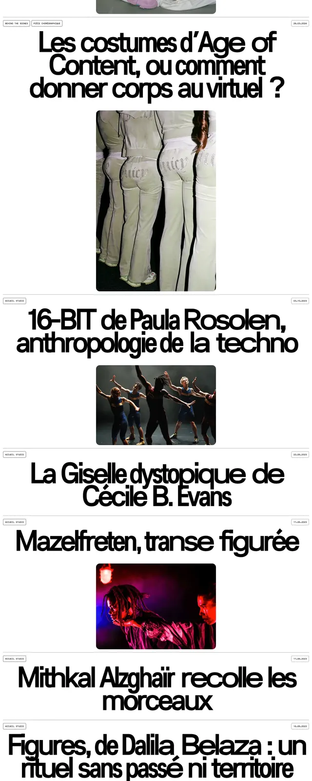
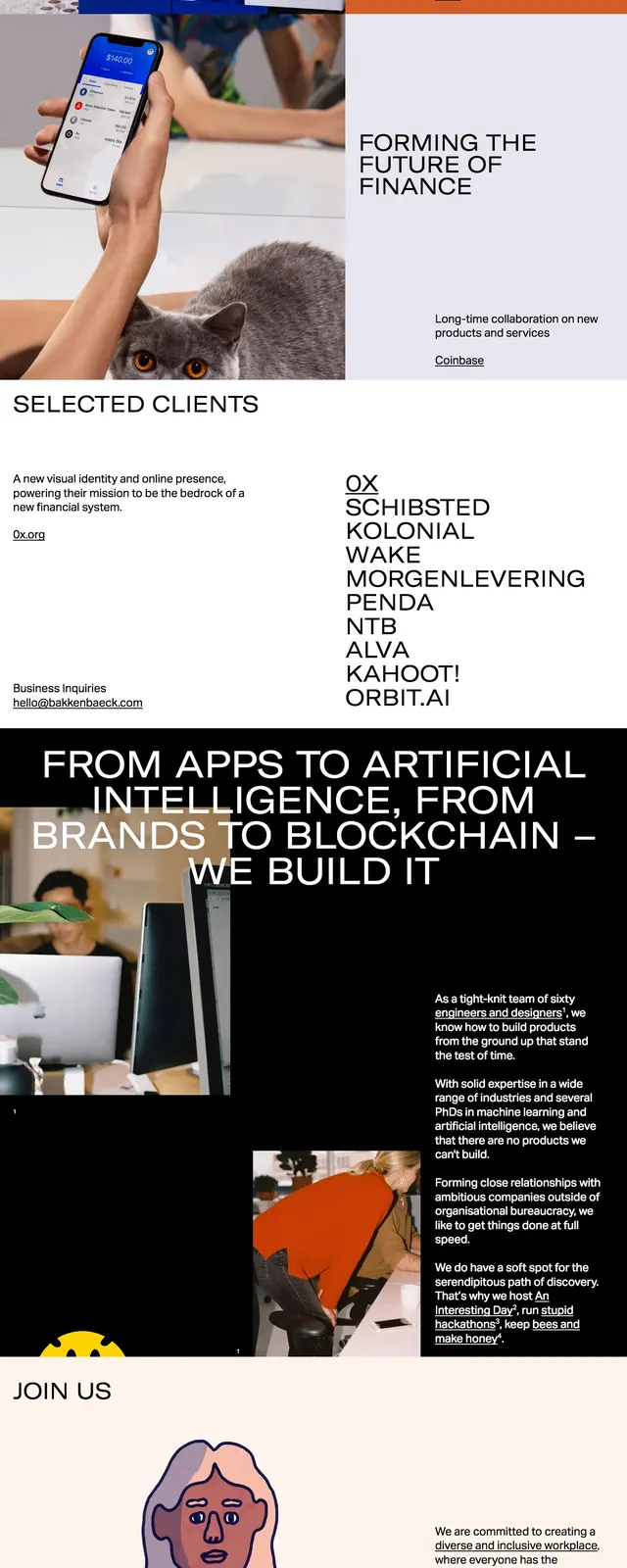
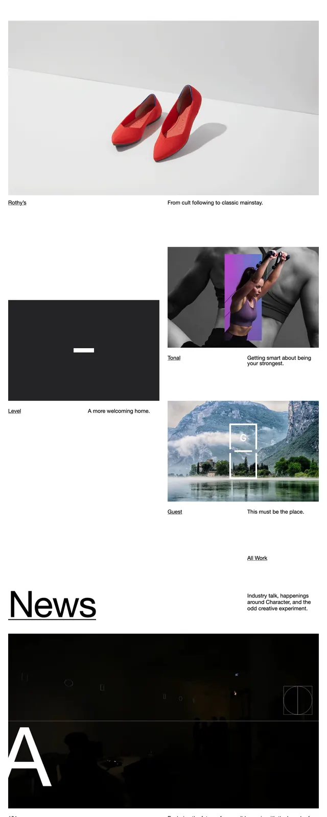
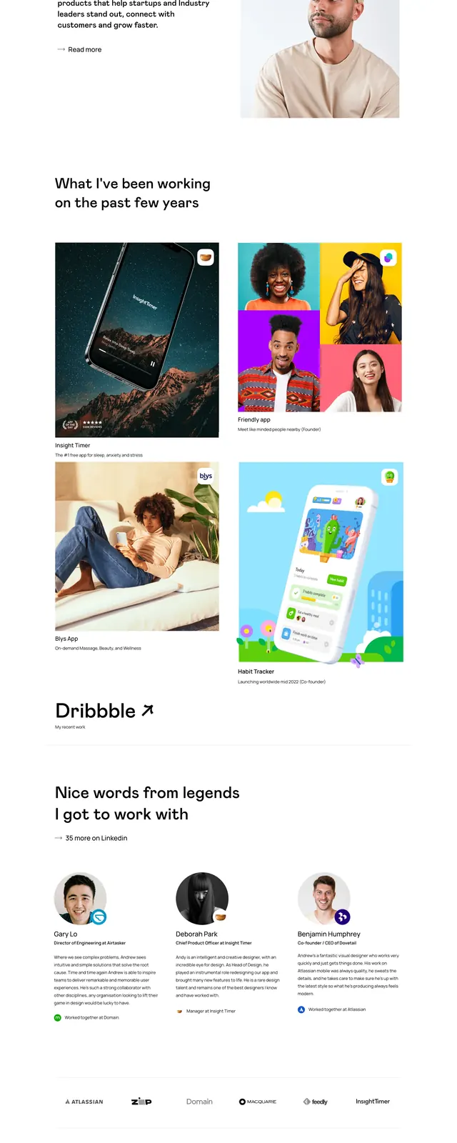
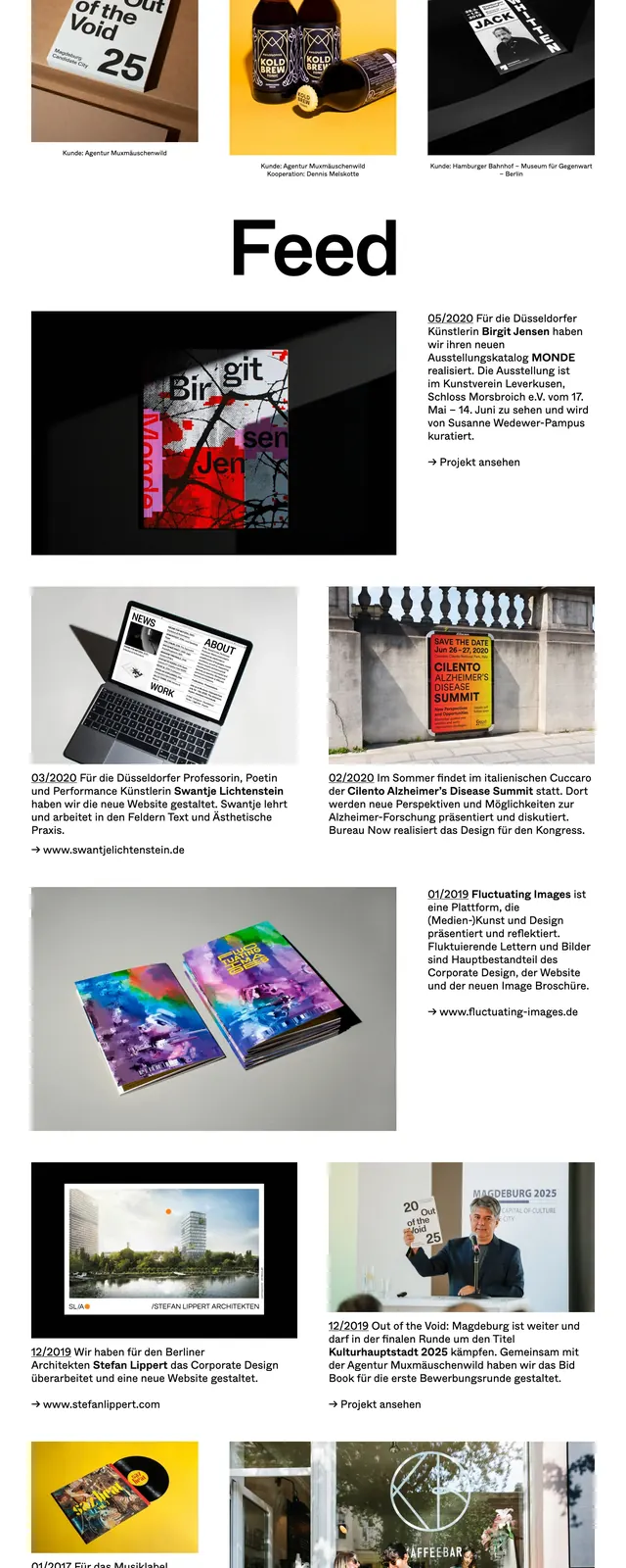
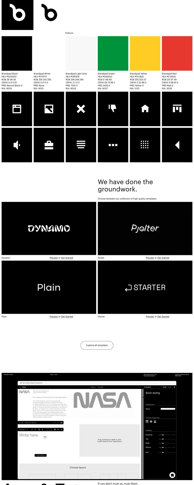
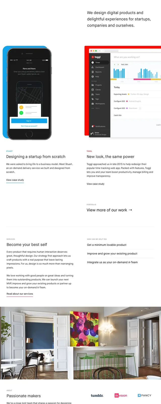
A clean, high-contrast agency landing page featuring bold typography and a minimalist grid layout.
Summary
A clean, high-contrast agency landing page featuring bold typography and a minimalist grid layout.
Visual description
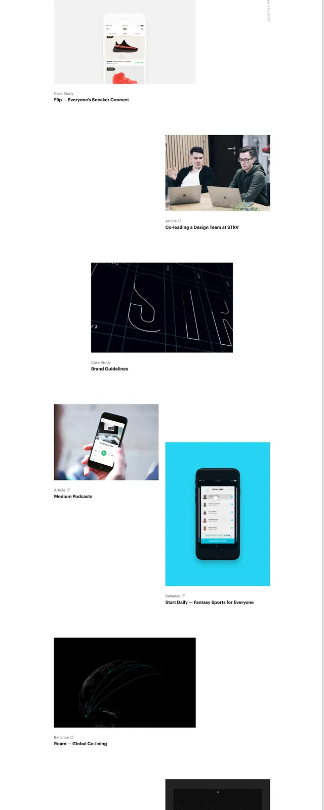
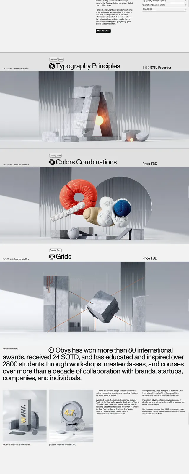
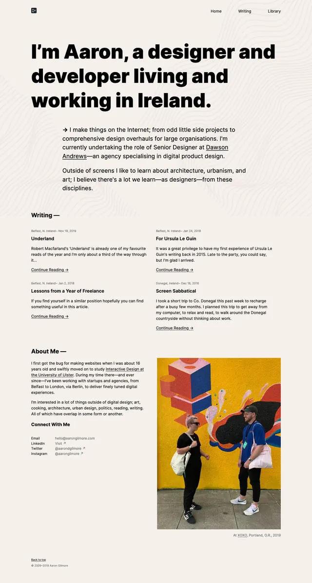
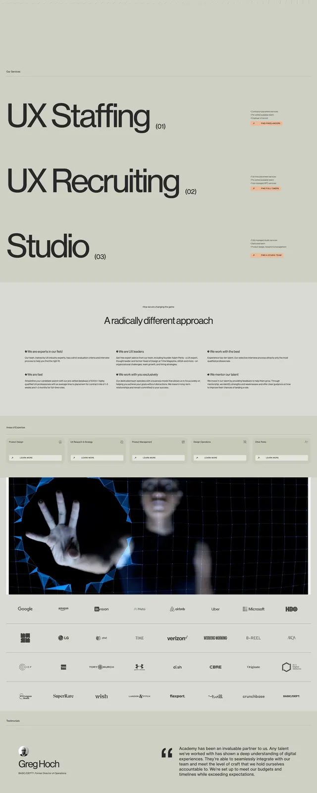
The page uses a stark white background with large, black sans-serif headings. It features a split-screen hero section followed by a two-column grid showcasing case studies with high-quality imagery. The footer is minimalist with simple text links and a clean email subscription field.
Key takeaway
Effective use of extreme white space and oversized typography creates a high-end, confident brand presence.
Reuse notes
Ideal for portfolios or studios wanting to emphasize a 'less is more' aesthetic. The layout demonstrates how to balance heavy typography with ample breathing room.