Preview image. Unlock full-res
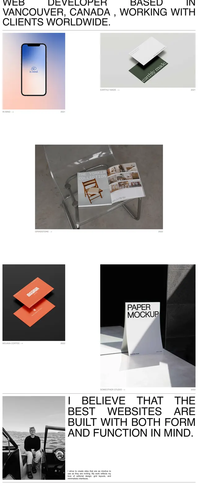
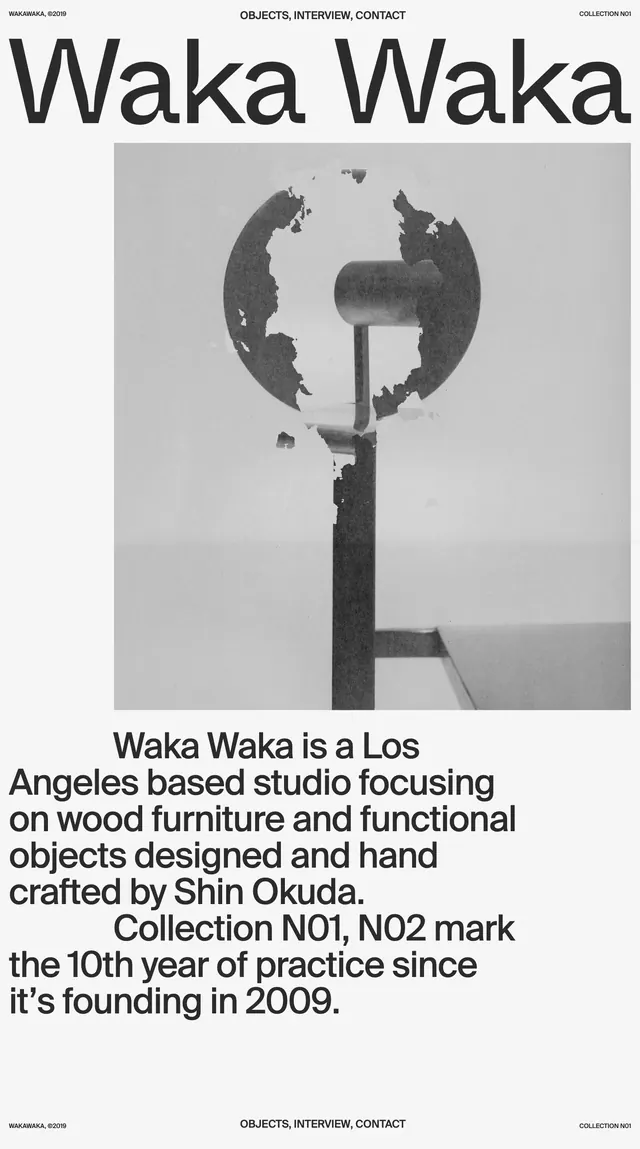
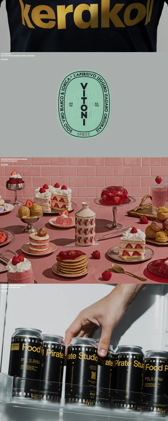
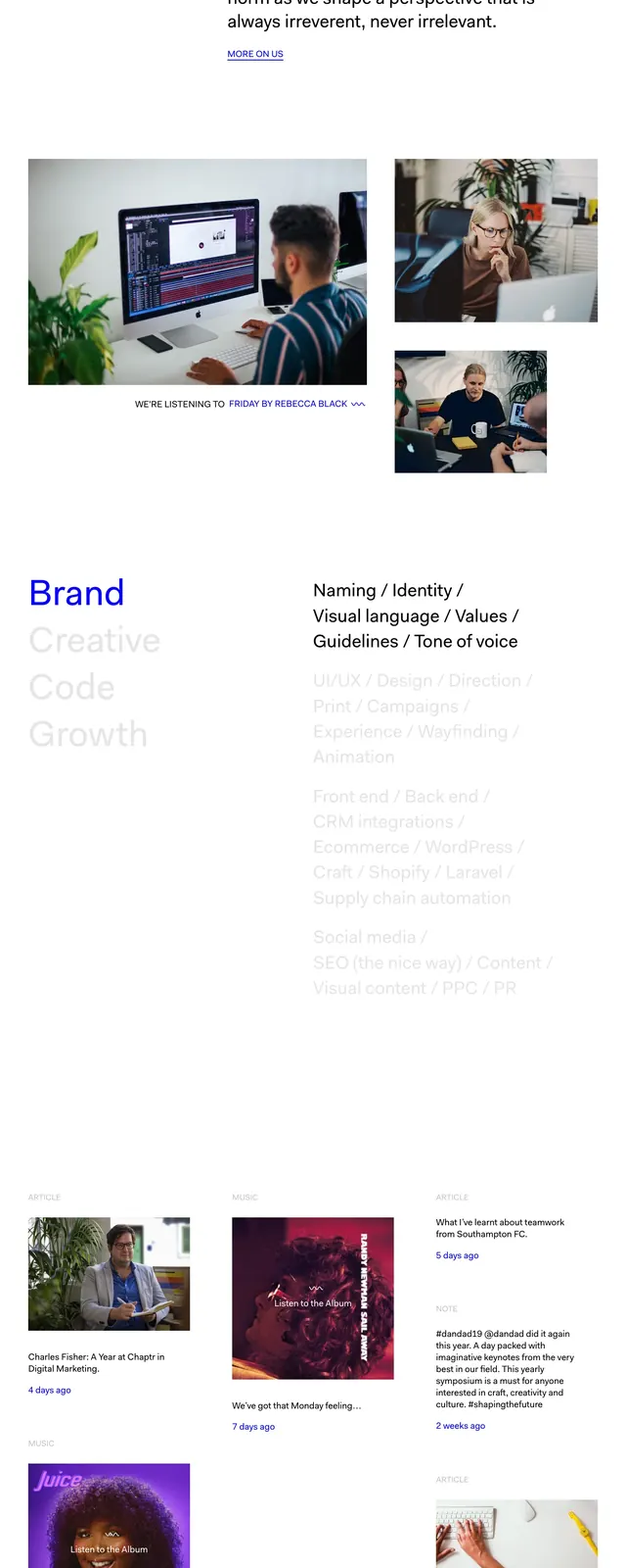
A clean, editorial portfolio page with oversized typography, sparse navigation, and a magazine-like grid of project stories and image-led entries.
Summary
A clean, editorial portfolio page with oversized typography, sparse navigation, and a magazine-like grid of project stories and image-led entries.
Visual description
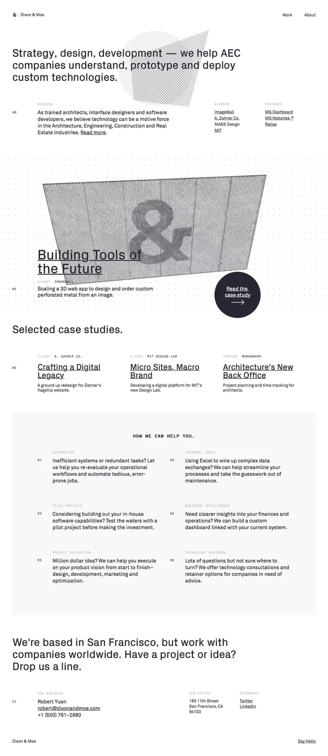
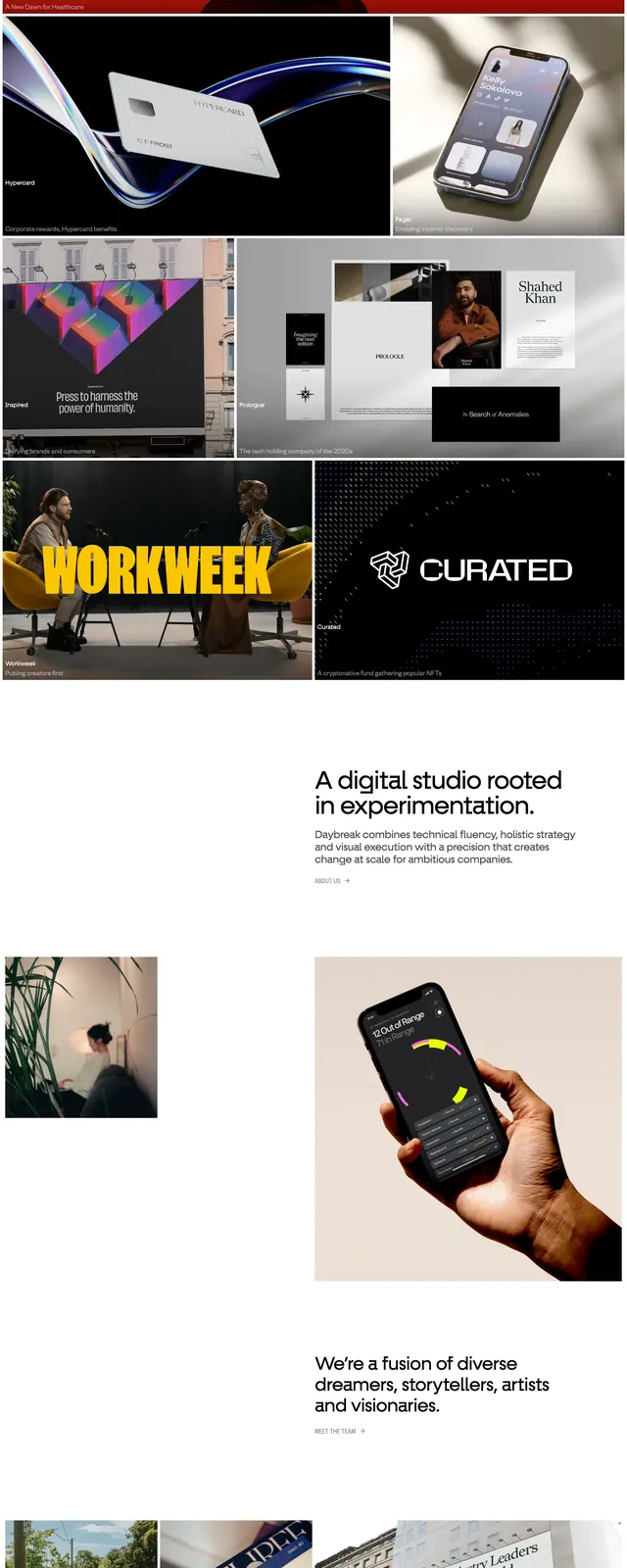
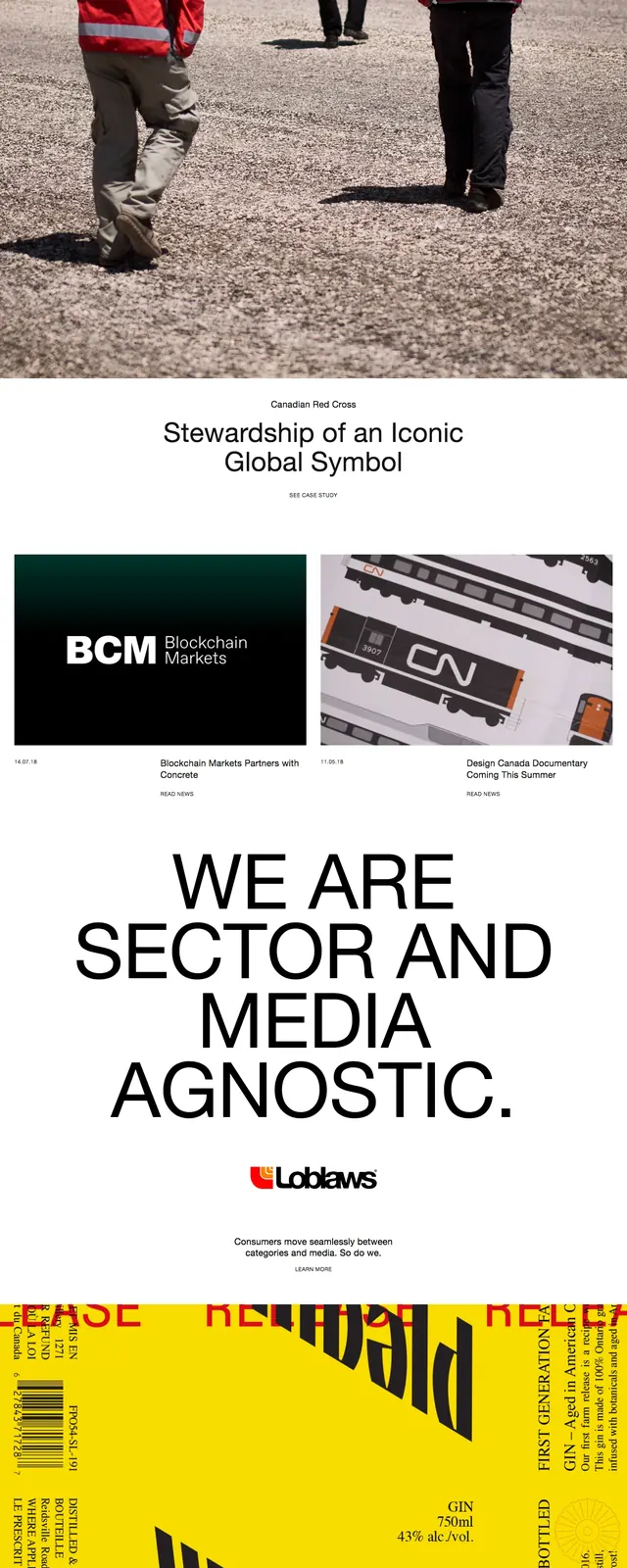
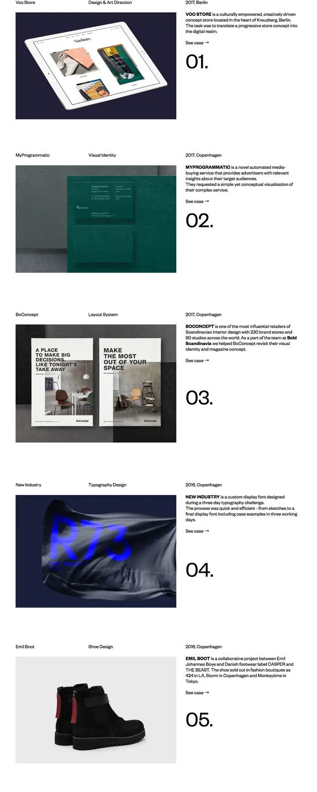
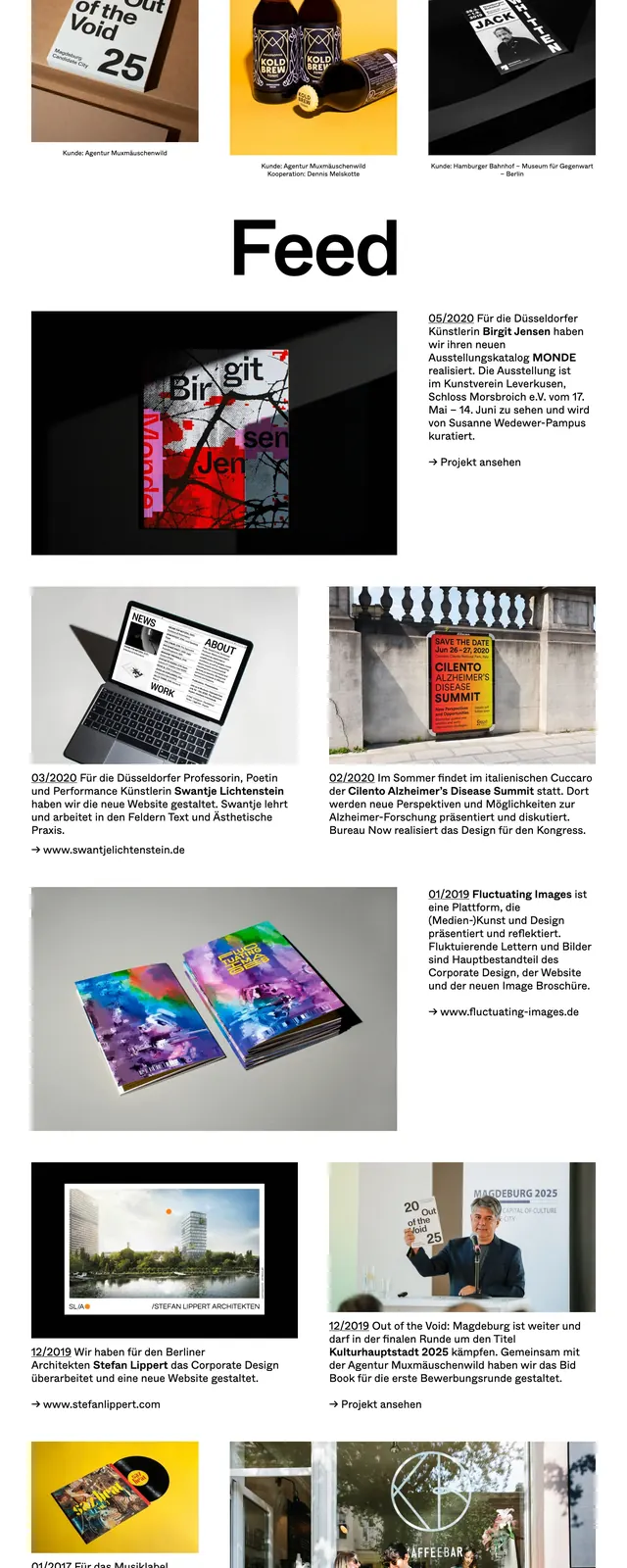
The page uses a stark white background with black text and extremely large headline typography. A simple top navigation sits above a three-column project grid with image tiles and short captions, followed by a large 'Feed' heading and a staggered list of editorial-style story entries. The lower sections combine wide images, text blocks, dates, and link prompts in a disciplined newspaper-like layout. Spacing is generous and the overall composition feels structured but visually varied.
Key takeaway
This design shows how to make a portfolio feel premium through oversized type, restrained color, and a strong editorial hierarchy. It is especially effective for studios or agencies that want the site to read like a curated publication.
Reuse notes
Reuse the oversized headline, minimal top nav, and image-caption cards to create a polished editorial landing page. The staggered story grid and lots of whitespace can be adapted for portfolio, magazine, or case-study browsing.