Preview image. Unlock full-res
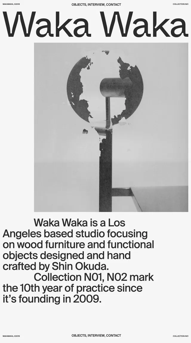
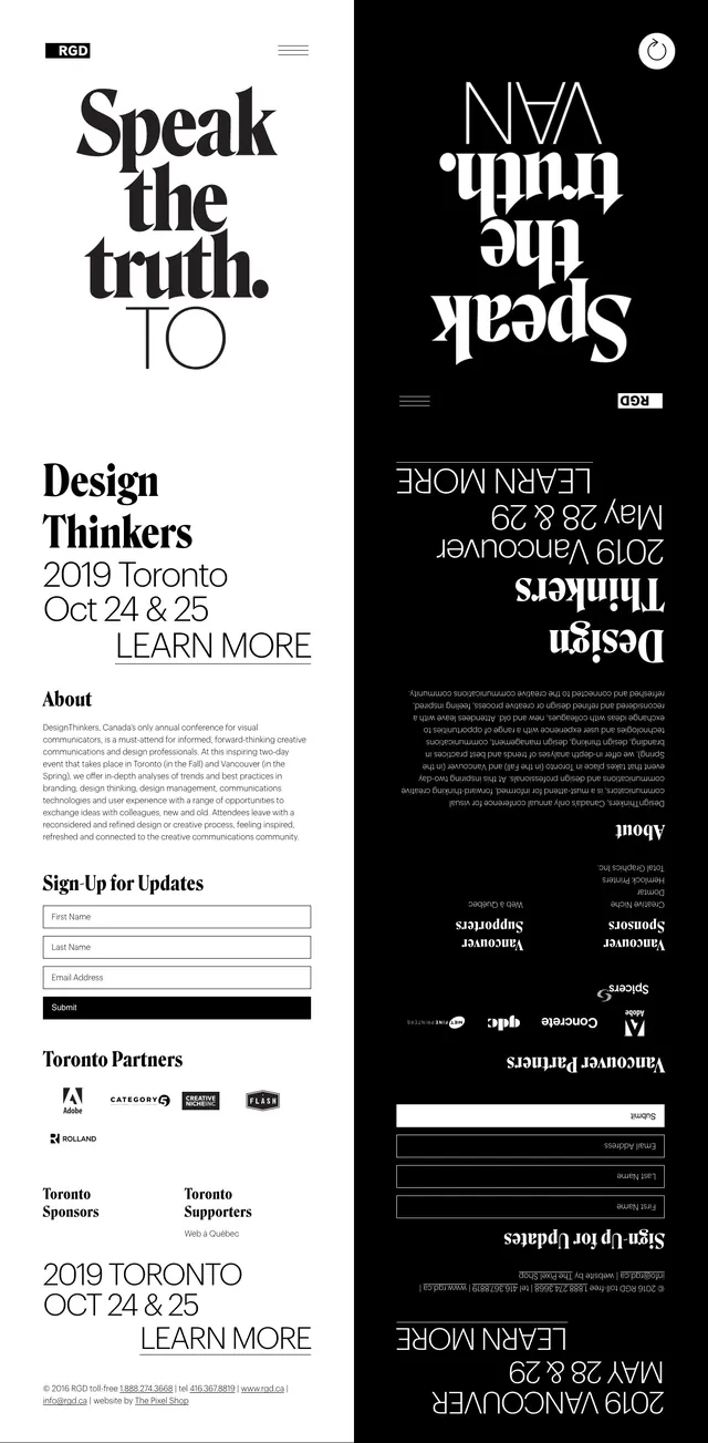
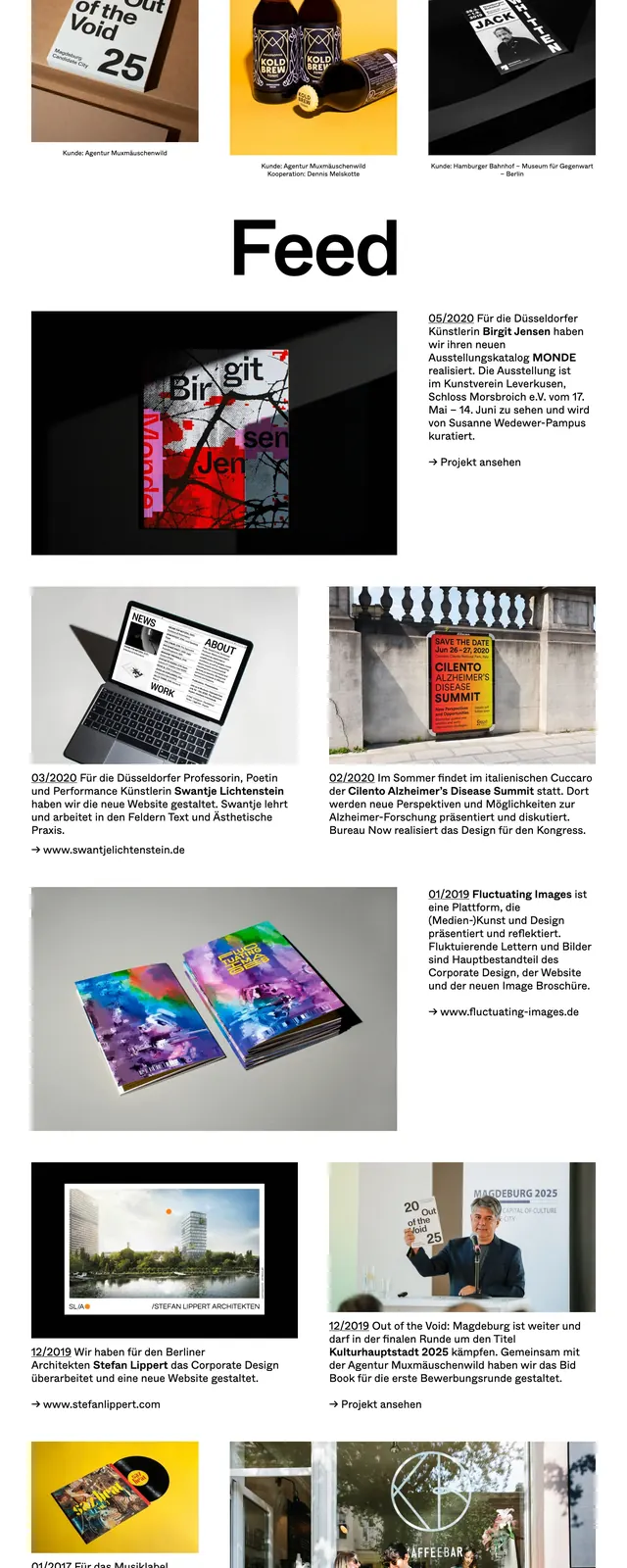
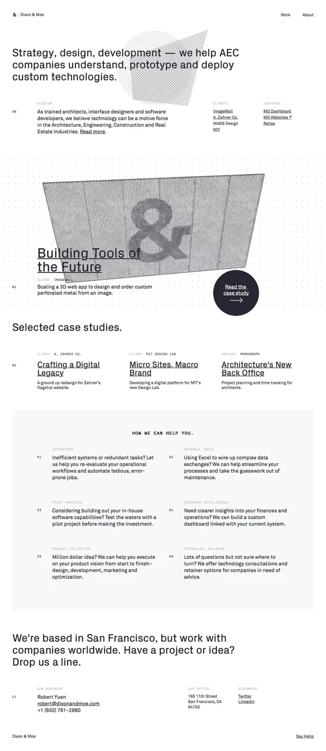
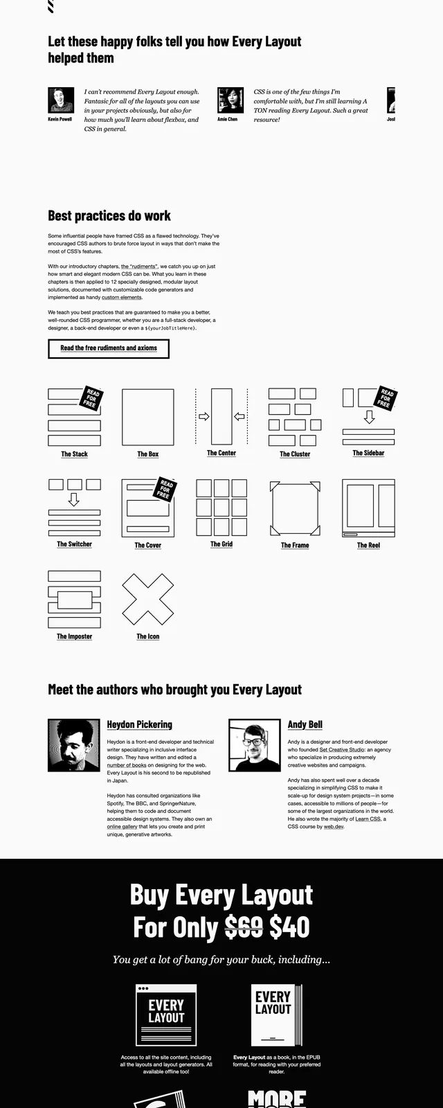
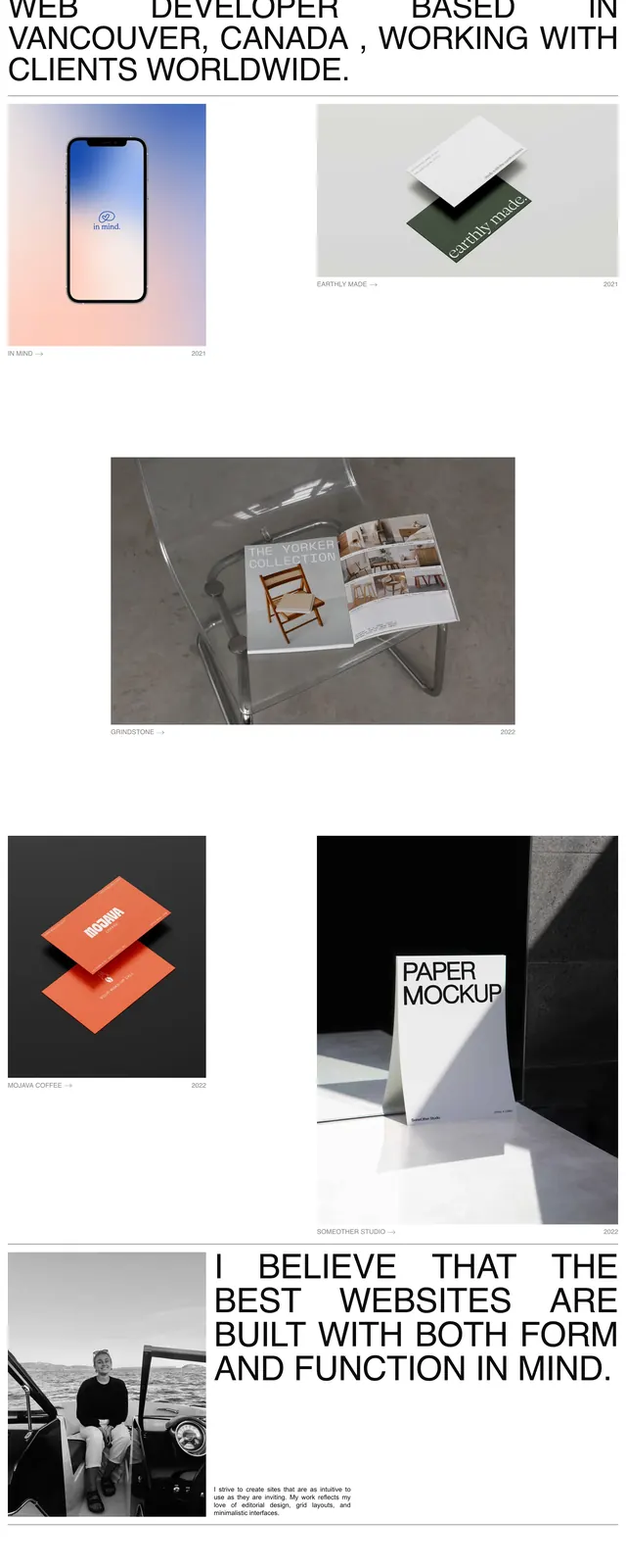
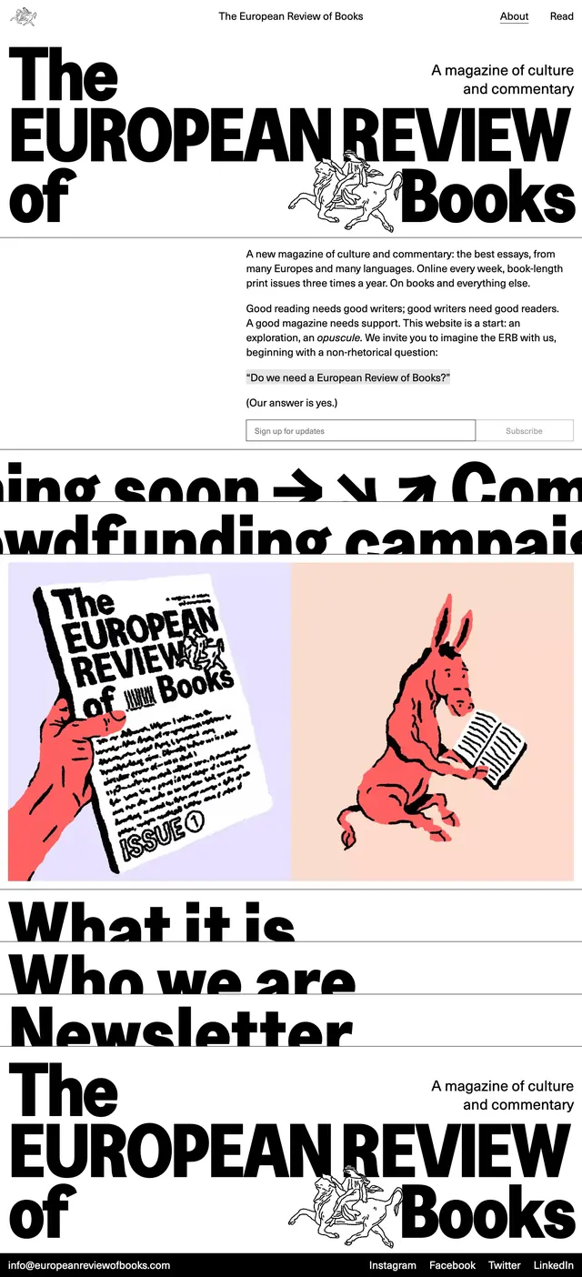
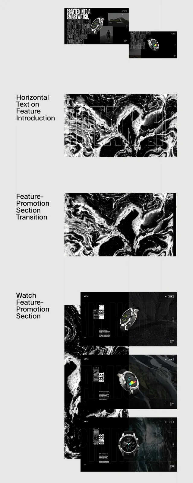
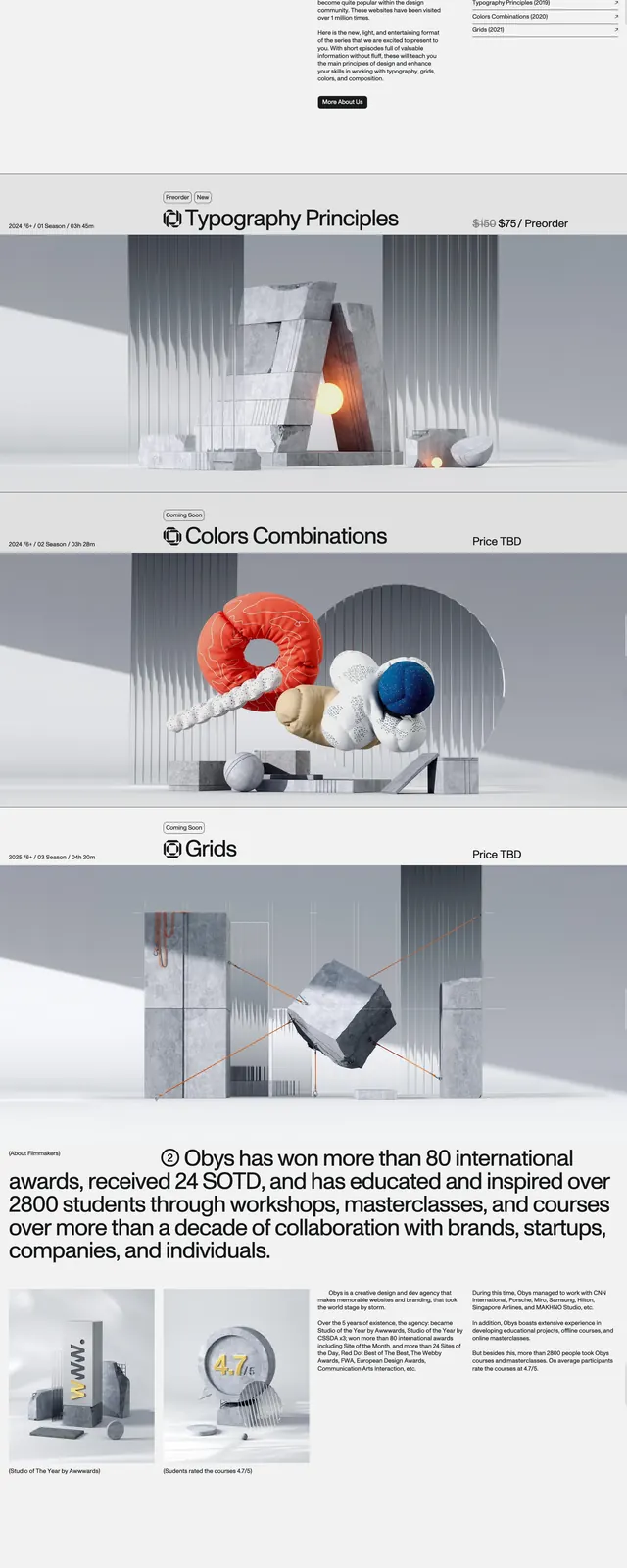
A monochrome, editorial website layout for a design education series with oversized branding, split-screen content, and stacked season modules.
Summary
A monochrome, editorial website layout for a design education series with oversized branding, split-screen content, and stacked season modules.
Visual description
The page uses a stark black-on-white identity with an enormous DES wordmark on the left and a compact navigation plus login button on the right. The upper section is split between a large branding area, a season list, and a video preview card with a visible play-state thumbnail. Lower sections stack a large about statement, project links, and season feature blocks with wide imagery, thin divider lines, and oversized headings.
Key takeaway
The strongest move is the tension between giant branding and tiny editorial details. Sparse layout, thin rules, and generous whitespace make the content feel curated and premium.
Reuse notes
Useful for cultural, educational, or design-studio sites that need to feel authoritative without heavy ornament. Reuse the split hero plus stacked editorial modules when the brand mark itself is part of the experience.