Preview image. Unlock full-res
A stark editorial hero for Character, pairing oversized black headline type with a sparse navigation strip and a collage-driven portfolio layout below.
Summary
A stark editorial hero for Character, pairing oversized black headline type with a sparse navigation strip and a collage-driven portfolio layout below.
Visual description
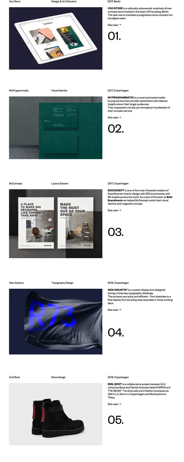
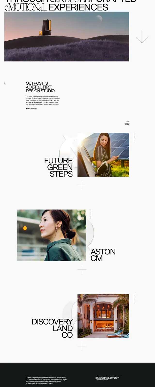
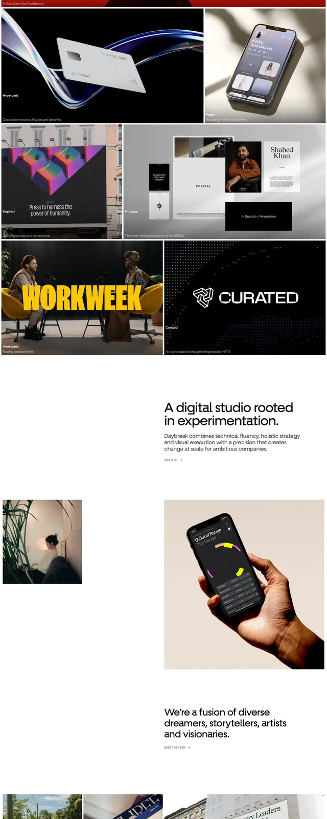
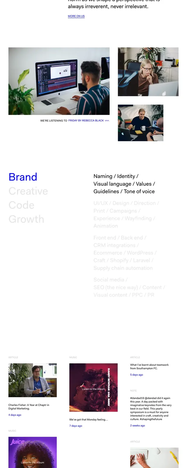
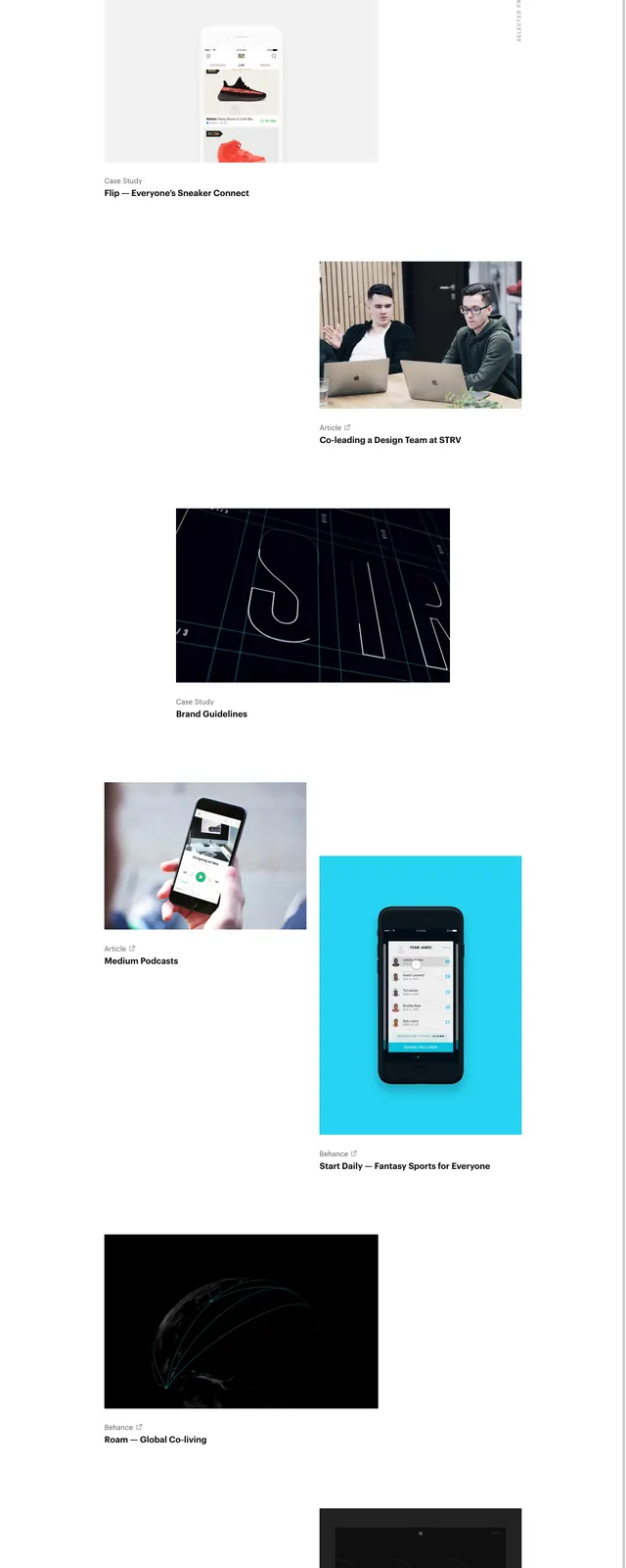
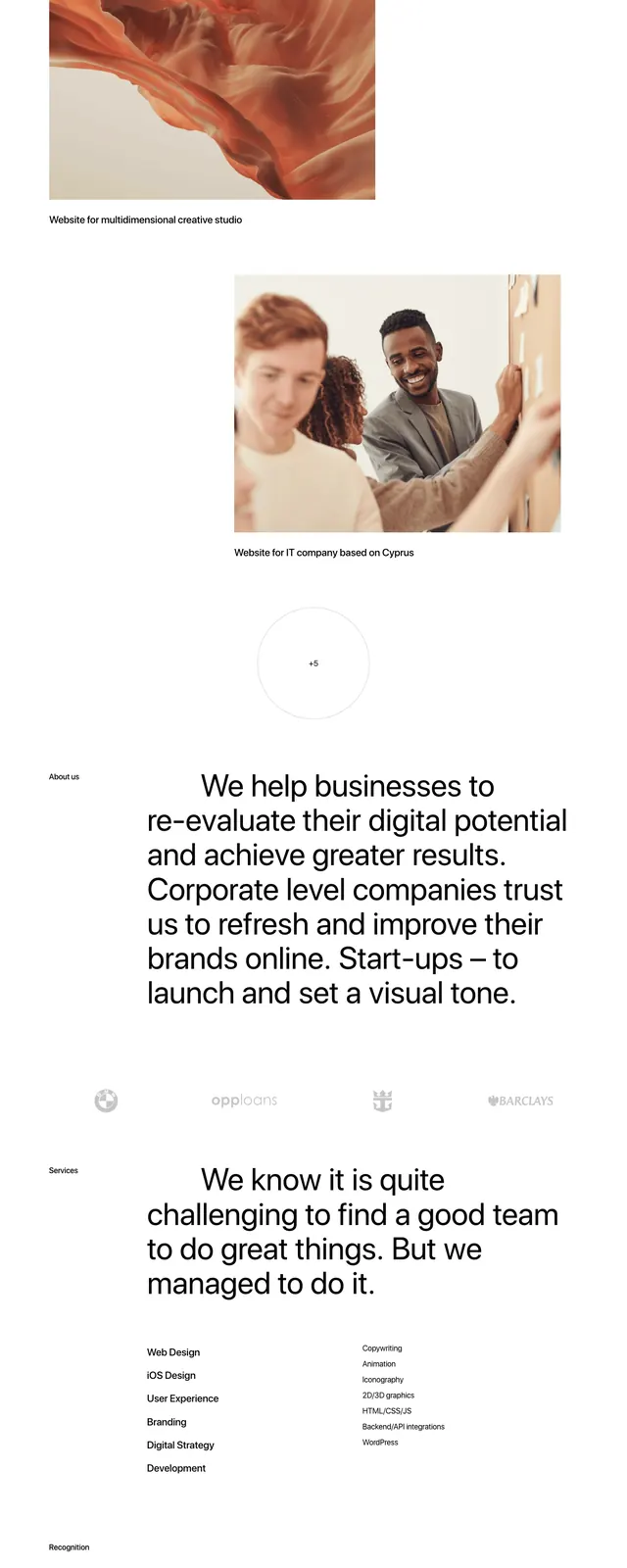
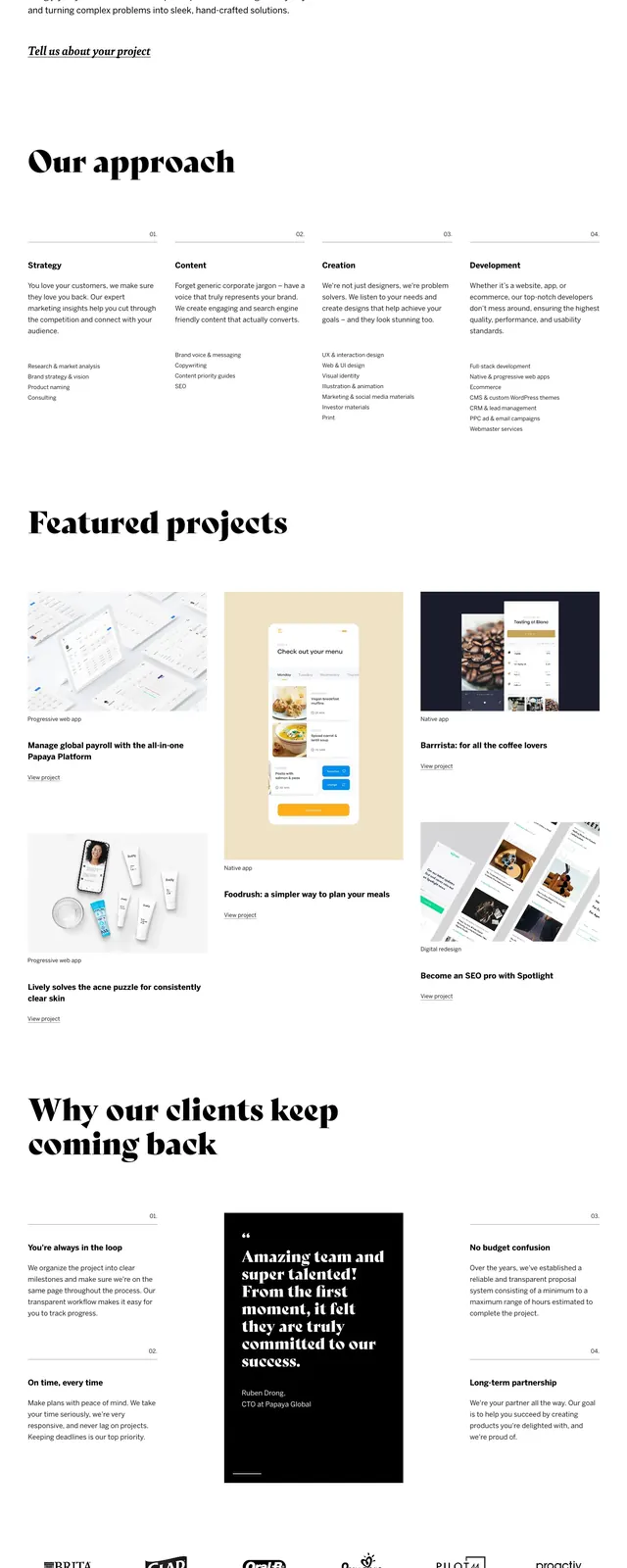
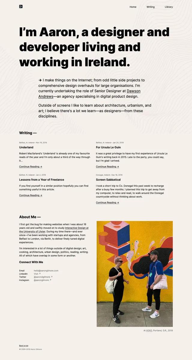
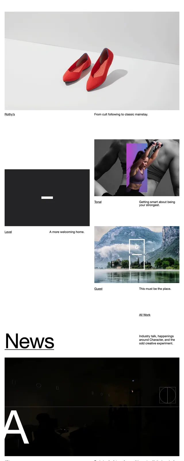
The page opens on a large white hero with a tiny wordmark at top left, a plus icon near the center, and compact time readouts at top right. The main headline is oversized, black, and left-aligned, spanning multiple lines across most of the width, with a small underlined 'About Us' link near the right side. Below the hero text is a dense strip of small portfolio thumbnails and project tiles, followed by larger image cards with captions, then a careers section and a dark footer with contact details and social links.
Key takeaway
The main move is the extreme contrast between massive editorial typography and tightly packed visual proof beneath it. It feels like a premium agency site that uses whitespace, restraint, and small-link hierarchy to make the brand look confident.
Reuse notes
Use this structure for agency or portfolio homepages that need to communicate credibility fast while showcasing varied work. It works best when the hero copy is short and the thumbnail grid can carry personality; it is less effective if you need prominent conversion CTAs.