Preview image. Unlock full-res
A monochrome brand-guidelines landing page with Swiss editorial structure, oversized typography, and modular content blocks.
Summary
A monochrome brand-guidelines landing page with Swiss editorial structure, oversized typography, and modular content blocks.
Visual description
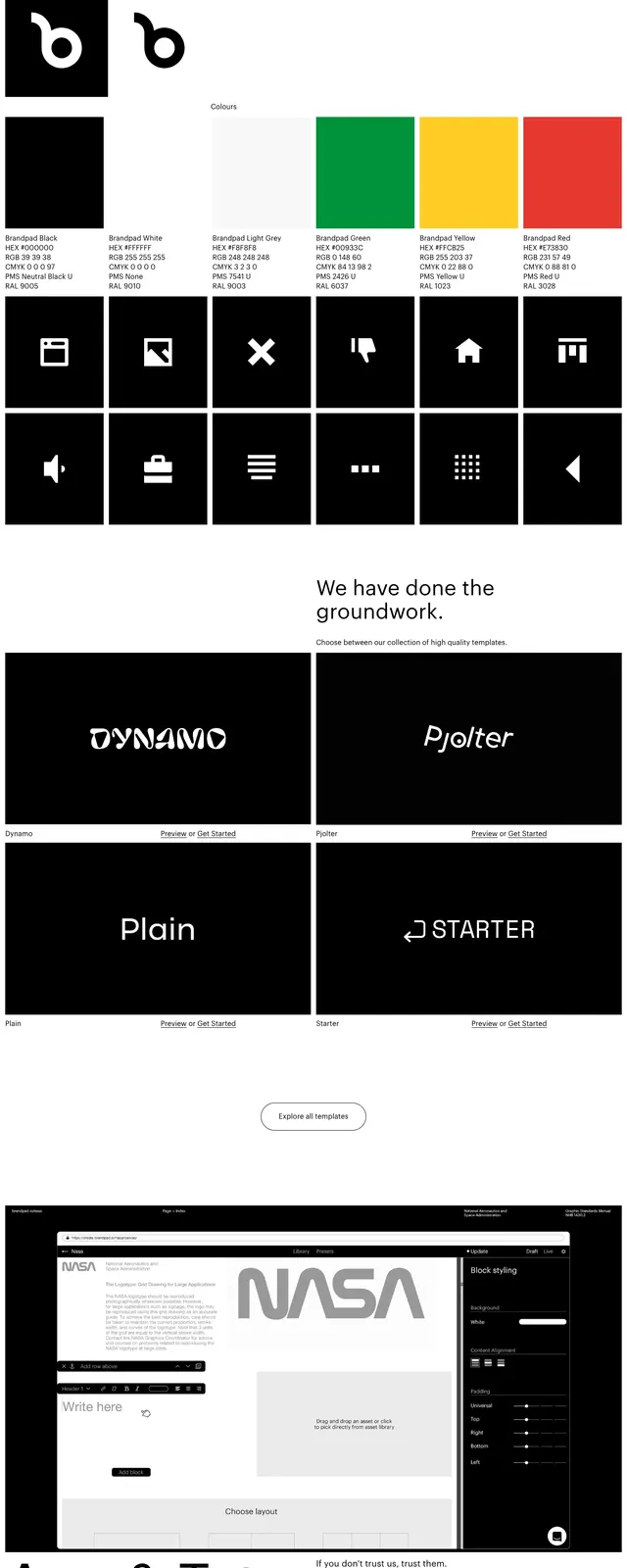
The page uses a stark black-and-white palette with a lot of white space and thin navigation links at the top. The first screen combines a centered headline, a three-panel pictogram grid, and a bold black banner strip with large text and a cursor icon. Lower sections show a short horizontal block pattern, a two-column template showcase with dark thumbnail cards, and an oversized text-led callout above a dense black footer. Typography is large, clean, and sans-serif, with several sections relying on oversized headlines and minimal supporting copy.
Key takeaway
The design relies on strict contrast, modular framing, and oversized type to make a brand-guidelines product feel contemporary and precise. The pictogram/grid treatment gives the page a distinct editorial identity without adding color or decorative clutter.
Reuse notes
Useful for SaaS or agency landing pages that need to communicate premium structure and design rigor. It works best when the content itself can carry the layout, since the styling is intentionally restrained and monochrome.