Preview image. Unlock full-res
A bold agency homepage with a full-bleed blue hero, oversized black wordmark typography, and a collage-like editorial content grid below.
Summary
A bold agency homepage with a full-bleed blue hero, oversized black wordmark typography, and a collage-like editorial content grid below.
Visual description
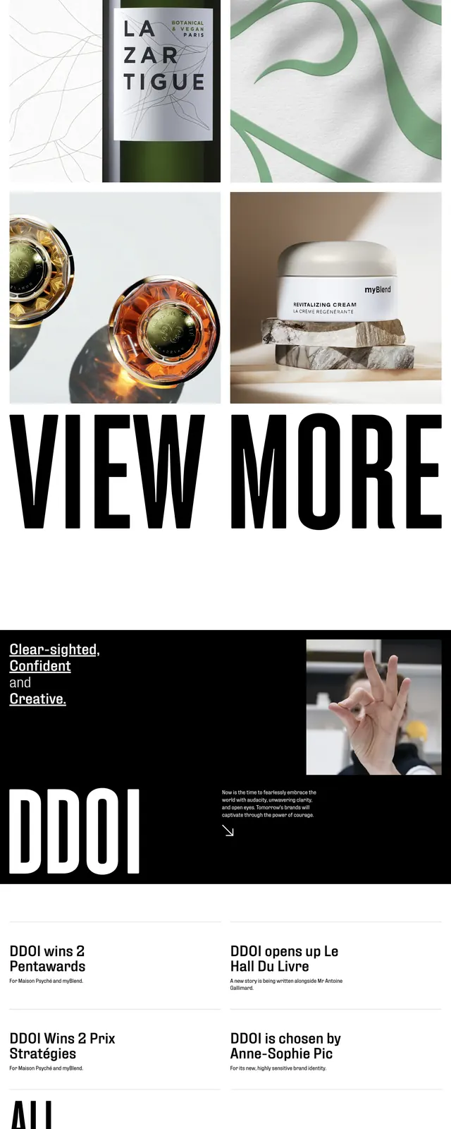
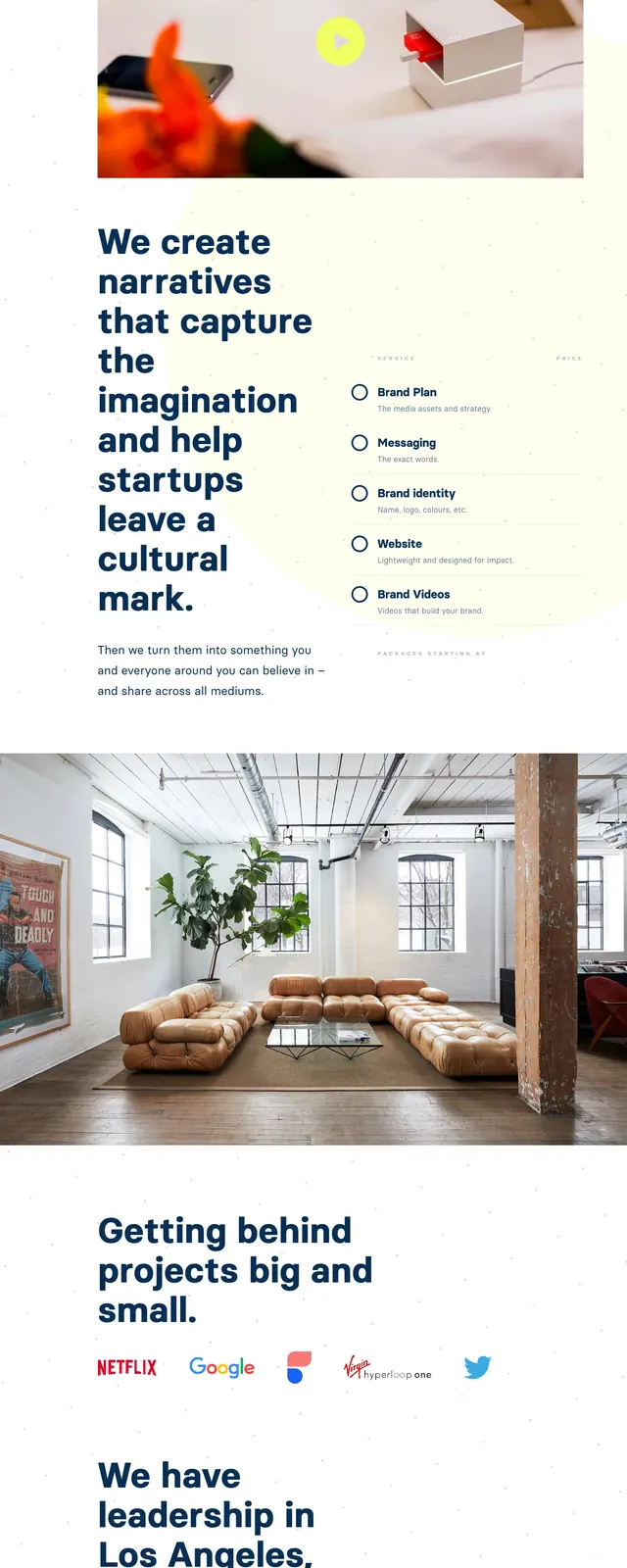
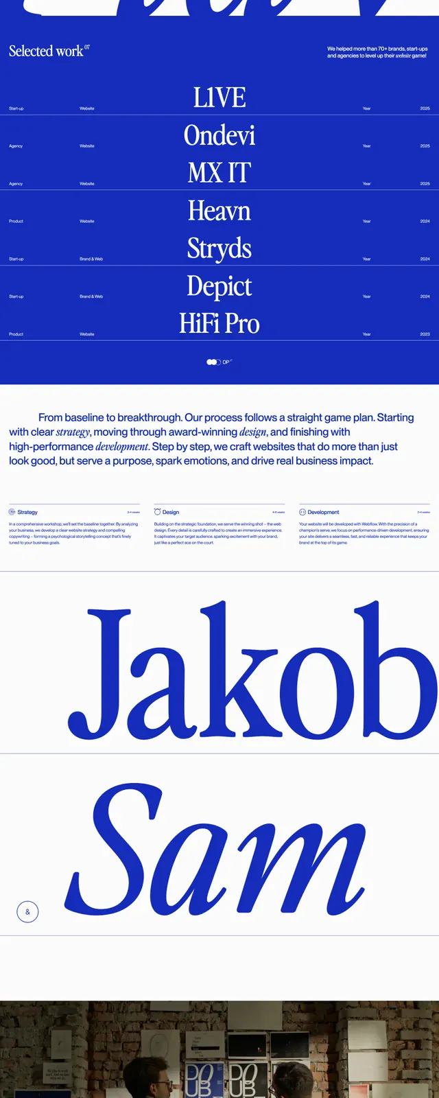
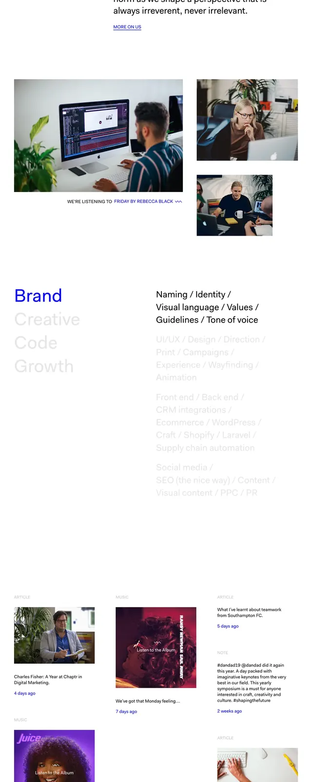
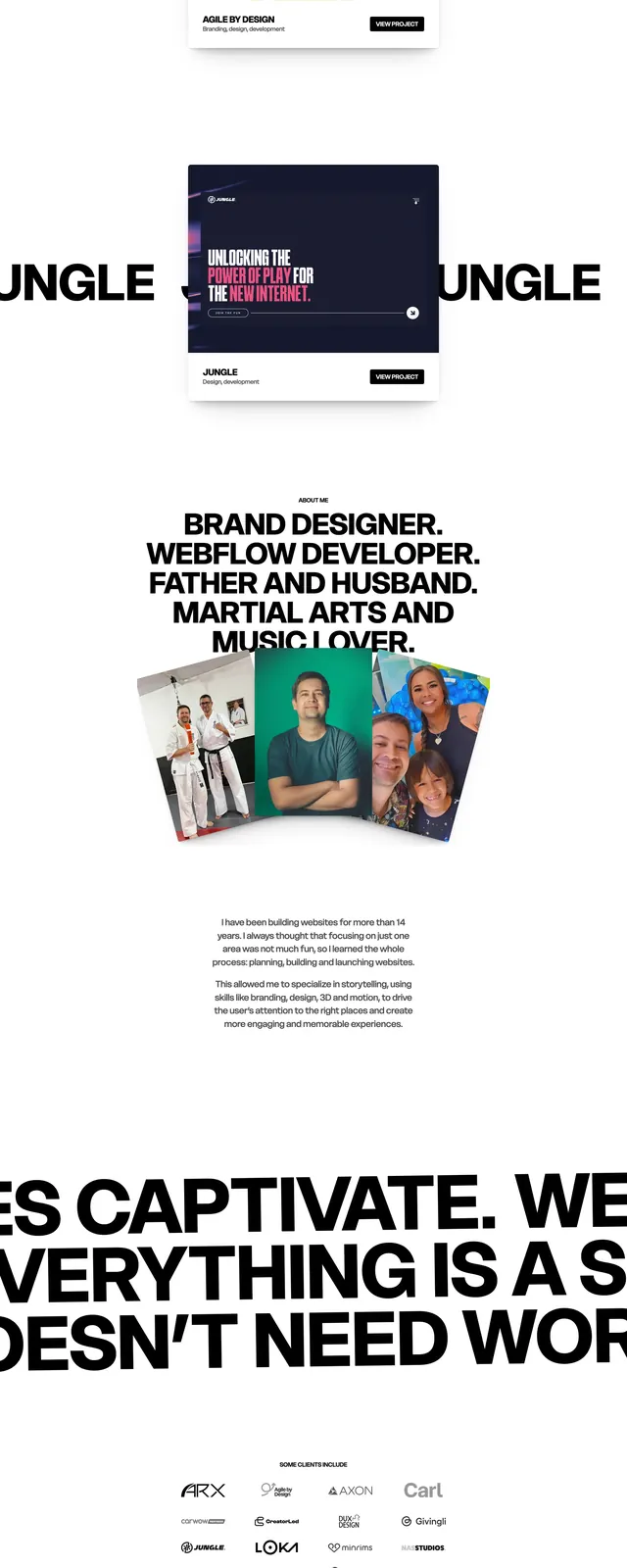
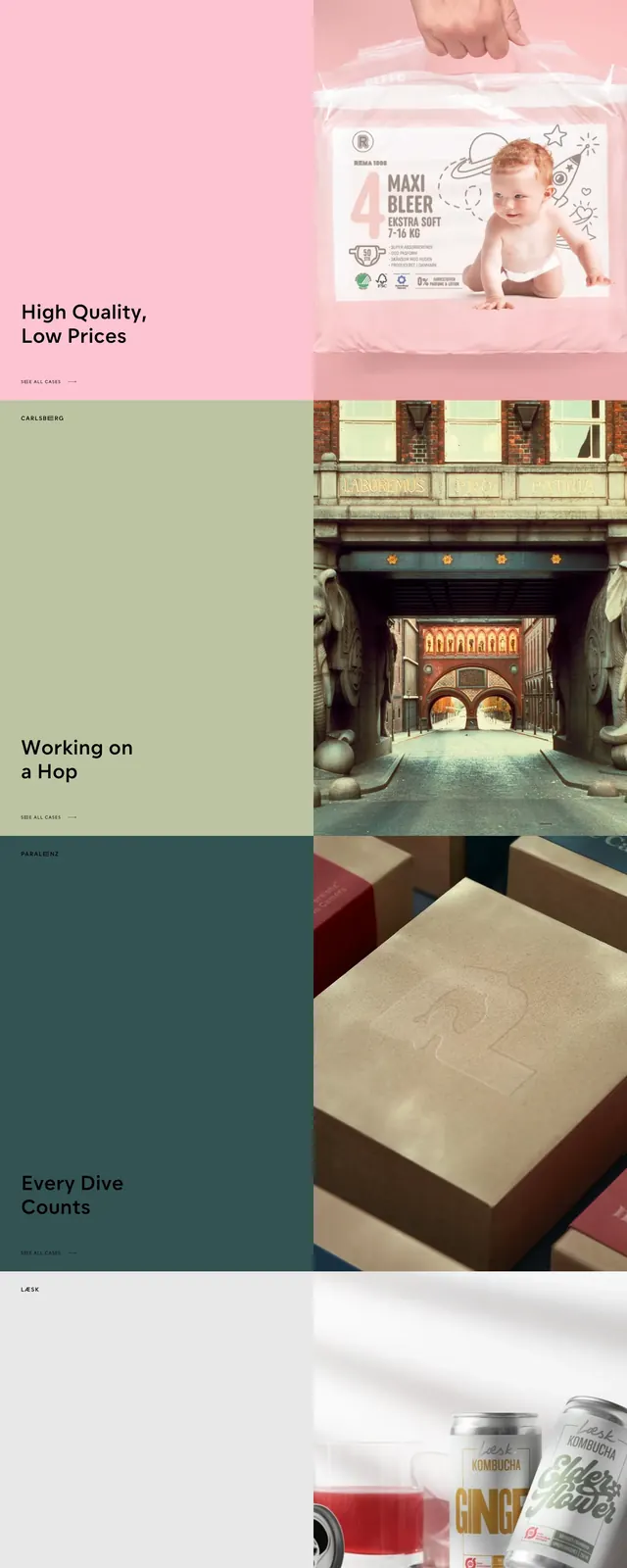
The page opens with a saturated blue full-bleed hero featuring a tiny centered "WELCOME TO" line above an extra-large black EVERLAND wordmark. Minimal icon-only navigation sits in the top corners, and a slim row of world-city time labels runs along the bottom edge of the hero. Below, the layout shifts into a two-column editorial grid with large blocks of text, solid color panels, and photography tiles. The lower section ends with oversized contact details and social links separated by thin horizontal rules, followed by an orange footer bar with address and contact information.
Key takeaway
The strongest move is the contrast between a blunt, oversized typographic hero and a refined editorial grid underneath. It feels agency-led, high-impact, and easy to scan while staying visually distinctive.
Reuse notes
Use this structure for creative agencies, studios, or brand consultancies that want a strong first impression with minimal navigation. The oversized type and simple color blocking work best when paired with striking photography and concise copy.