Preview image. Unlock full-res
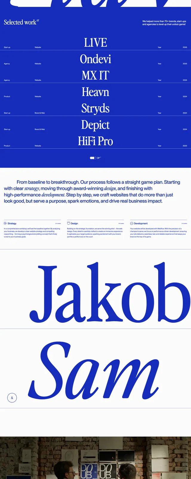
A minimalist agency homepage that pairs a full-bleed monochrome hero image with sparse copy and a bold electric-blue contact footer.
Summary
A minimalist agency homepage that pairs a full-bleed monochrome hero image with sparse copy and a bold electric-blue contact footer.
Visual description
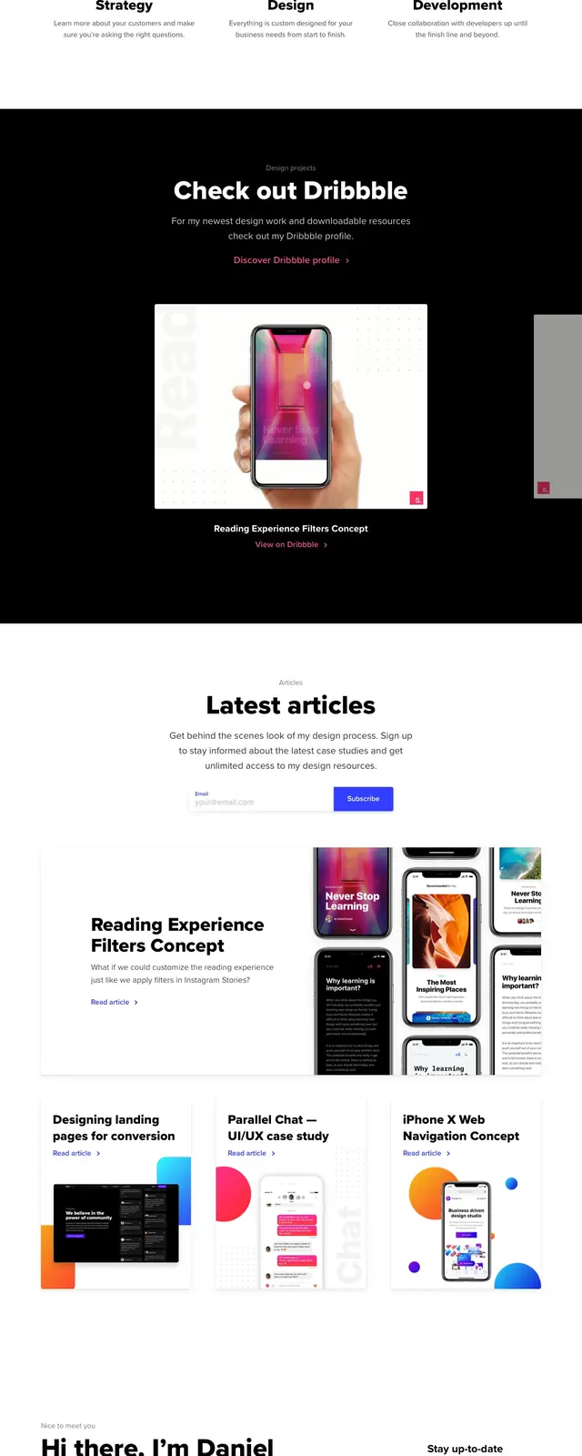
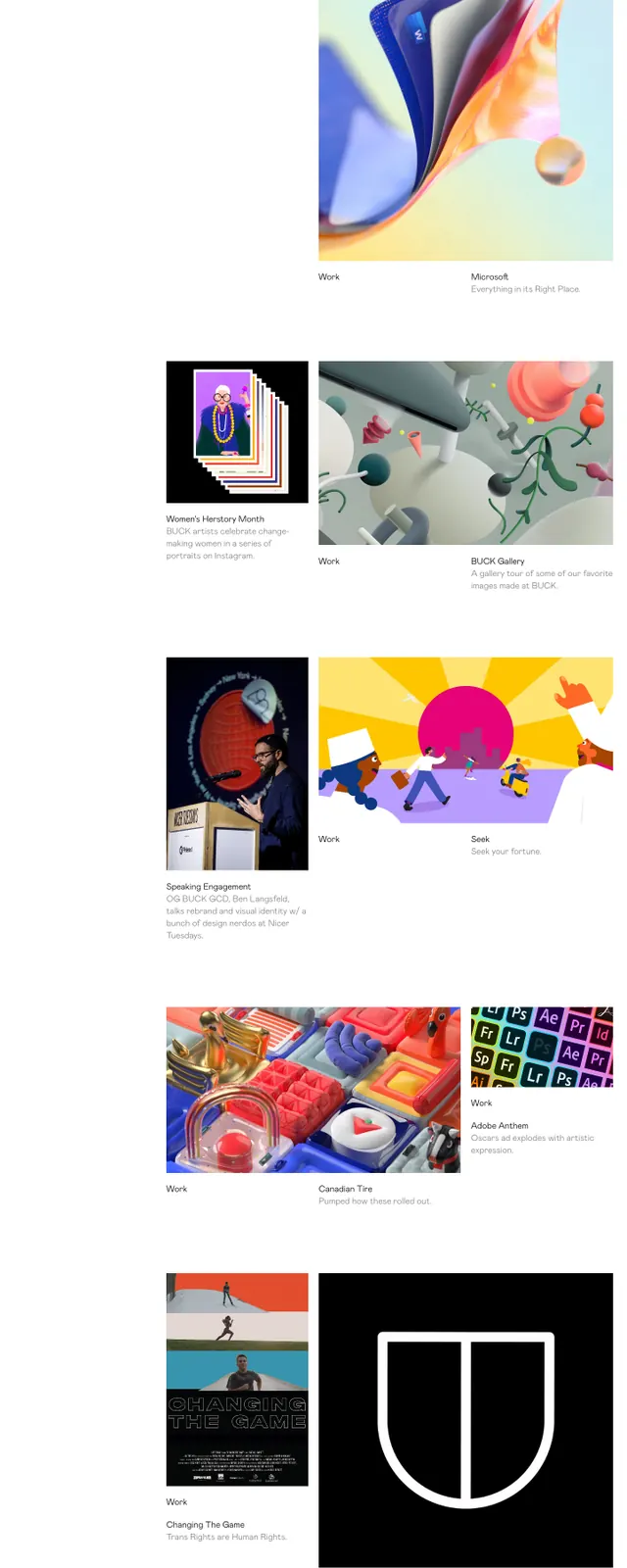
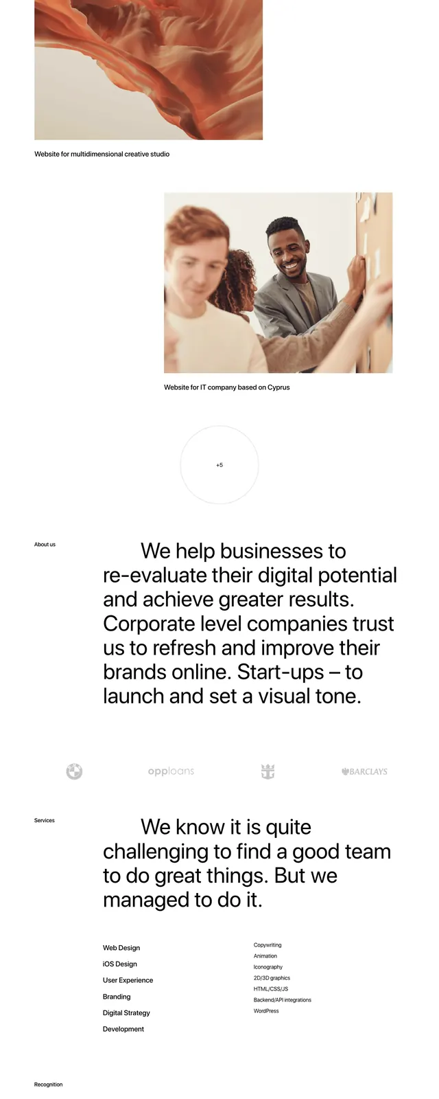
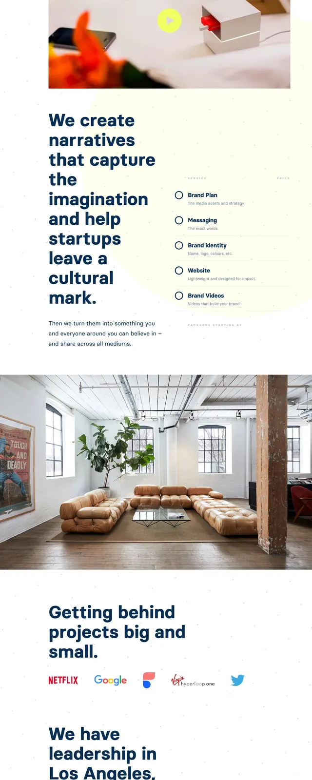
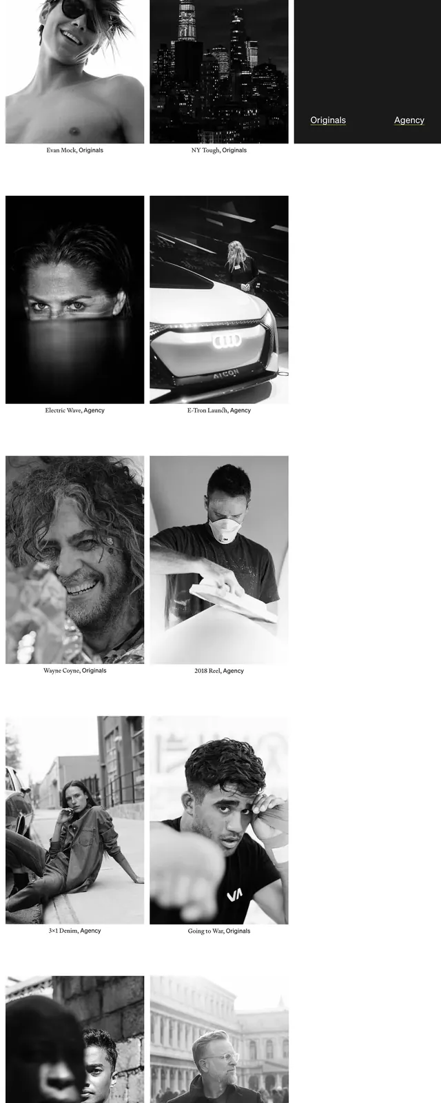
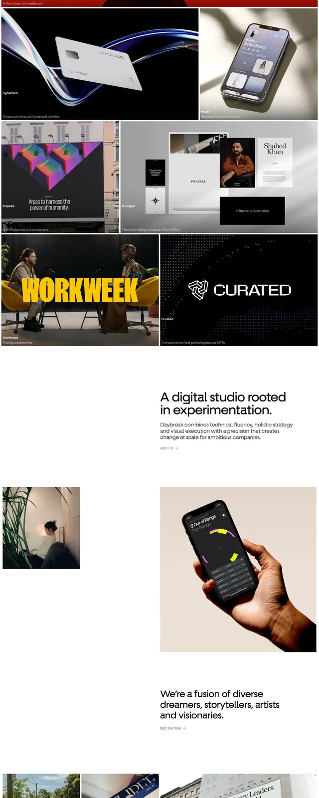
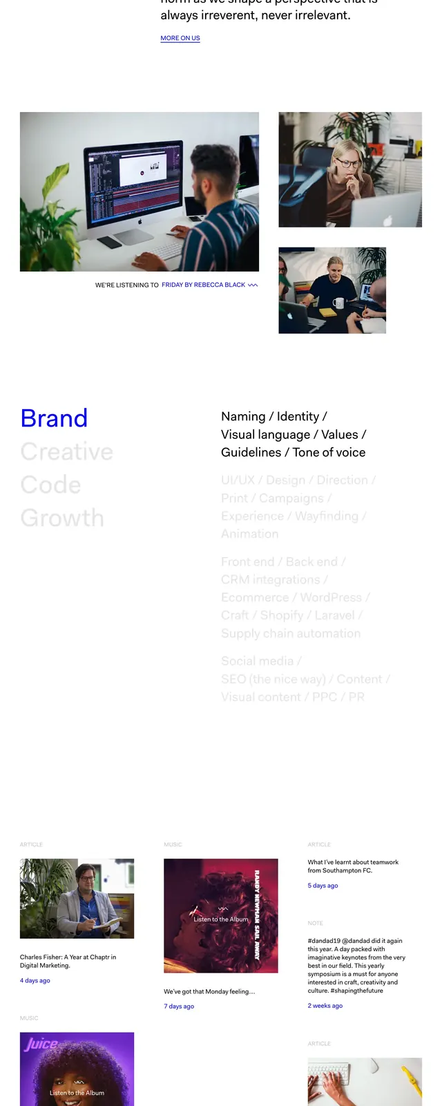
The page opens with a full-width black-and-white hero photograph of a live performance, with large centered headline text over the image and minimal navigation in the corners. Below, the layout switches to a very open white canvas with a short studio introduction, a two-column services area, and small blog-style preview cards. The page ends with a large solid electric-blue contact block that centers the primary call to action and a compact multi-column footer.
Key takeaway
The strongest move is the contrast between restrained monochrome editorial sections and the saturated blue closing panel. The spacing is generous and the hierarchy is kept simple, which makes the few bold elements feel deliberate.
Reuse notes
Useful for creative agencies, studios, or portfolio sites that want a premium editorial feel without heavy decoration. The structure works best when you have strong photography and concise service or manifesto copy.