Preview image. Unlock full-res
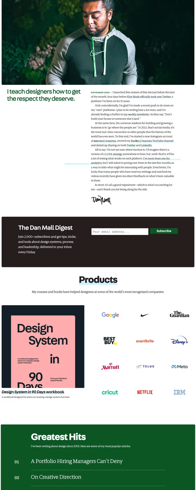
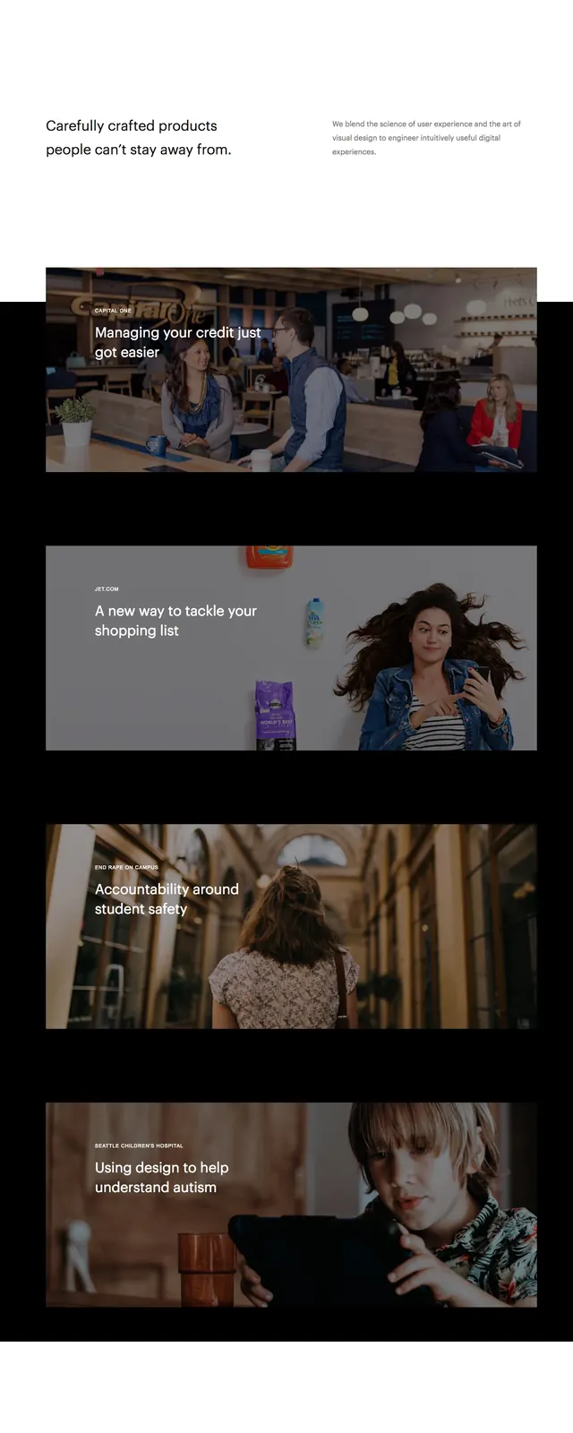
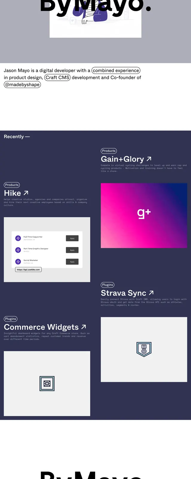
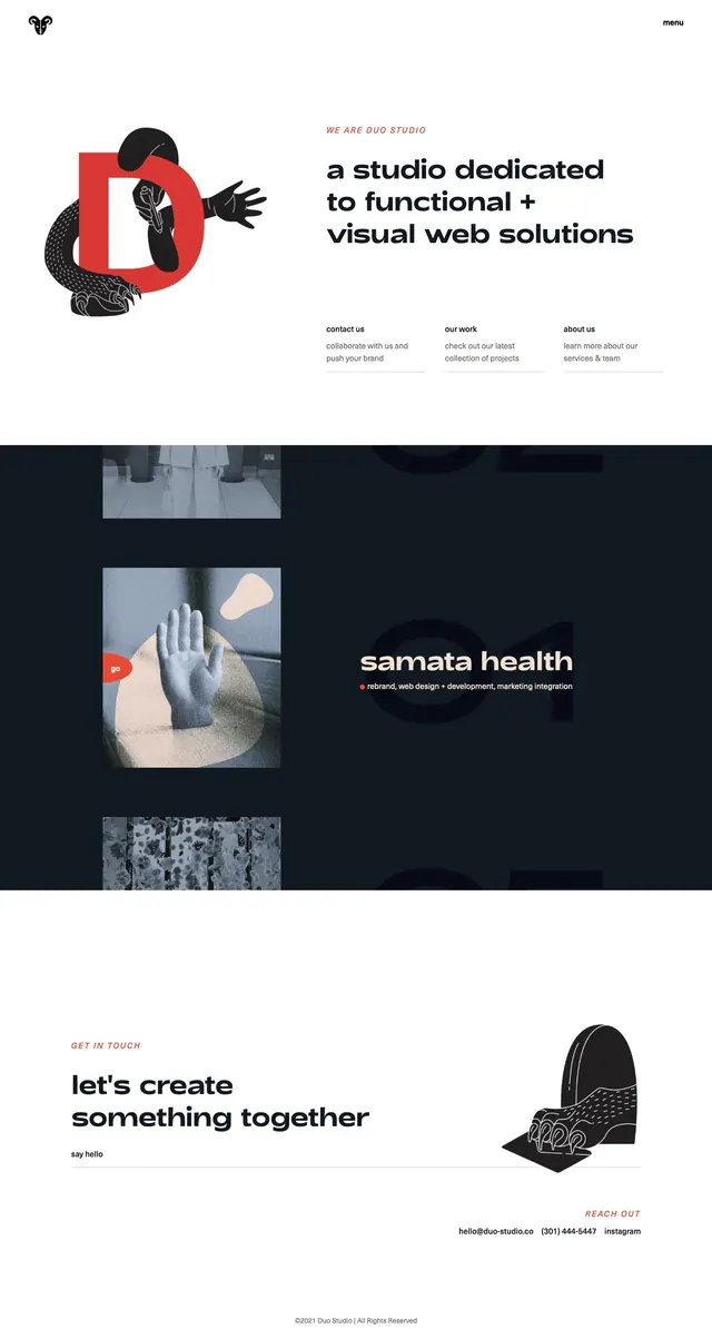
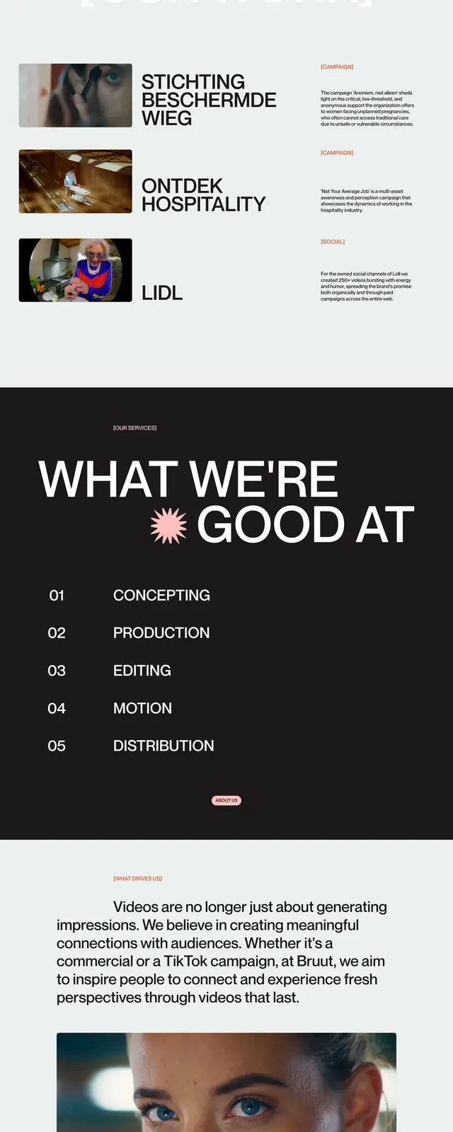
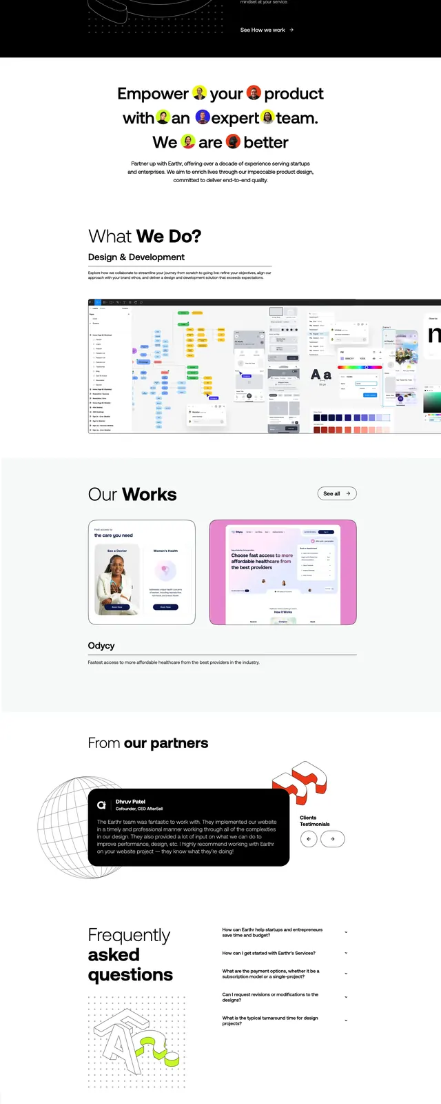
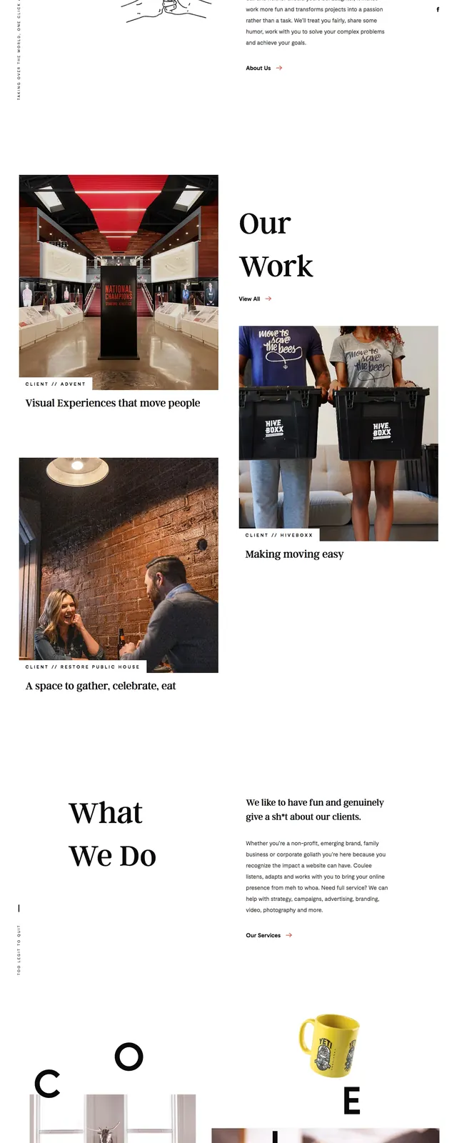
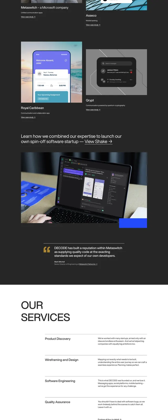
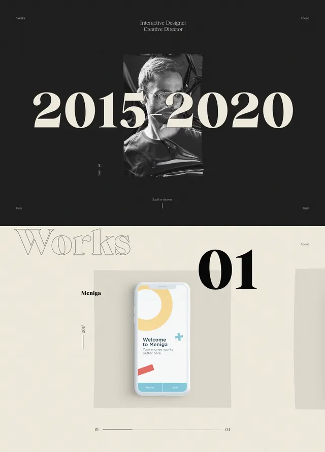
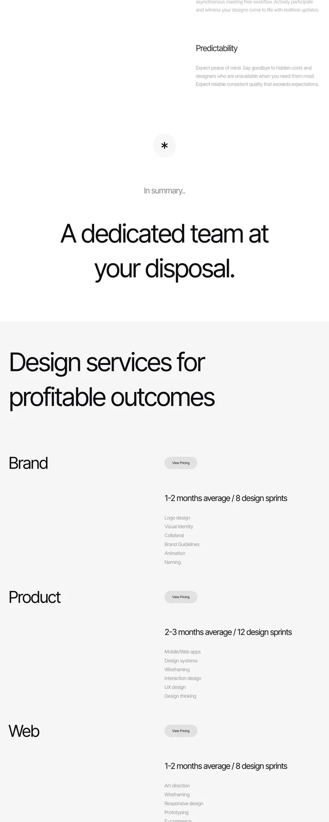
A minimalist agency landing page with a collage-style hero, oversized centered headline, and sparse service and CTA sections on a light background.
Summary
A minimalist agency landing page with a collage-style hero, oversized centered headline, and sparse service and CTA sections on a light background.
Visual description
The page opens with a wide collage of brand imagery and mockups arranged in a grid across the top of the screen, followed by a large white curved divider into the main content. The hero headline is centered and set in large black sans-serif type on a very light background, with generous spacing and minimal supporting text. Below it, a services section lists design offerings in a sparse two-column style, then a simple CTA area appears on a dark background with a centered button.
Key takeaway
The strongest move is the contrast between the busy image collage and the very open, typography-led sections that follow. The layout relies on whitespace, oversized headlines, and a restrained palette to feel polished and premium.
Reuse notes
Use this structure for agency or studio sites that need a bold first impression without heavy UI complexity. It works best when you have strong brand imagery and want the page to feel editorial and high-end rather than product-driven.