Preview image. Unlock full-res
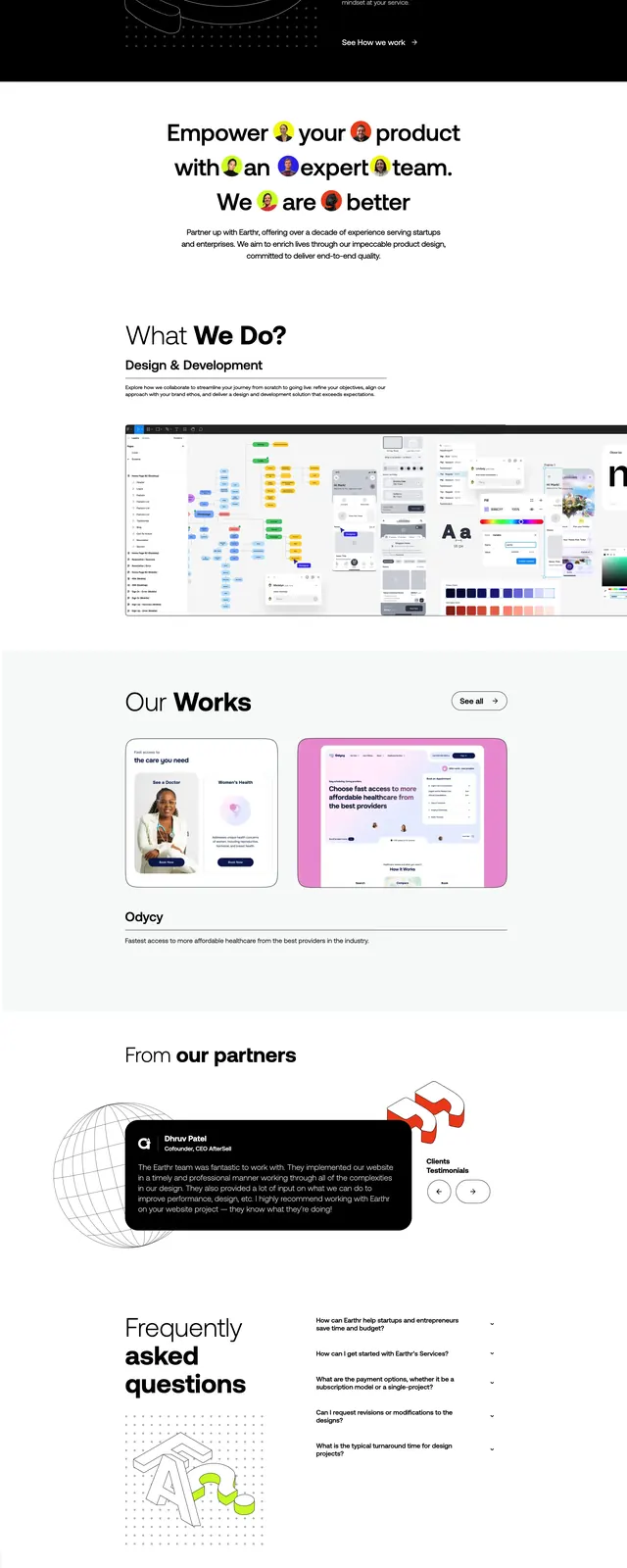
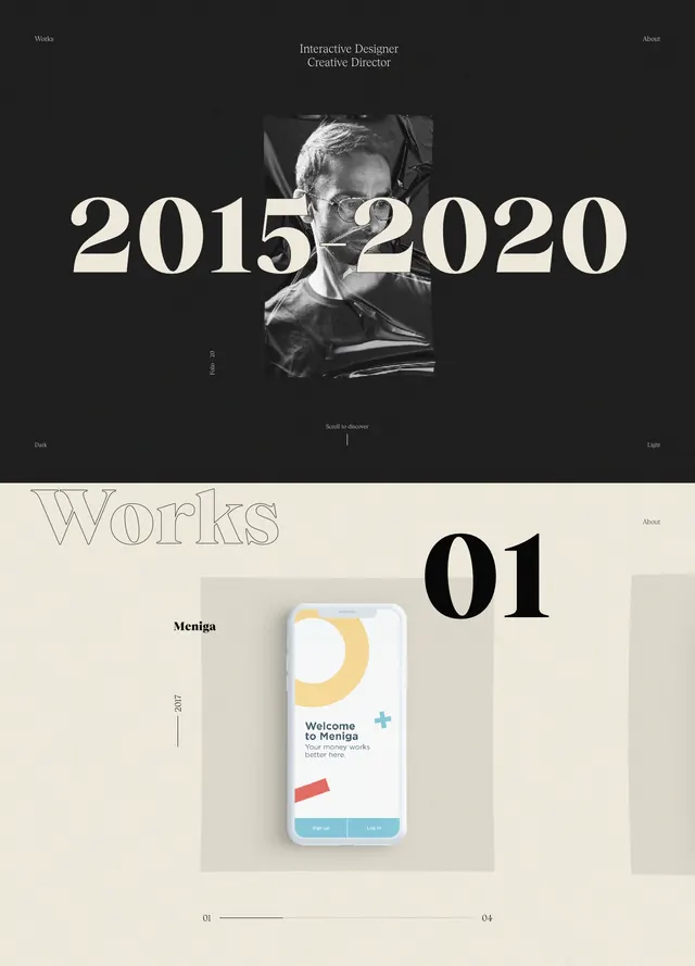
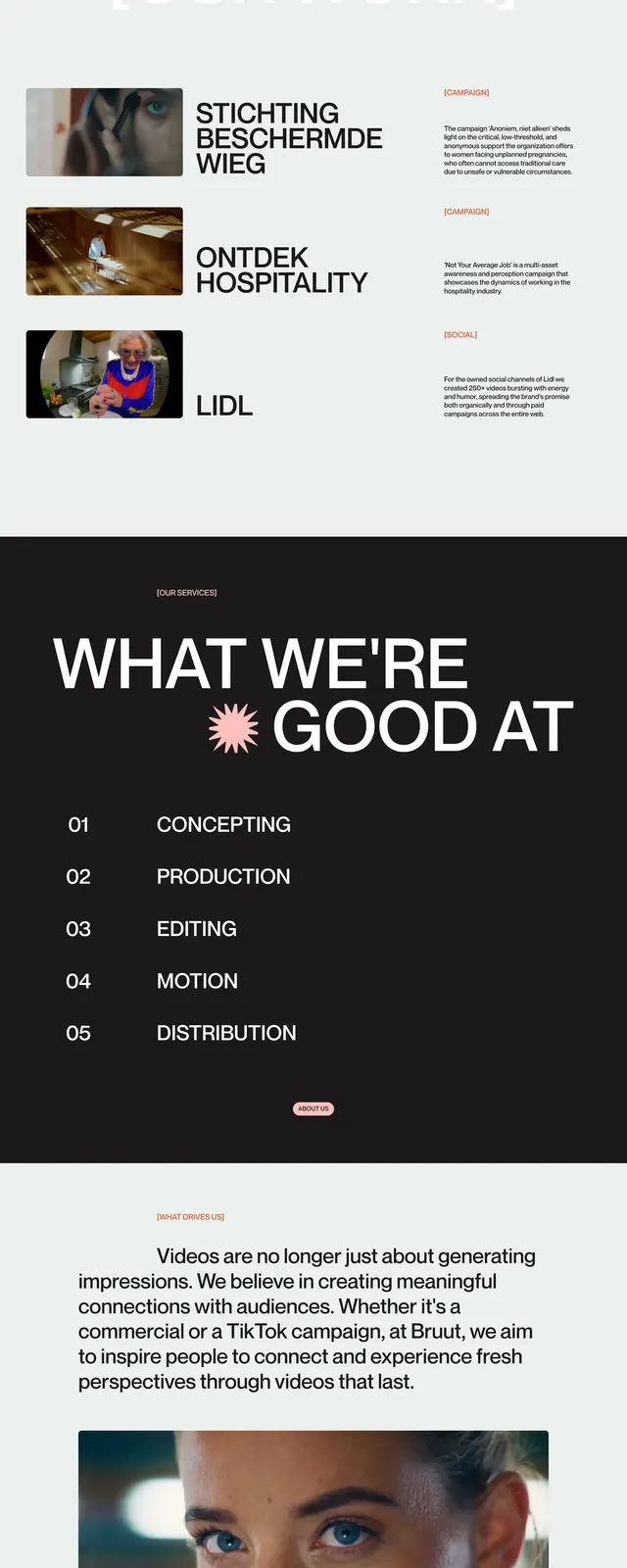
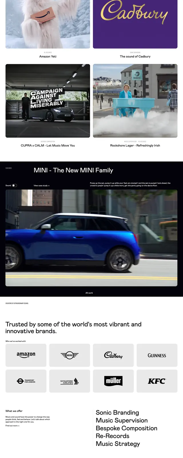
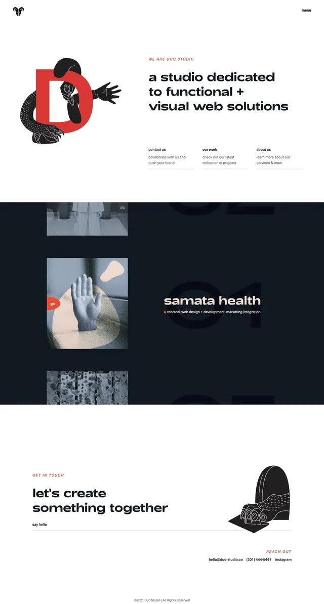
Minimal agency landing page with a white hero, bold oversized headline, illustrated brand mark, and dark portfolio sections below.
Summary
Minimal agency landing page with a white hero, bold oversized headline, illustrated brand mark, and dark portfolio sections below.
Visual description
The page opens on a white hero with a small logo at top left, a simple 'menu' label at top right, a large illustrated graphic on the left, and a bold three-line headline on the right. Under the headline are three small text links arranged in columns, each with a short label and brief supporting copy. Lower in the capture, the design alternates between dark full-width portfolio bands and white spacer sections, with stacked project imagery and a project title set against the dark background. The page ends with a wide contact CTA on white, featuring a large heading on the left, a small handwritten-style link line, and a decorative illustration on the right.
Key takeaway
The strongest idea is the contrast between airy white hero sections and dense dark portfolio bands. The oversized type, sparse navigation, and illustration-led branding make it feel distinctly agency-focused and memorable.
Reuse notes
Use this structure for agency homepages or creative studio sites that need a strong editorial first impression. It works best when paired with custom illustration or mascot-style branding and a simple portfolio grid below.