Preview image. Unlock full-res
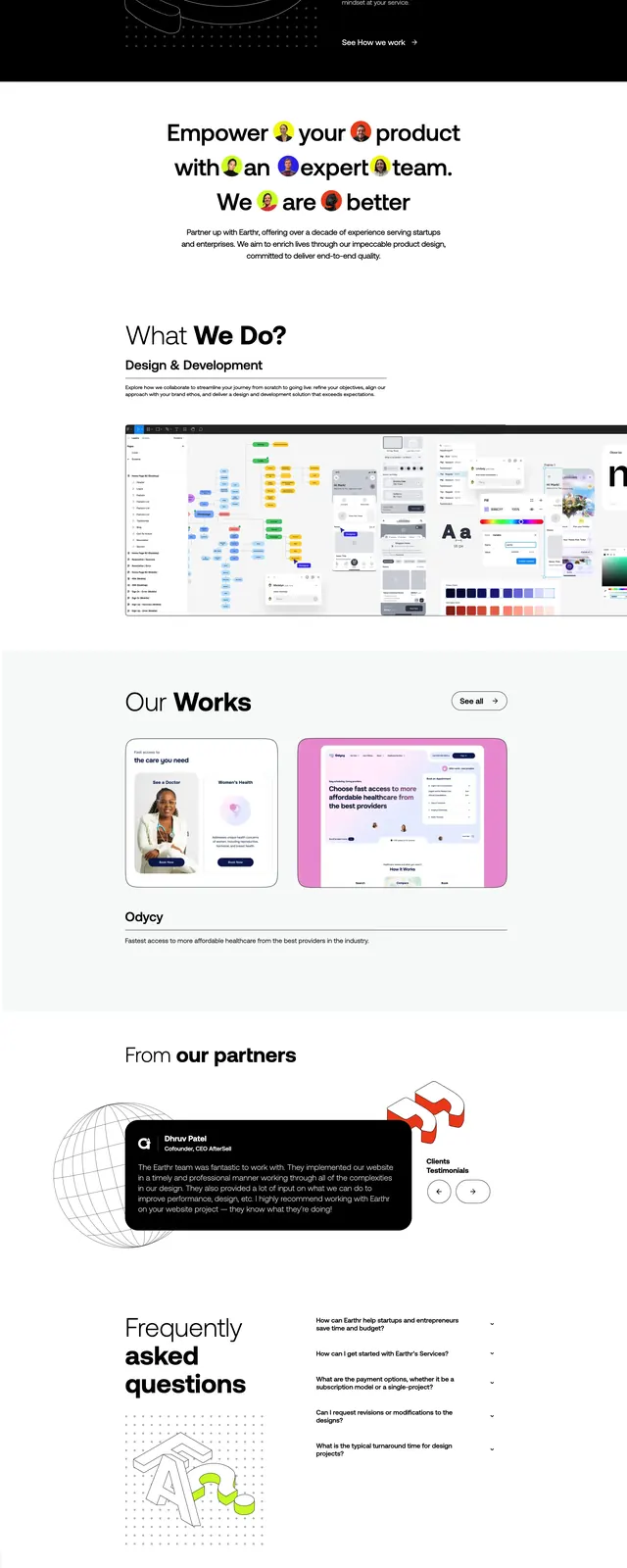
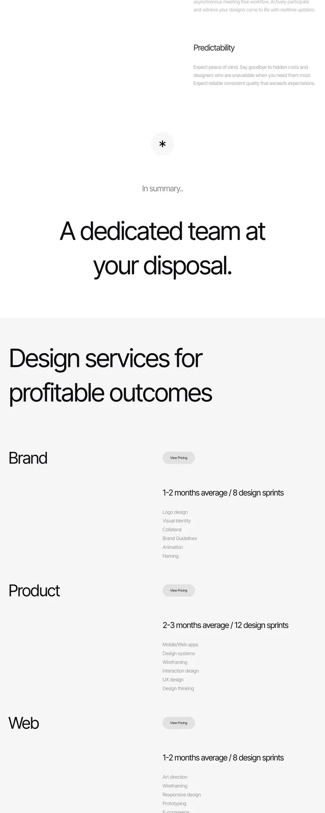
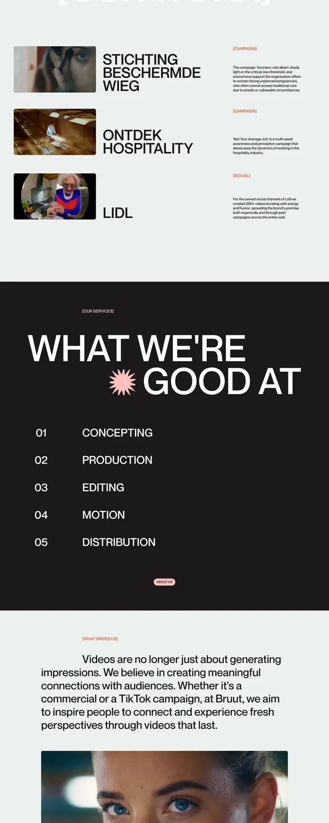
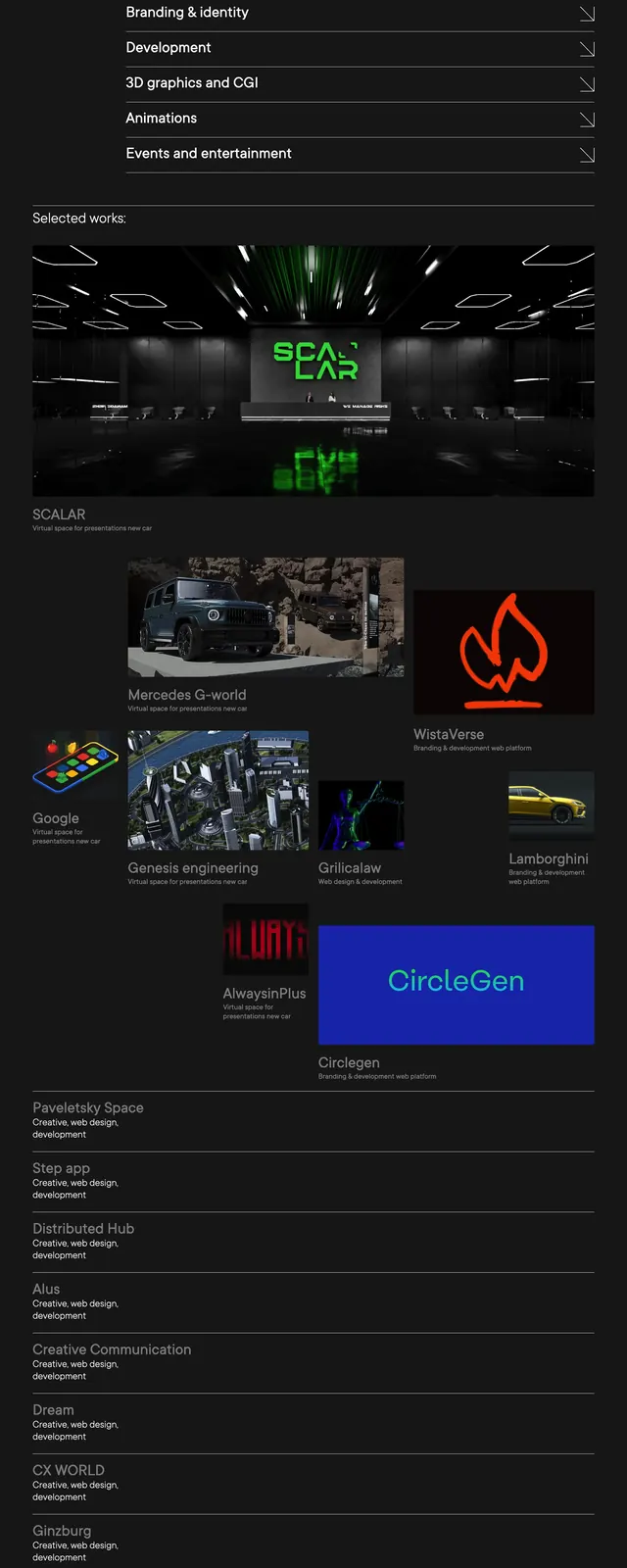
A sparse agency homepage with a black hero, oversized white headline, stacked case-study previews, client logos, and a simple closing CTA.
Summary
A sparse agency homepage with a black hero, oversized white headline, stacked case-study previews, client logos, and a simple closing CTA.
Visual description
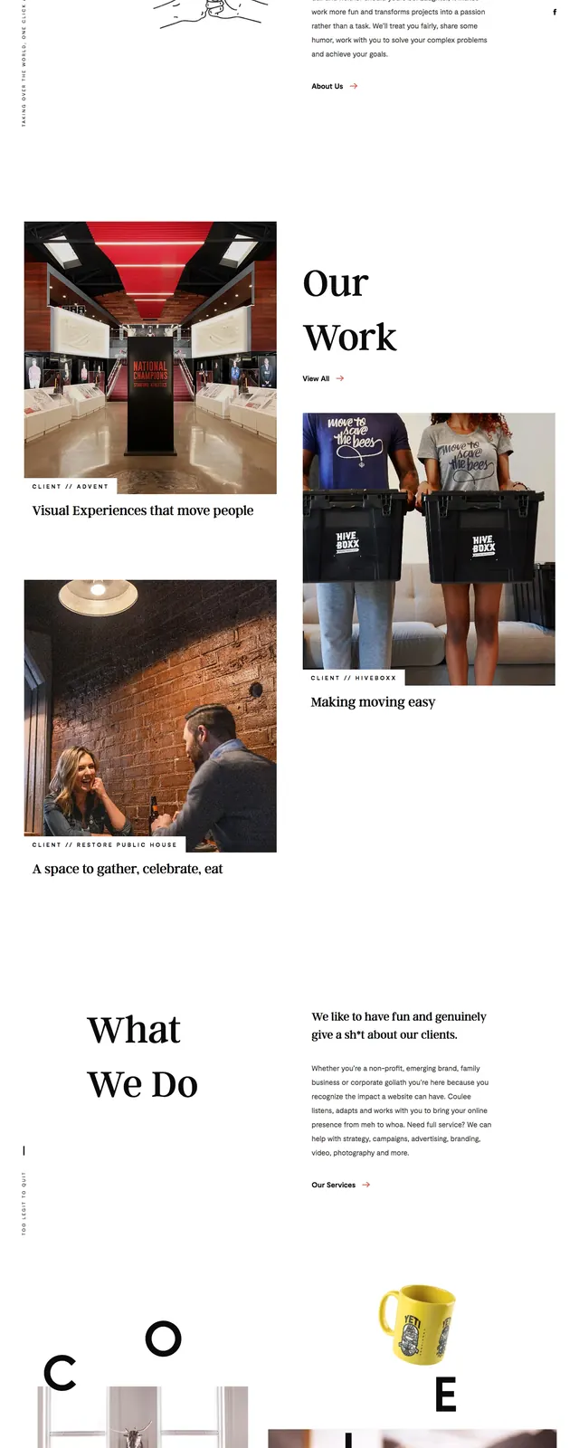
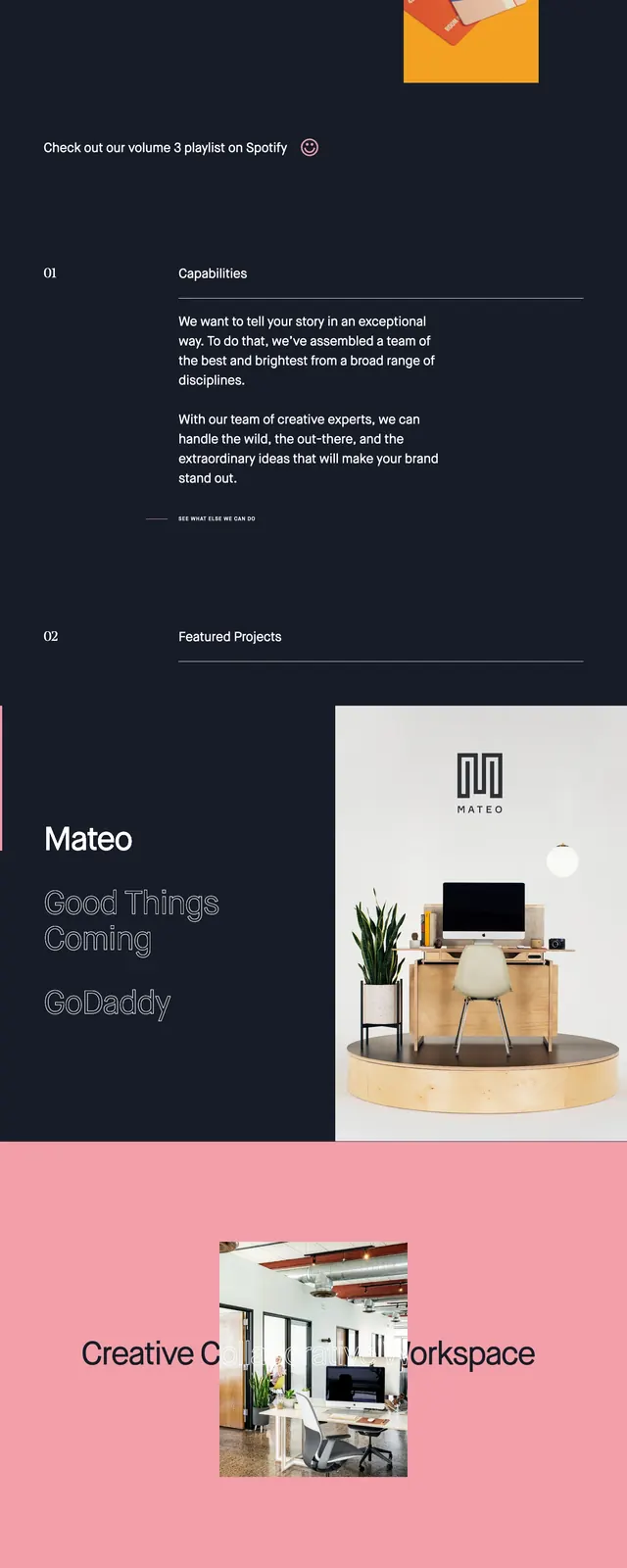
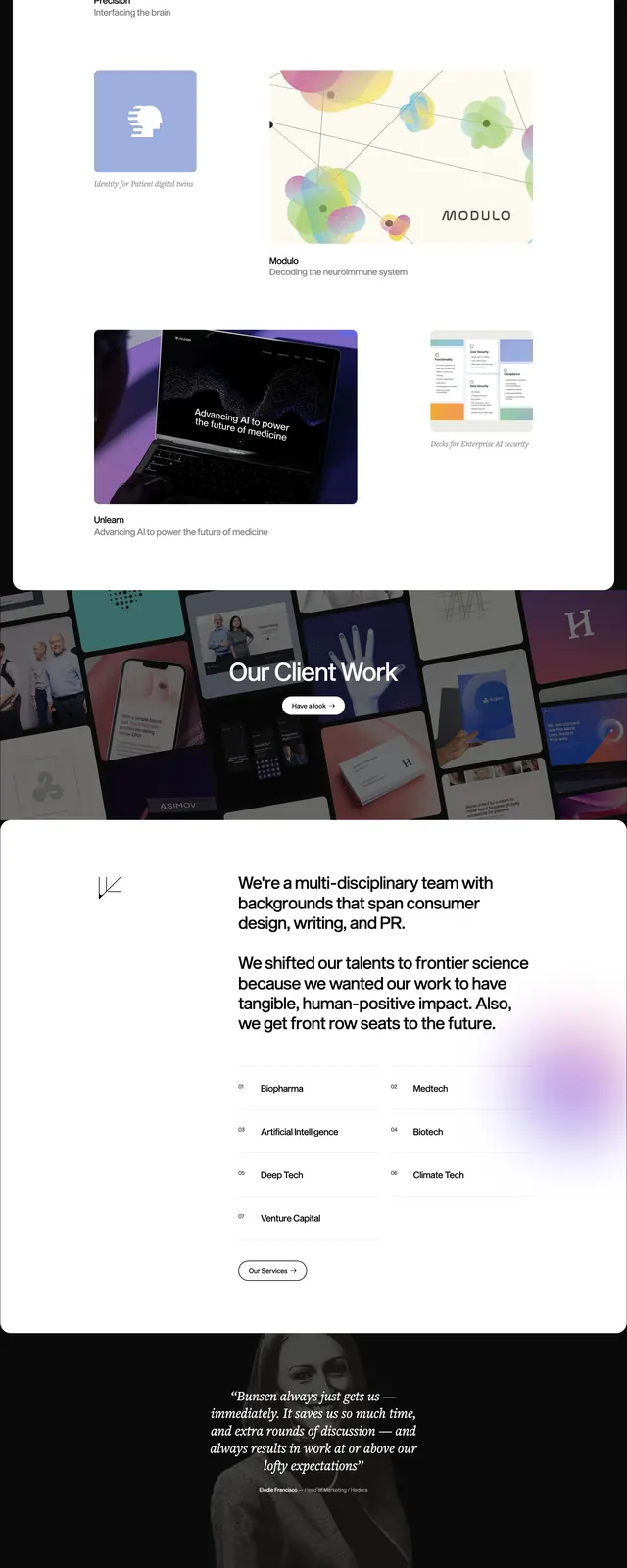
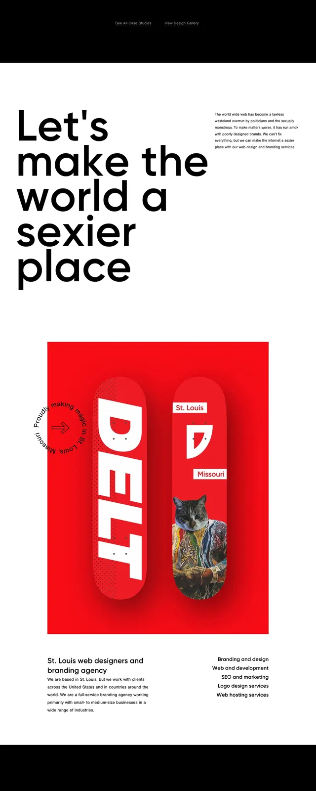
The page opens on a full black hero with a small wordmark in the top left, a tiny icon in the top right, and a large two-line headline aligned left. A narrow vertical "Explore" label and line sit beside the hero content, then a large white panel overlaps downward into the next section with a short intro line. Lower on the page are wide case-study cards with muted photography and overlaid titles, followed by a white client logo wall and a final black footer-style CTA area with contact and social icons.
Key takeaway
The strongest move is the extreme contrast between the empty black hero and the bright overlapping content blocks. The page feels premium by using very little UI chrome and letting typography and spacing do most of the work.
Reuse notes
Use this pattern for agency, studio, or portfolio sites that need a high-end editorial feel. It works best when you have strong case-study imagery and a short list of trusted clients or partners to display.