Preview image. Unlock full-res
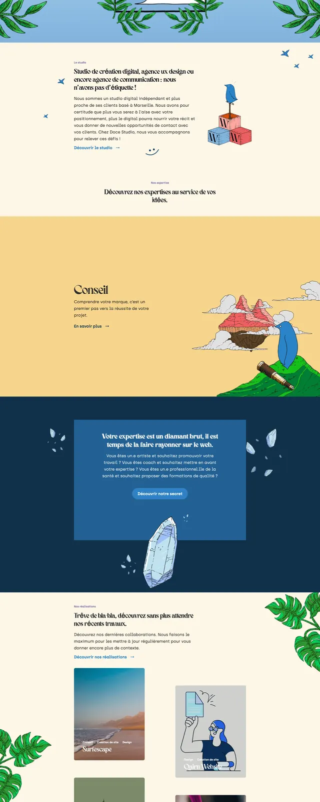
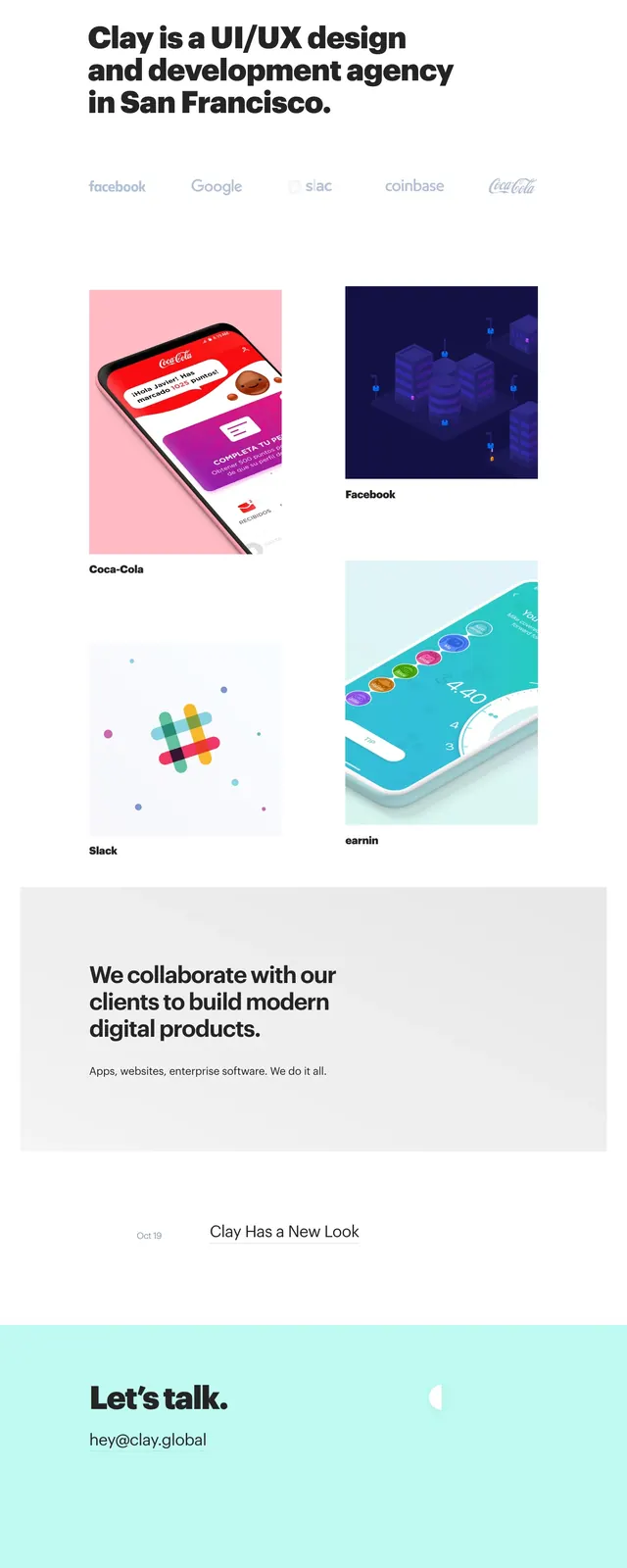
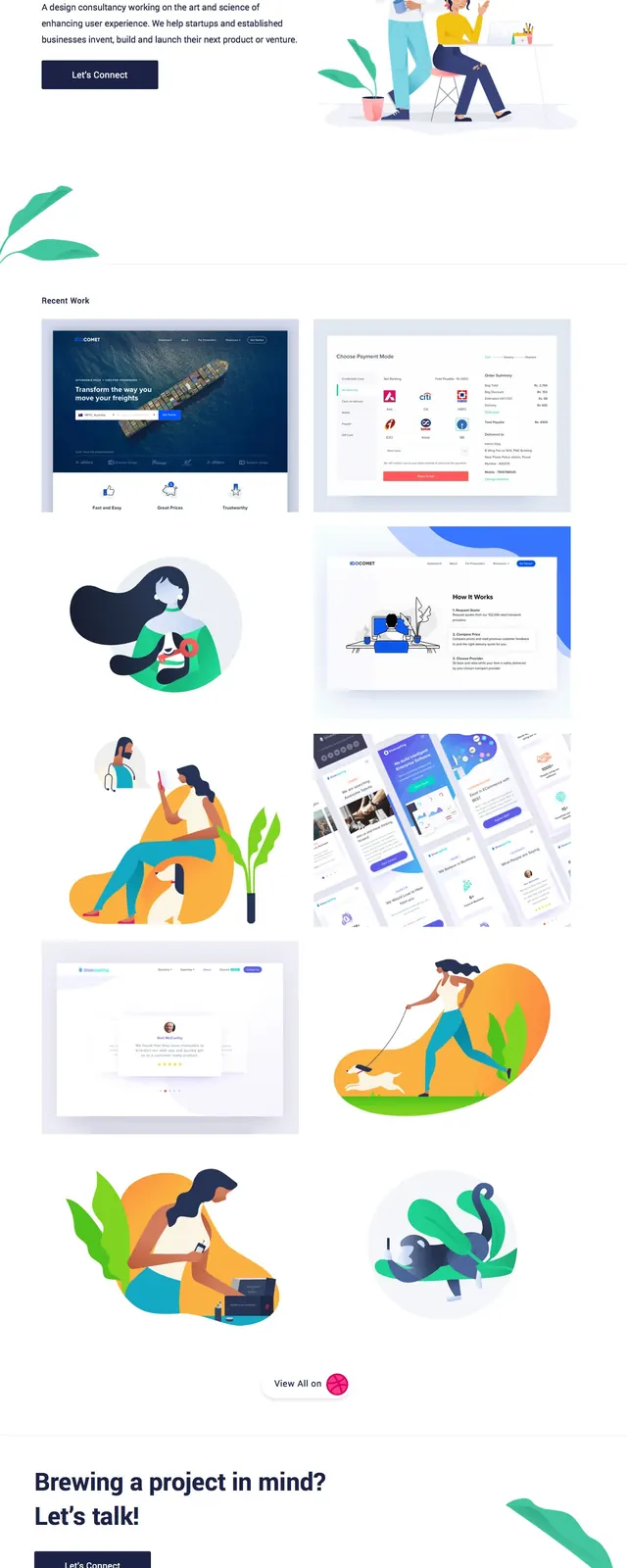
A bright agency landing page with a split hero, illustrated artwork, a masonry-style project gallery, and a simple contact CTA.
Summary
A bright agency landing page with a split hero, illustrated artwork, a masonry-style project gallery, and a simple contact CTA.
Visual description
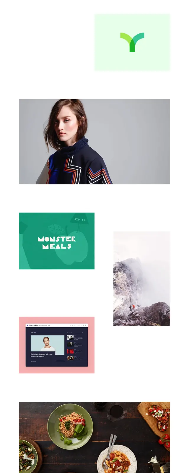
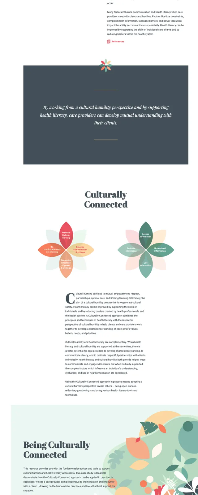
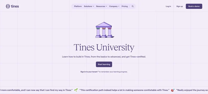
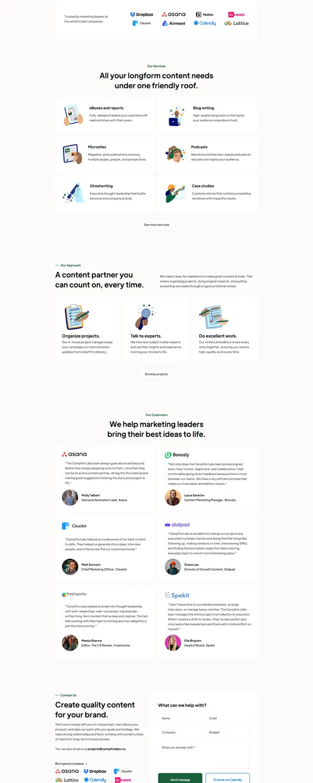
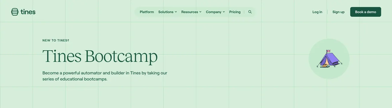
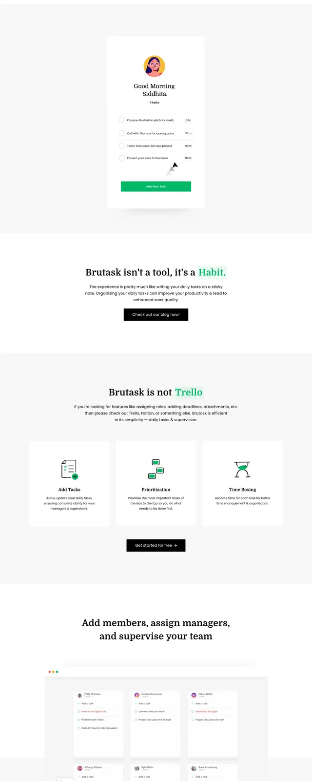
The page uses a very light, airy background with a top navigation bar and a split hero: headline, short paragraph, and primary button on the left, large illustrated character artwork on the right. Below the fold, a recent work section shows a loose masonry grid of portfolio thumbnails and illustrations with generous spacing between items. The page ends with a large contact CTA, another primary button, small social icons, and decorative leaf illustrations at the edges.
Key takeaway
The strongest pattern is the combination of generous white space with colorful flat illustrations, which keeps the page approachable while still feeling polished. The portfolio content is presented as a relaxed gallery rather than a rigid grid, making the page feel creative and editorial.
Reuse notes
Use this structure for agency or studio homepages that need to showcase work without feeling dense. It works best when the brand can support illustration-heavy visuals and a soft, minimal interface.