Preview image. Unlock full-res
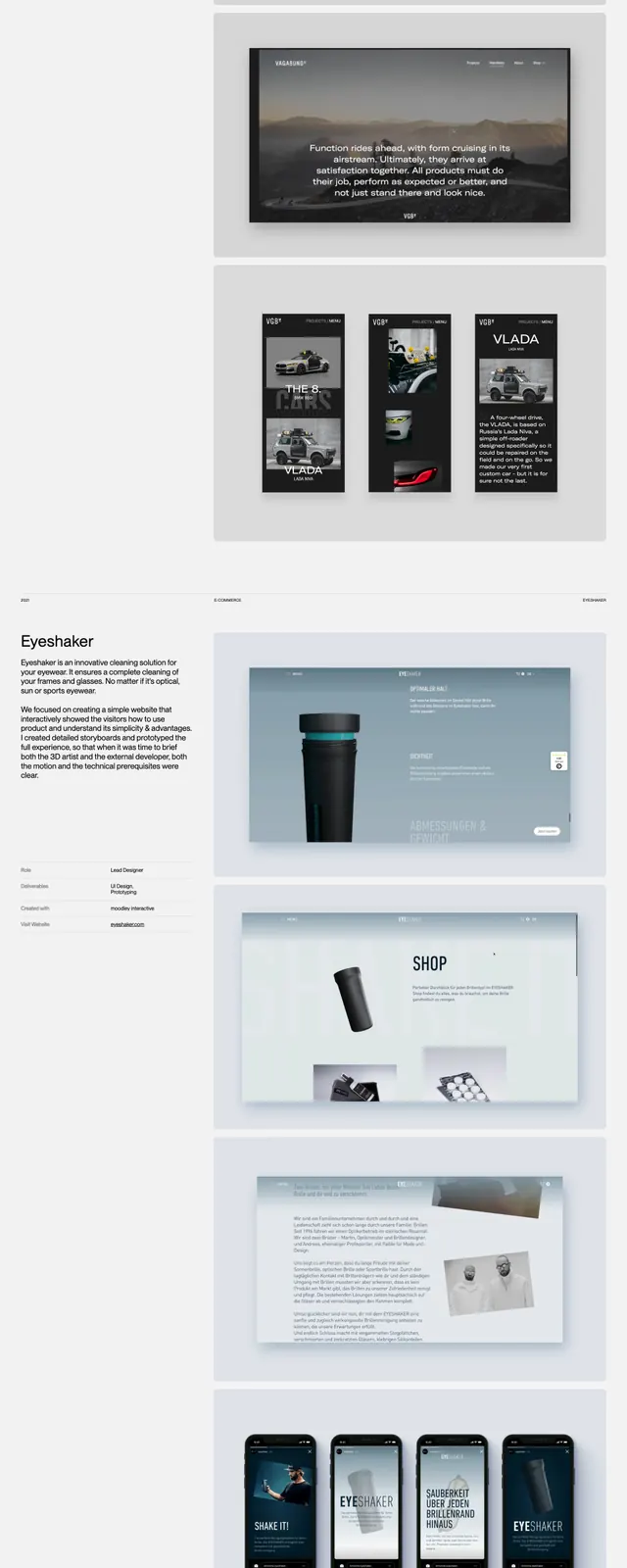
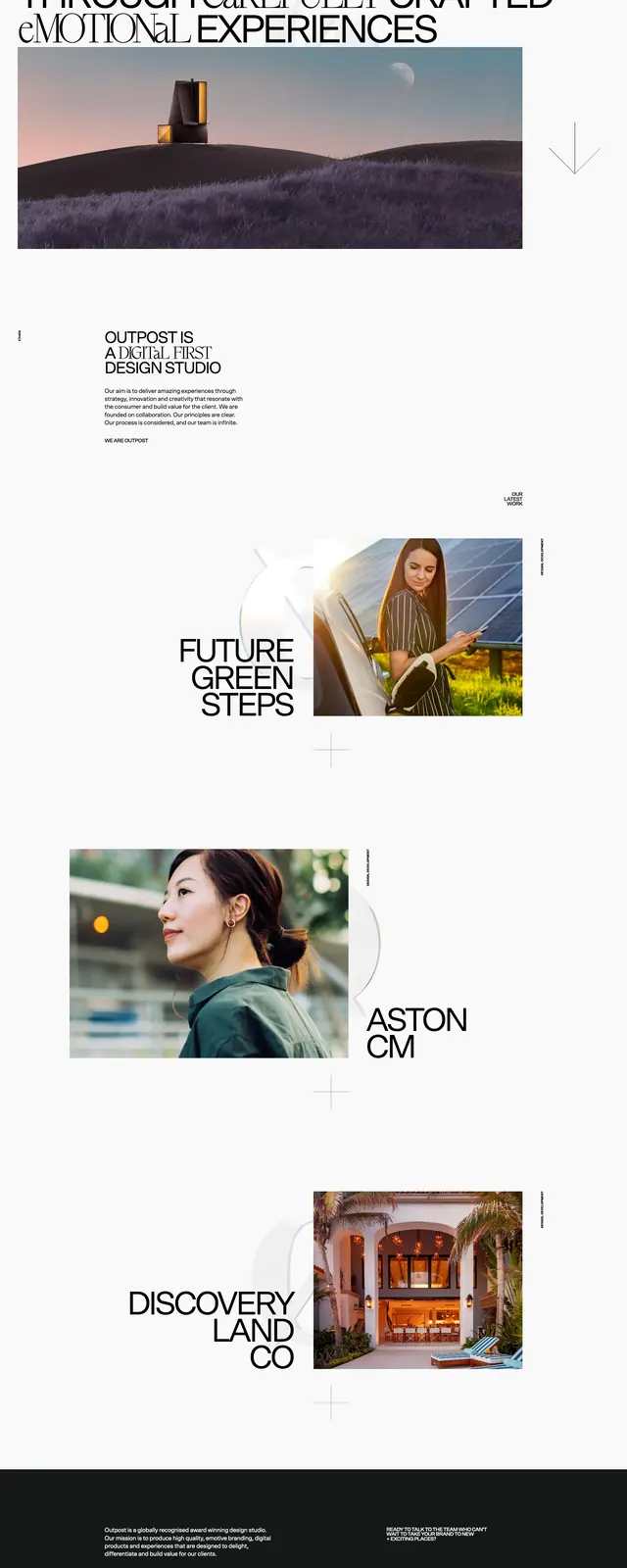
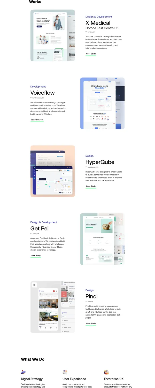
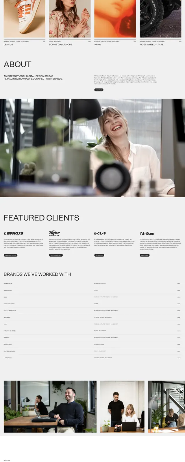
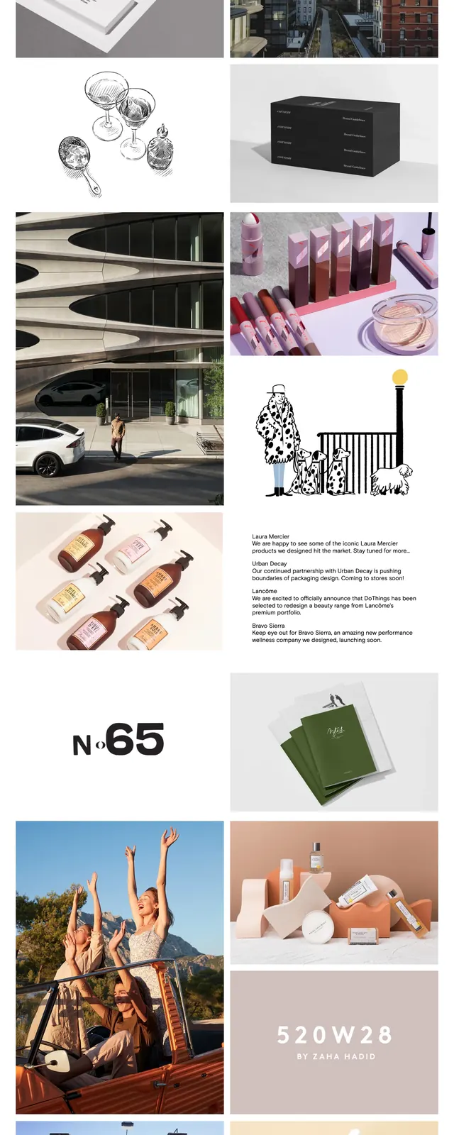
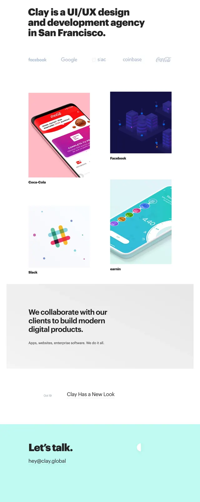
A clean agency homepage with oversized headline typography, client logos, portfolio tiles, and a soft pastel contact footer.
Summary
A clean agency homepage with oversized headline typography, client logos, portfolio tiles, and a soft pastel contact footer.
Visual description
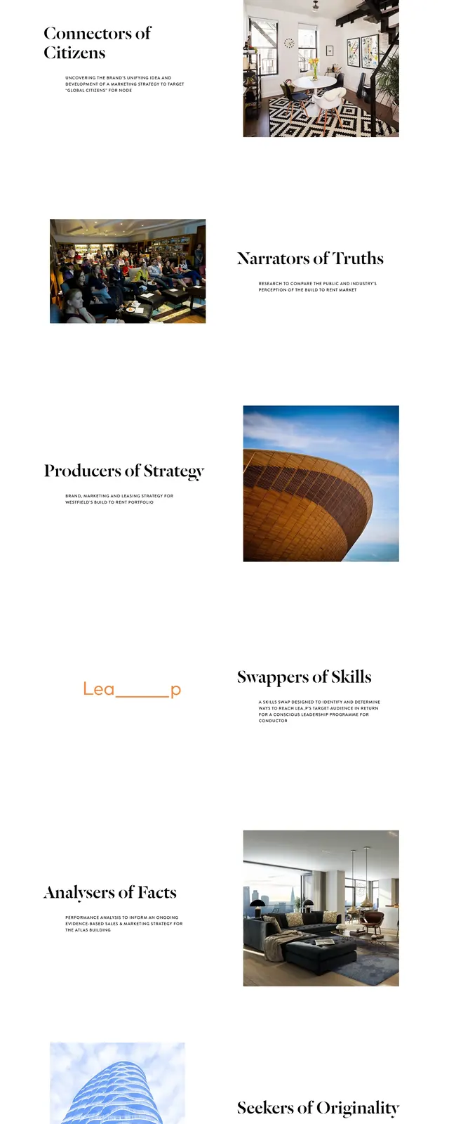
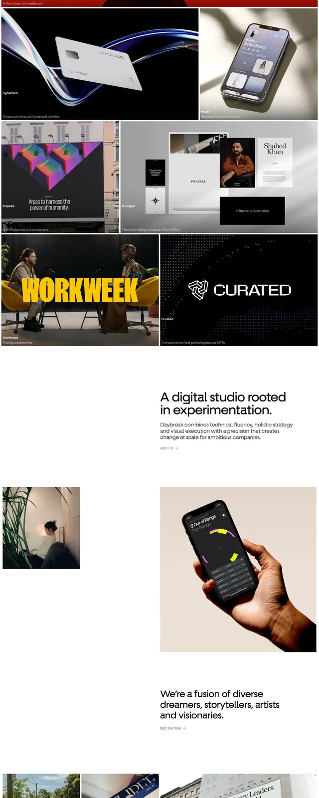
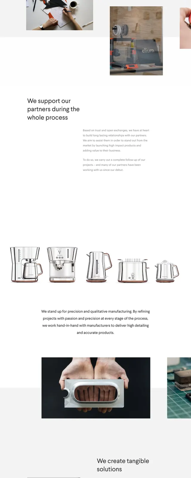
The page opens on a stark white hero with a small logo and email in the corners, followed by a large bold headline announcing the agency. A row of faint client logos sits beneath the hero copy, leading into a two-column portfolio grid with large visual project cards. Lower sections include a wide light-gray statement block and a mint-colored footer-style contact area with address and social links.
Key takeaway
The design relies on generous whitespace, heavy typography, and restrained color to keep the focus on positioning and work samples. It feels polished and minimal while still using soft accent tones in the portfolio and footer sections.
Reuse notes
Reuse this structure for agency or studio sites that need a strong first impression, client proof, and curated project highlights. The layout works well when the goal is to feel premium without adding visual clutter.