Preview image. Unlock full-res
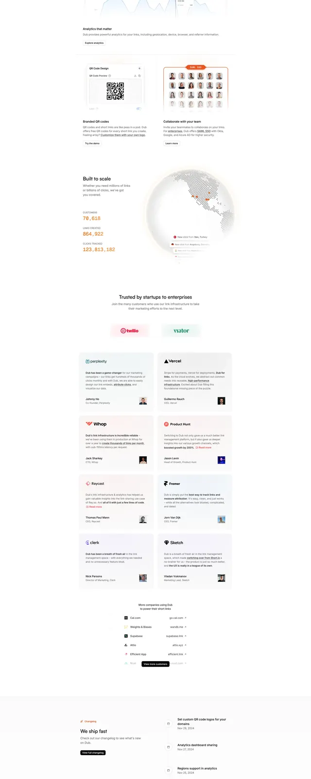
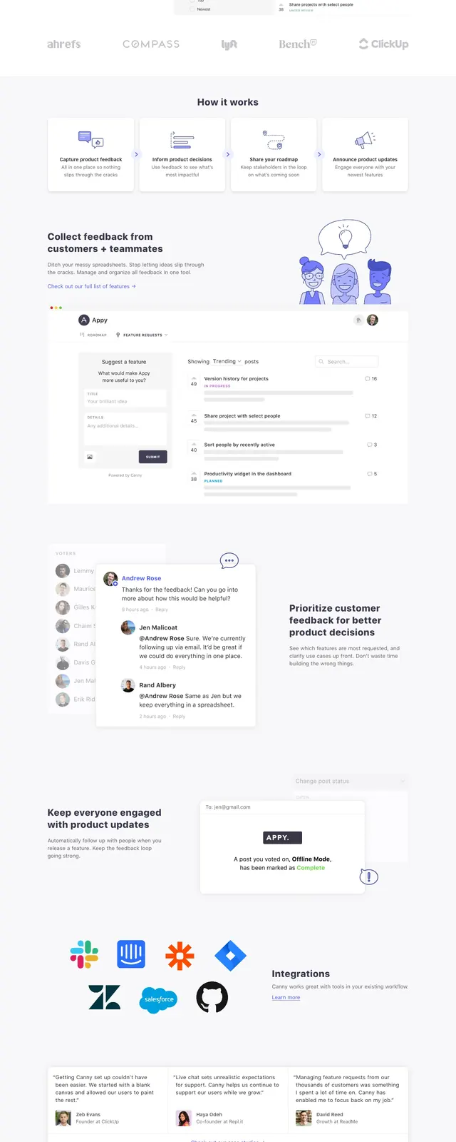
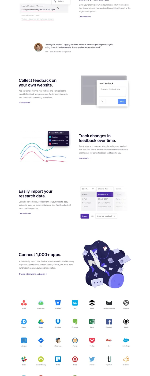
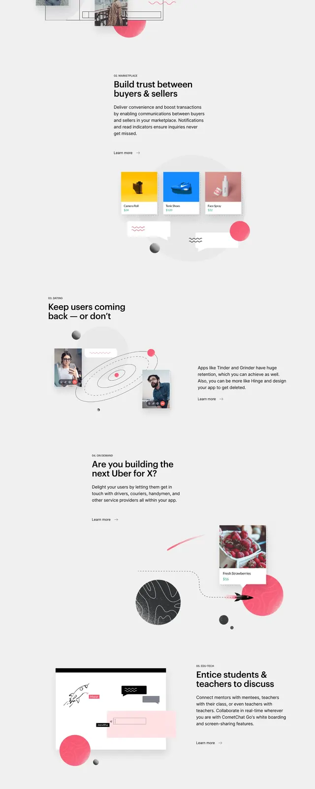
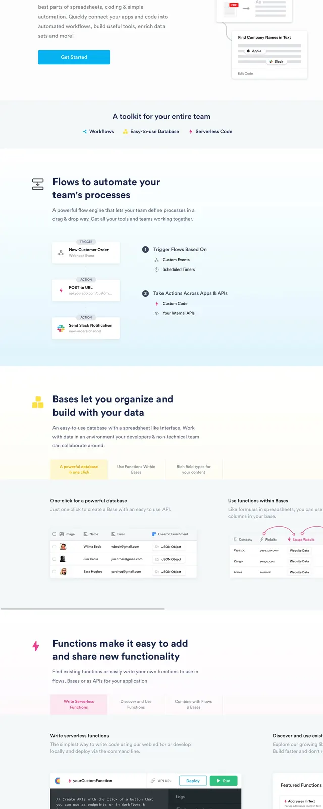
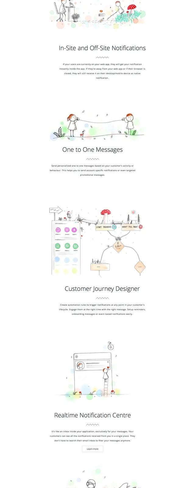
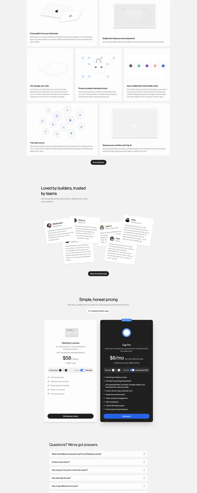
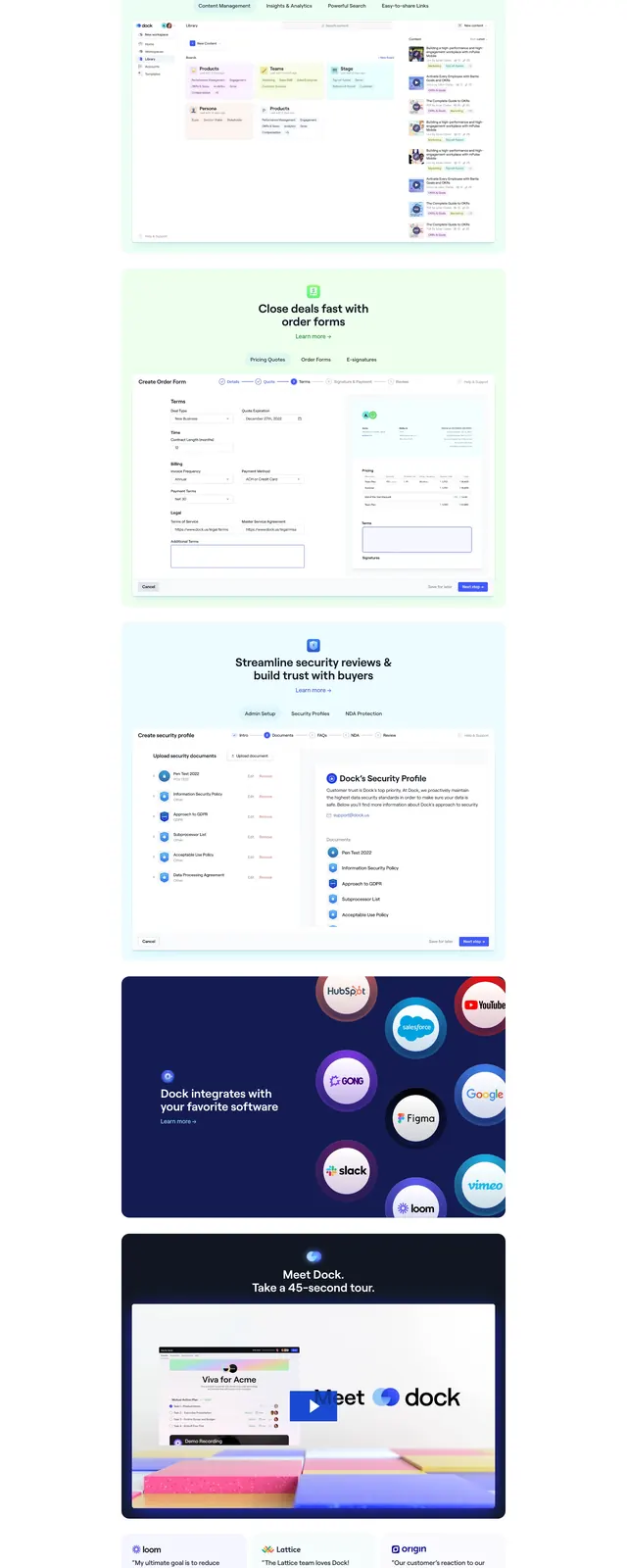
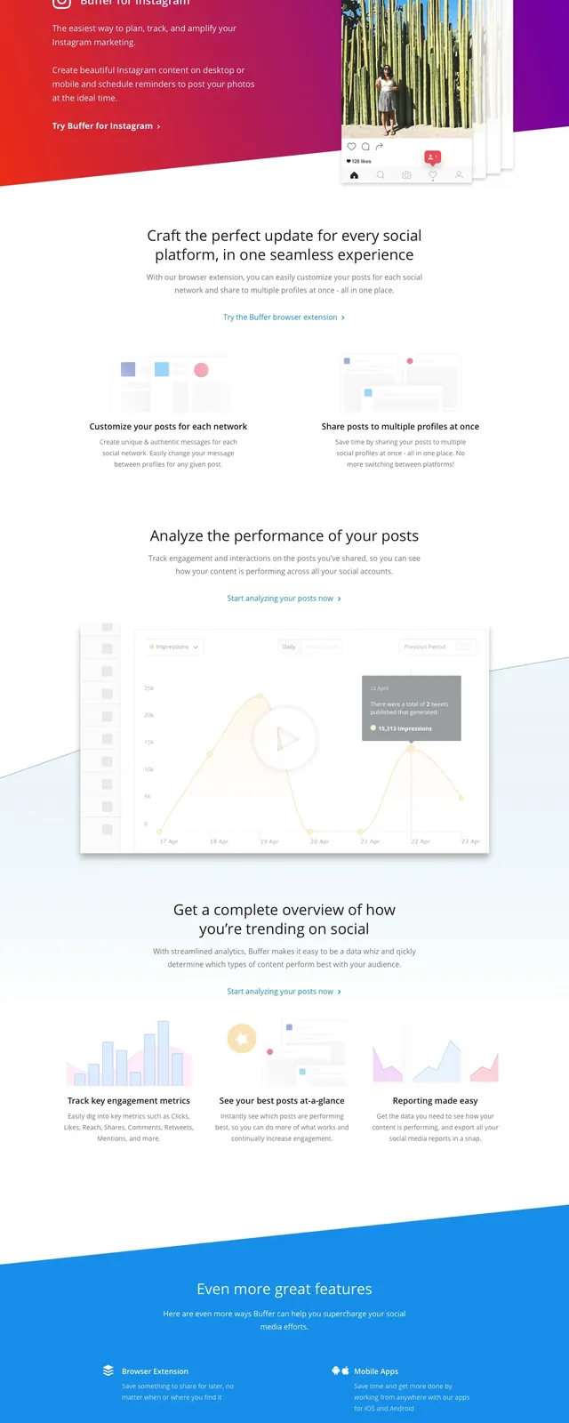
A clean Buffer landing page with a centered hero, social proof logos, feature explainer bands, and a simple three-tier pricing table.
Summary
A clean Buffer landing page with a centered hero, social proof logos, feature explainer bands, and a simple three-tier pricing table.
Visual description
The page opens with a thin top navigation bar, a small logo on the left, and two right-aligned action buttons. The hero is centered on a mostly white background with a large headline, short supporting copy, and a single blue primary CTA. Below the fold are a muted logo strip, a full-width blue feature band, a pale analytics section with a dashboard screenshot, and a boxed pricing table with three columns. The layout stays airy and minimal throughout, using lots of whitespace, light gray dividers, and restrained blue accents.
Key takeaway
The design relies on a simple centered hero plus strong whitespace to make the message feel easy to scan. Reusable patterns include the social-proof logo row, a bold colored feature band, and a straightforward pricing comparison block.
Reuse notes
Good reference for a lightweight SaaS homepage that needs to feel approachable and trustworthy. Works best when the product has clear social proof, a simple value proposition, and a compact pricing story.