Preview image. Unlock full-res
A minimal, image-led agency homepage with oversized typography, airy white space, and a grid of editorial content blocks.
Summary
A minimal, image-led agency homepage with oversized typography, airy white space, and a grid of editorial content blocks.
Visual description
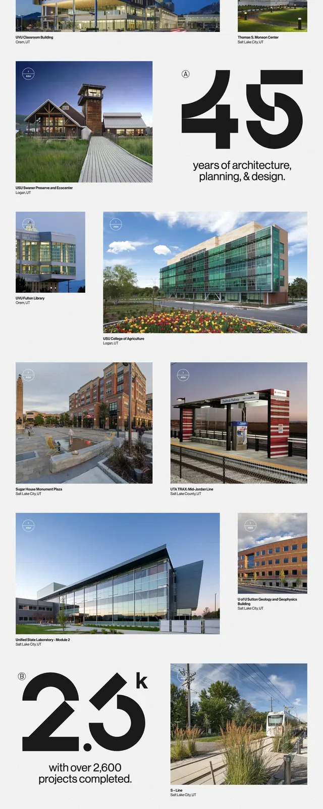
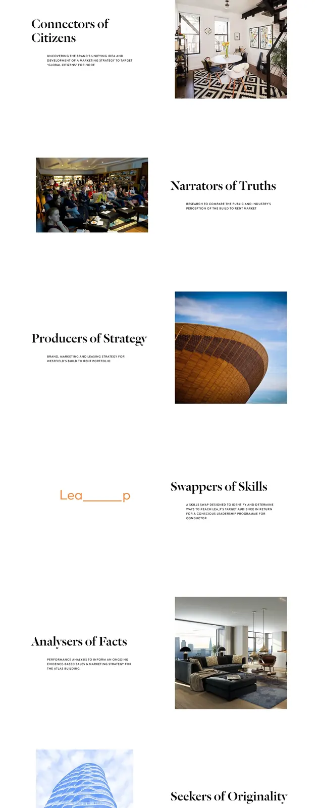
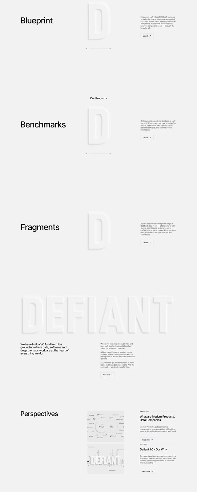
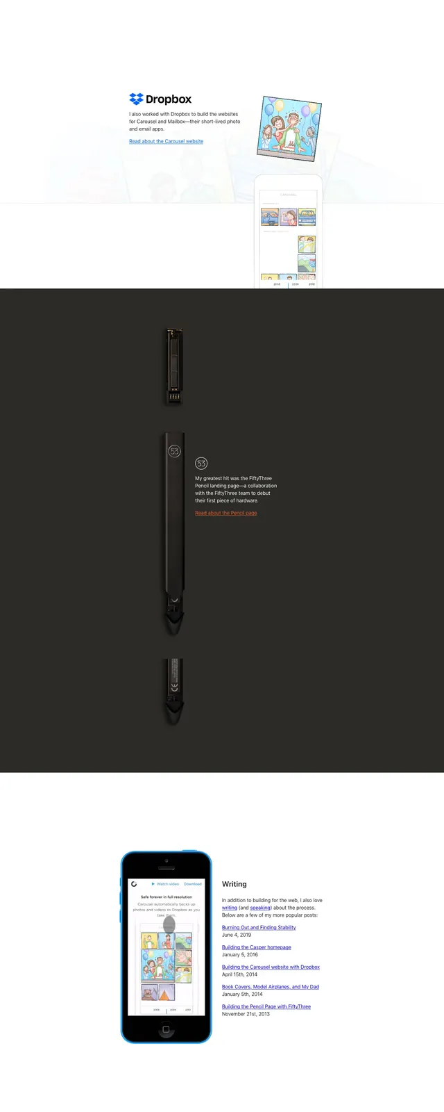
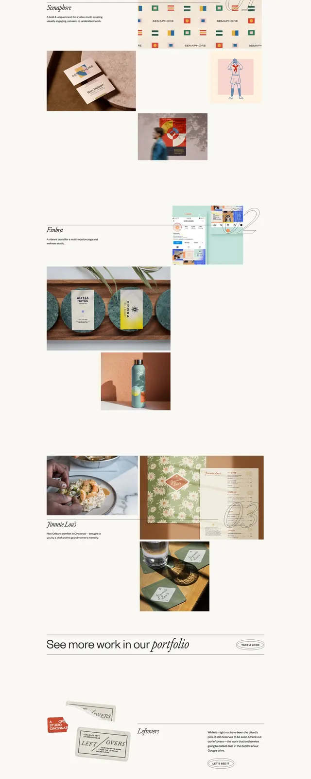
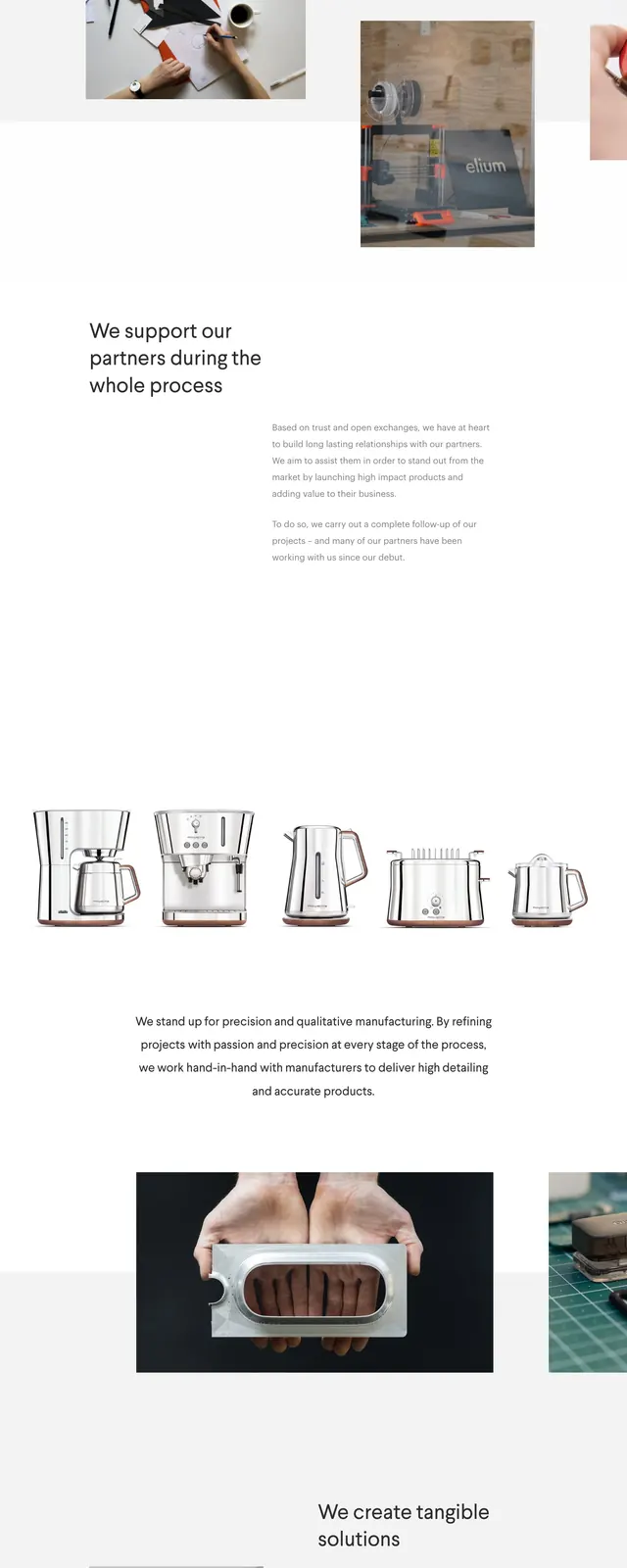
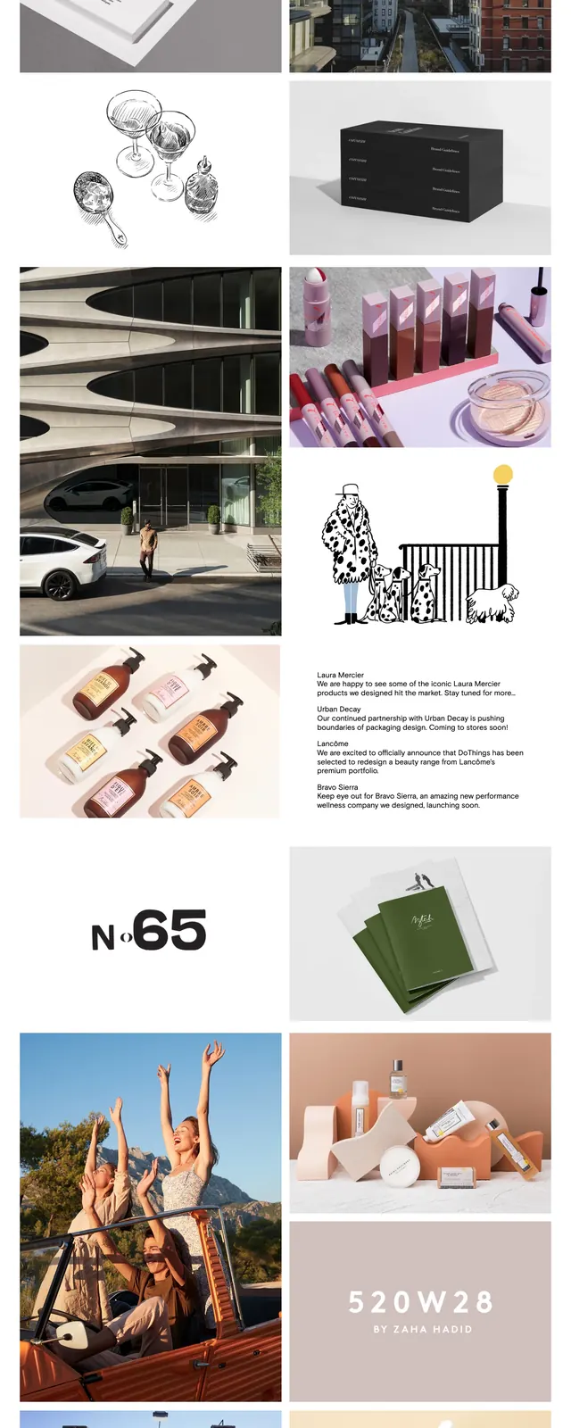
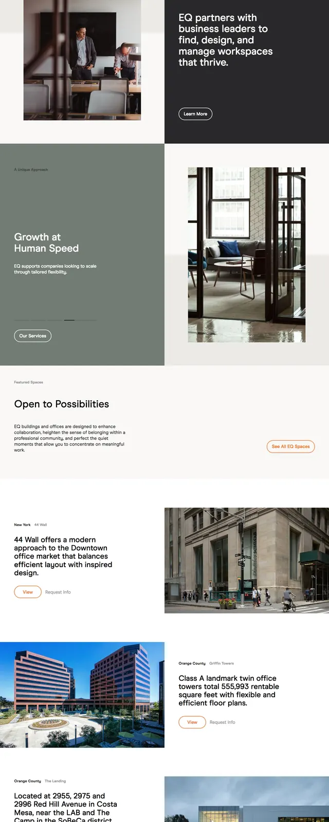
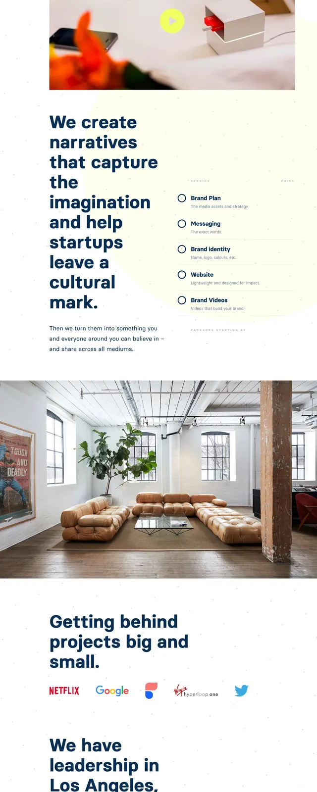
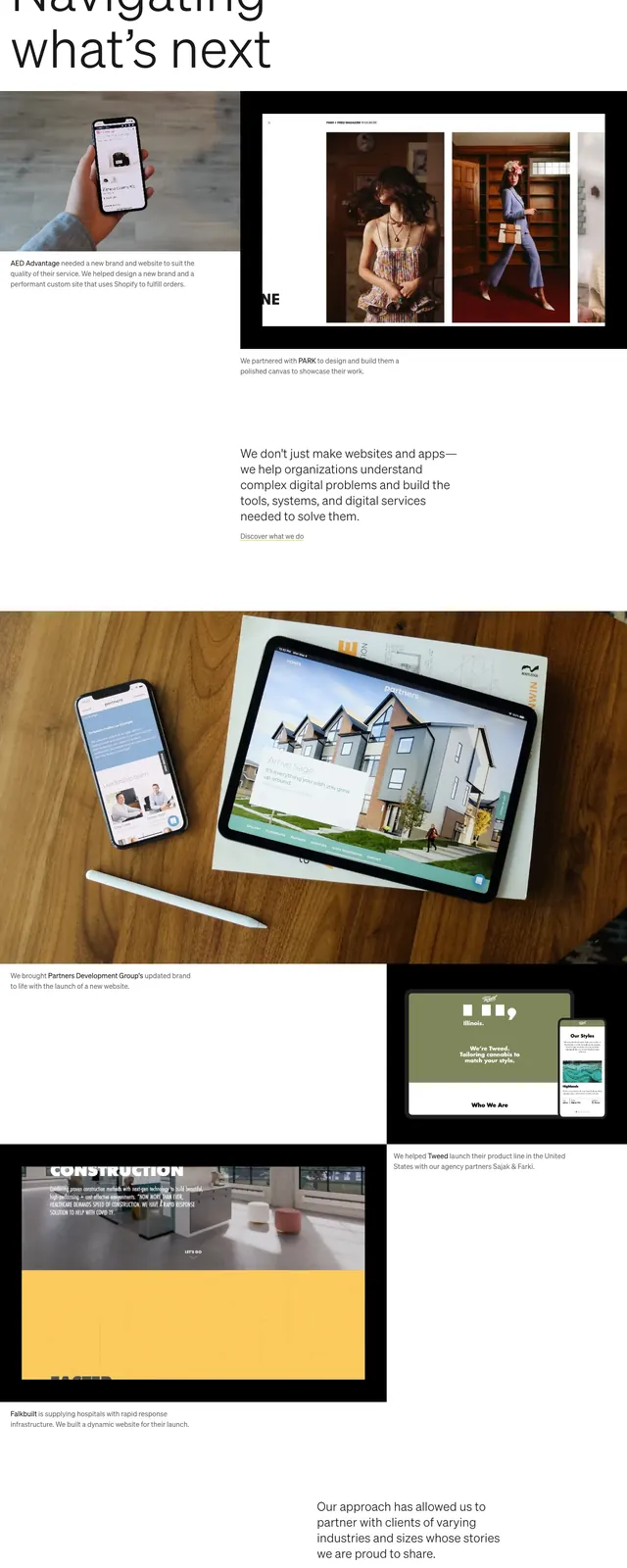
The page opens with a full-width hero image of an office scene overlaid with subtle navigation and four large text links. Below, a large typographic intro sits in a mostly white layout, followed by an oversized project showcase image and a small supporting content block. Farther down, a row of editorial-style article or project cards appears in a four-column grid, ending with a very large 'Who we are' section and a sparse footer with contact links.
Key takeaway
This design relies on strong photography, restrained navigation, and generous negative space to feel premium and considered. The oversized headings and sparse grid make it easy to adapt for agency, studio, or consultancy portfolios.
Reuse notes
Reuse the full-bleed hero plus understated overlay nav for a strong first impression. The large text blocks and modular card grid are well suited to case studies, team stories, or journal entries.