Preview image. Unlock full-res
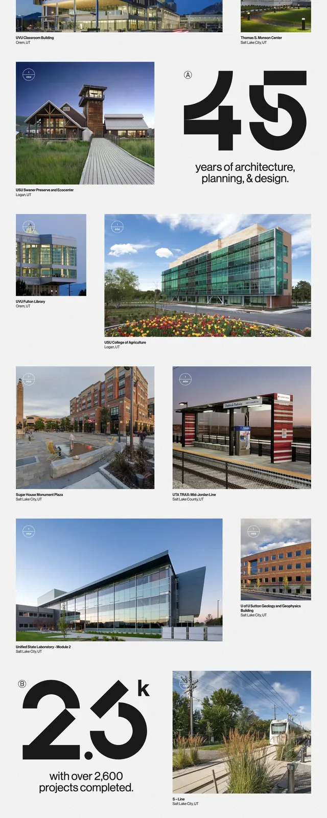
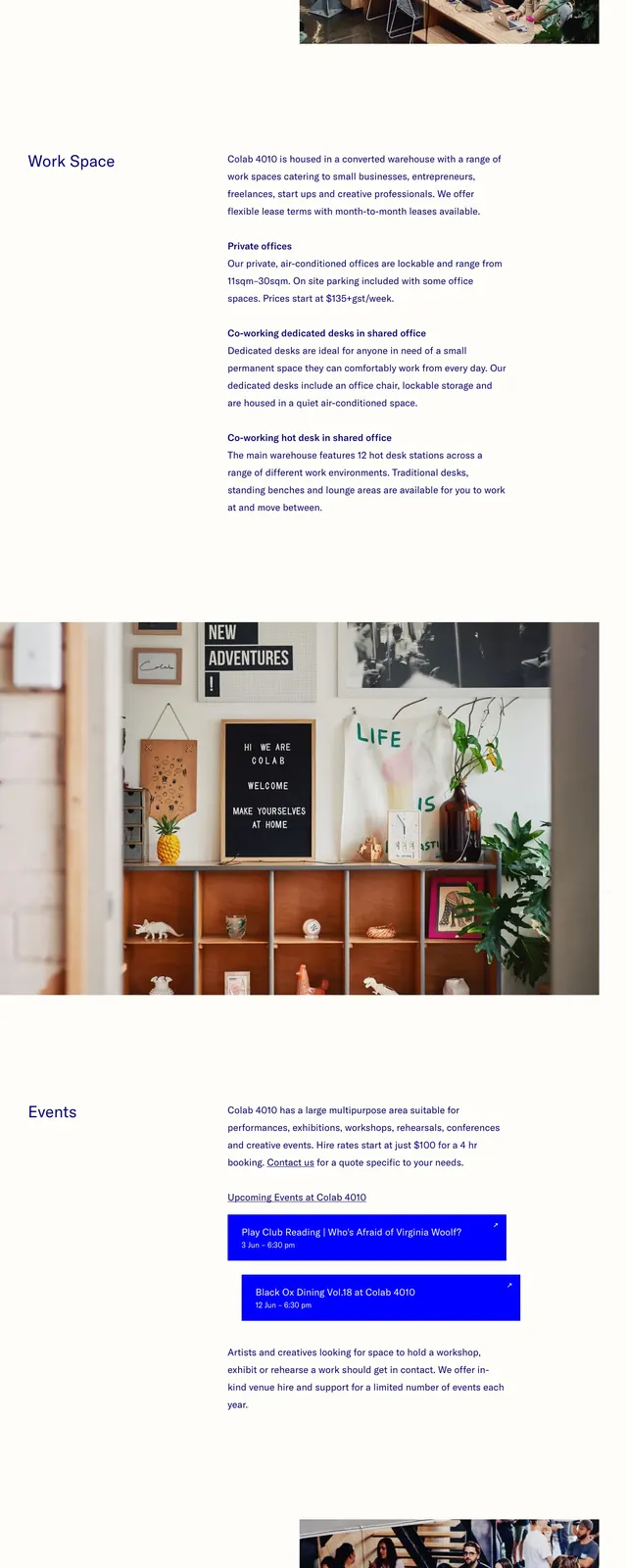
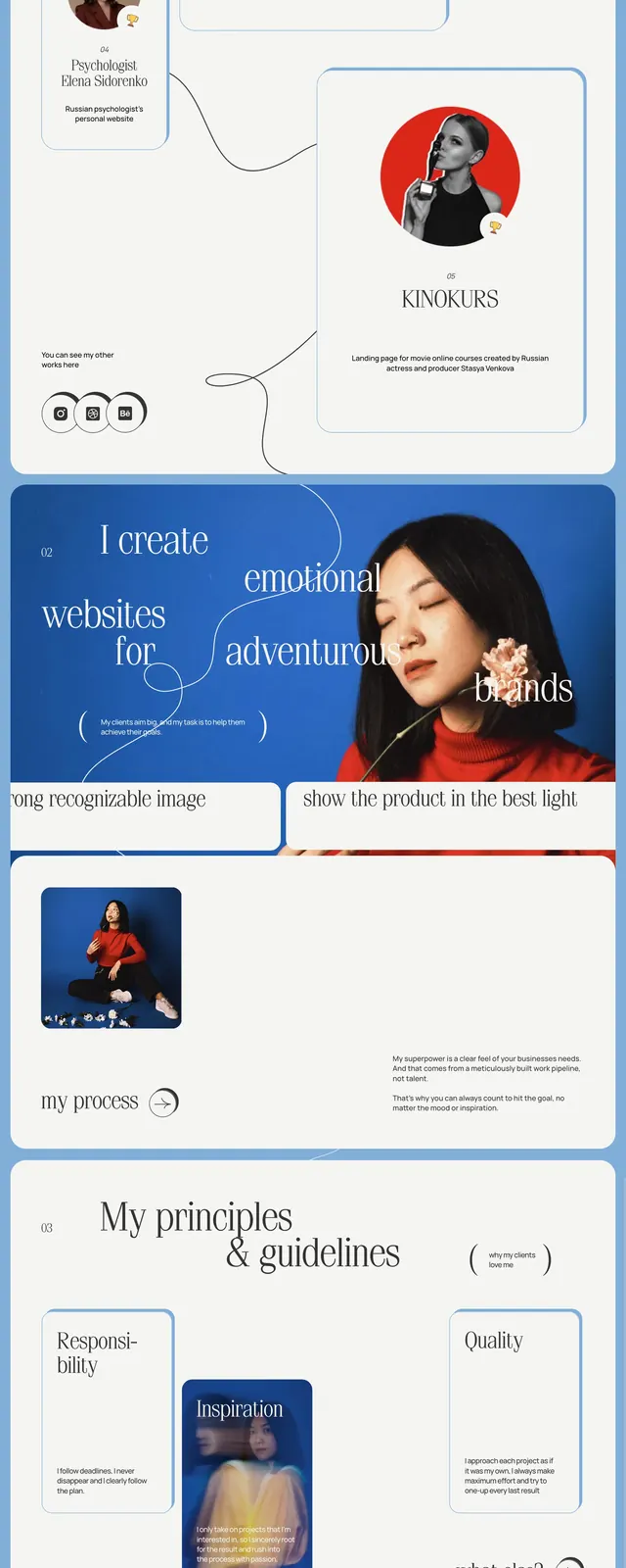
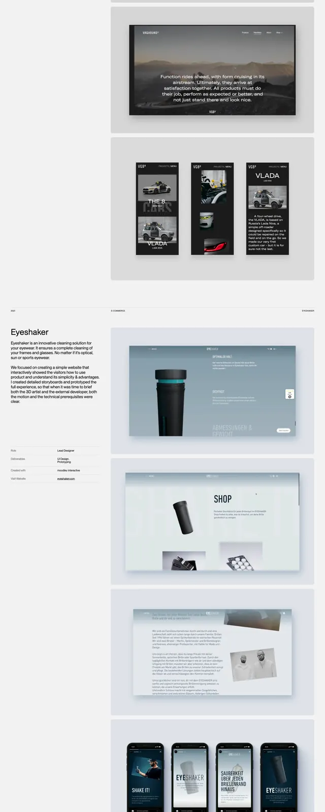
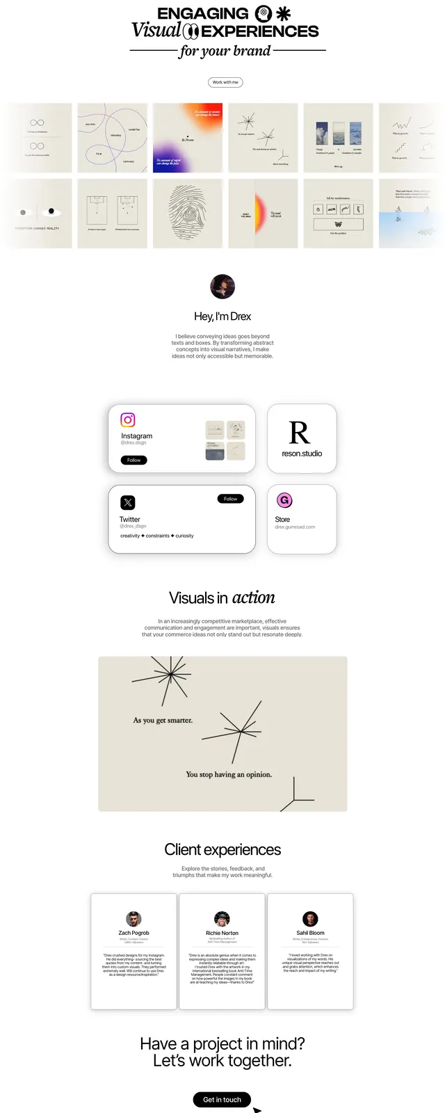
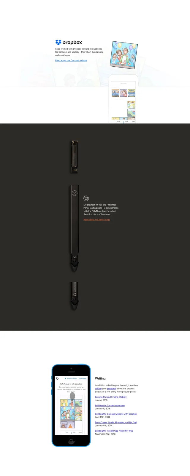
A sparse personal portfolio page uses large white space, simple navigation, and bold visual case-study blocks to present work and writing.
Summary
A sparse personal portfolio page uses large white space, simple navigation, and bold visual case-study blocks to present work and writing.
Visual description
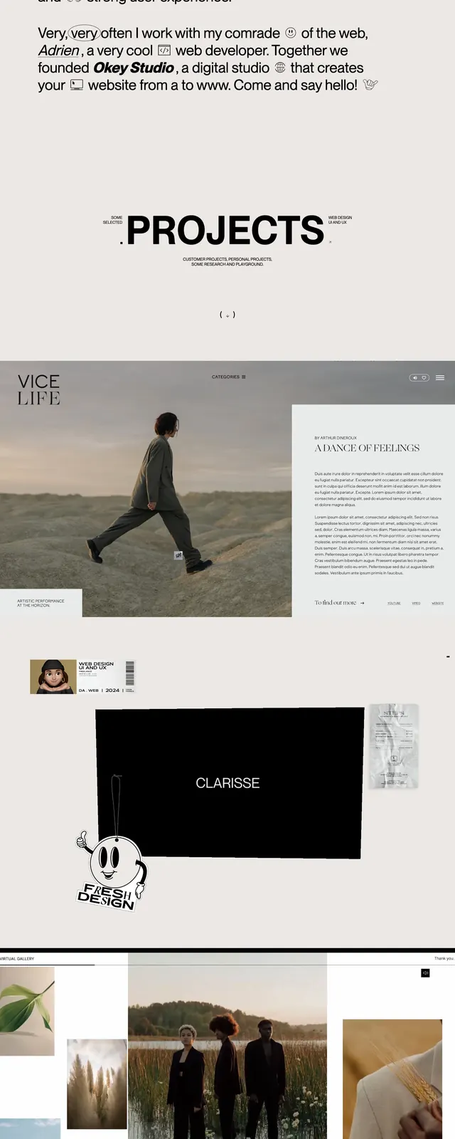
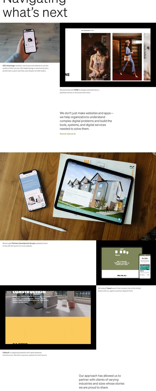
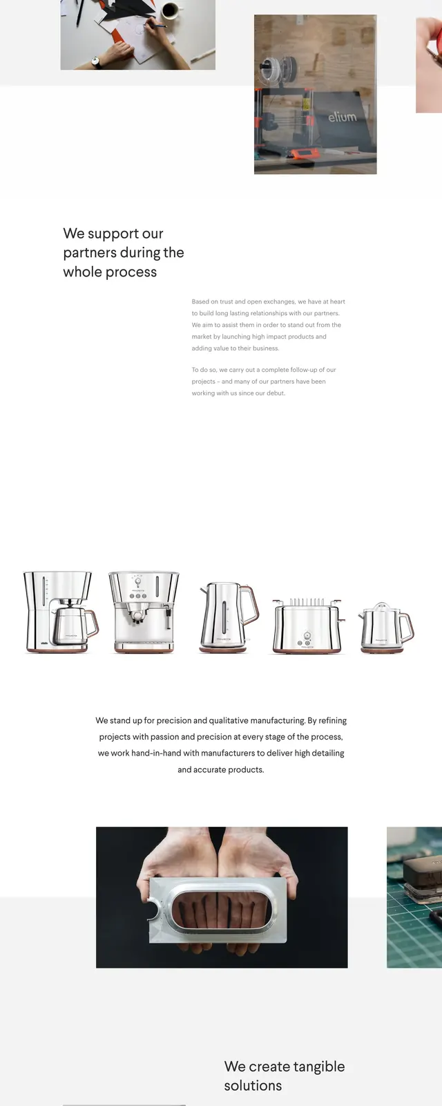
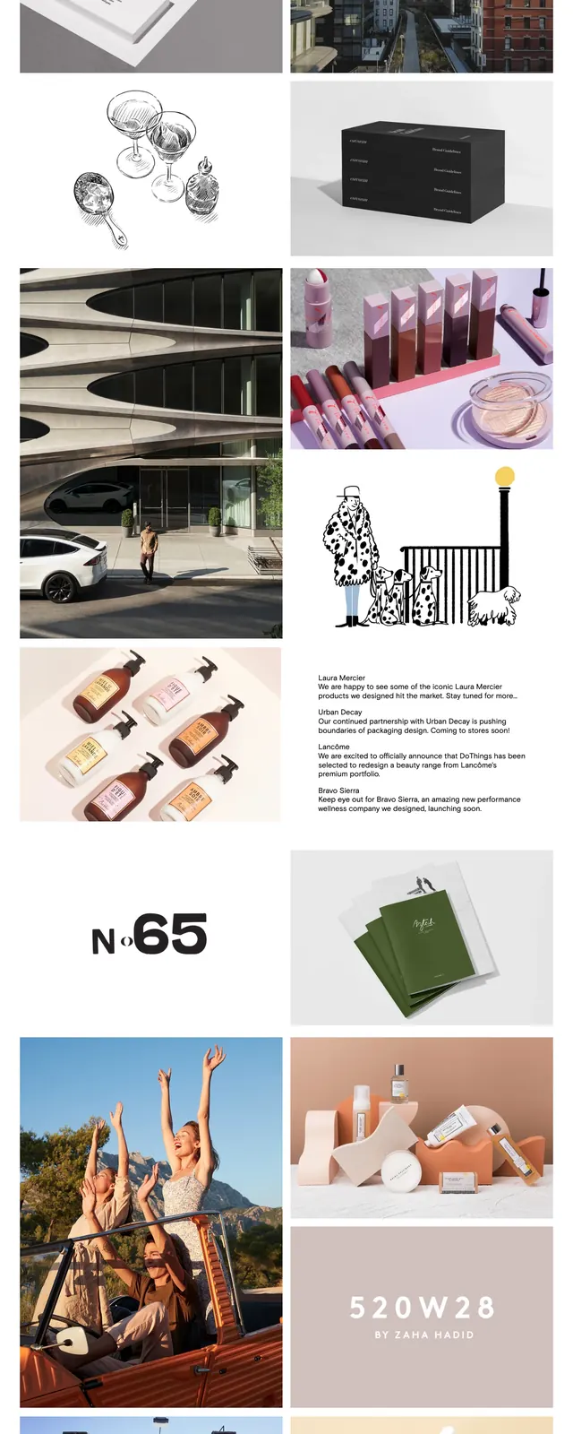
The page opens with a centered personal intro on a white background, a small square logo at top left, and simple text links aligned in the header. Below, large full-width case-study sections stack vertically with strong color-blocked imagery, including a Stripe project panel, a dark hardware-focused section, and a green image strip. The lower portion returns to a minimal white layout with short contact and blog links in a compact text block.
Key takeaway
The design relies on restraint, spacing, and a few large visual moments rather than dense navigation or heavy UI chrome. It feels like a designer-developer portfolio that foregrounds work samples and writing with an understated editorial tone.
Reuse notes
Reuse the structure for a personal portfolio or creative studio site: minimal header, concise intro, then oversized project slices with brief captions. The approach works best when each section has one strong visual and a short explanatory paragraph.