Preview image. Unlock full-res
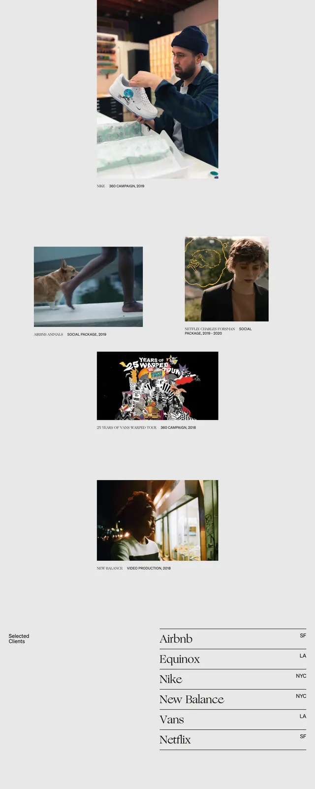
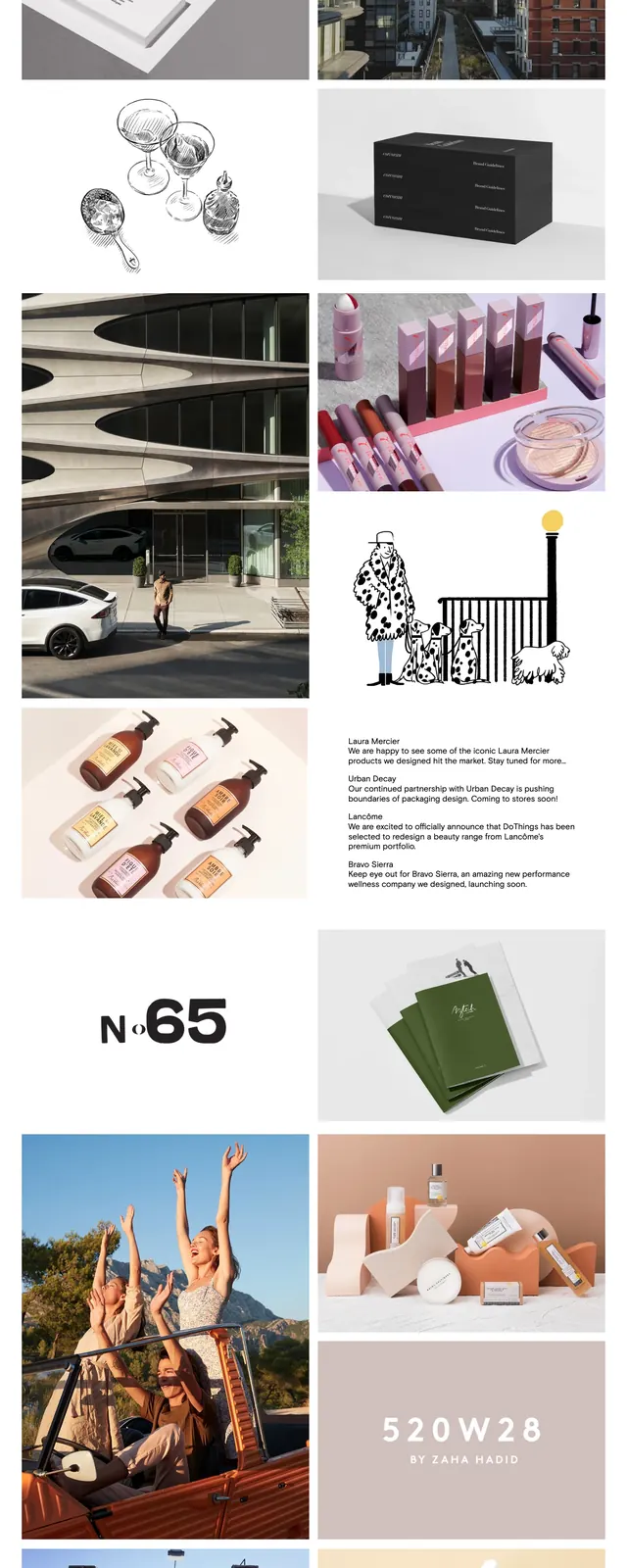
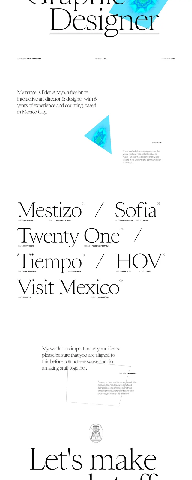
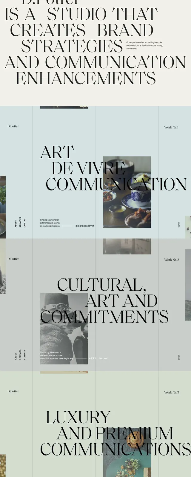
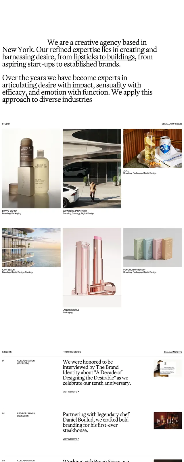
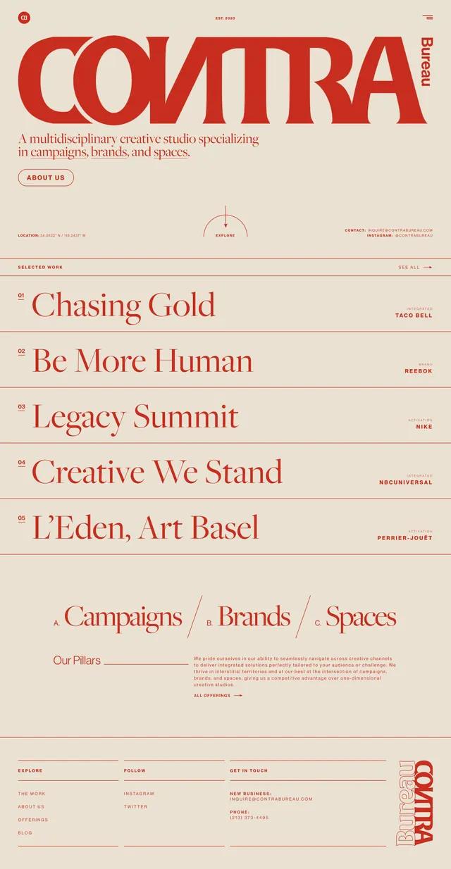
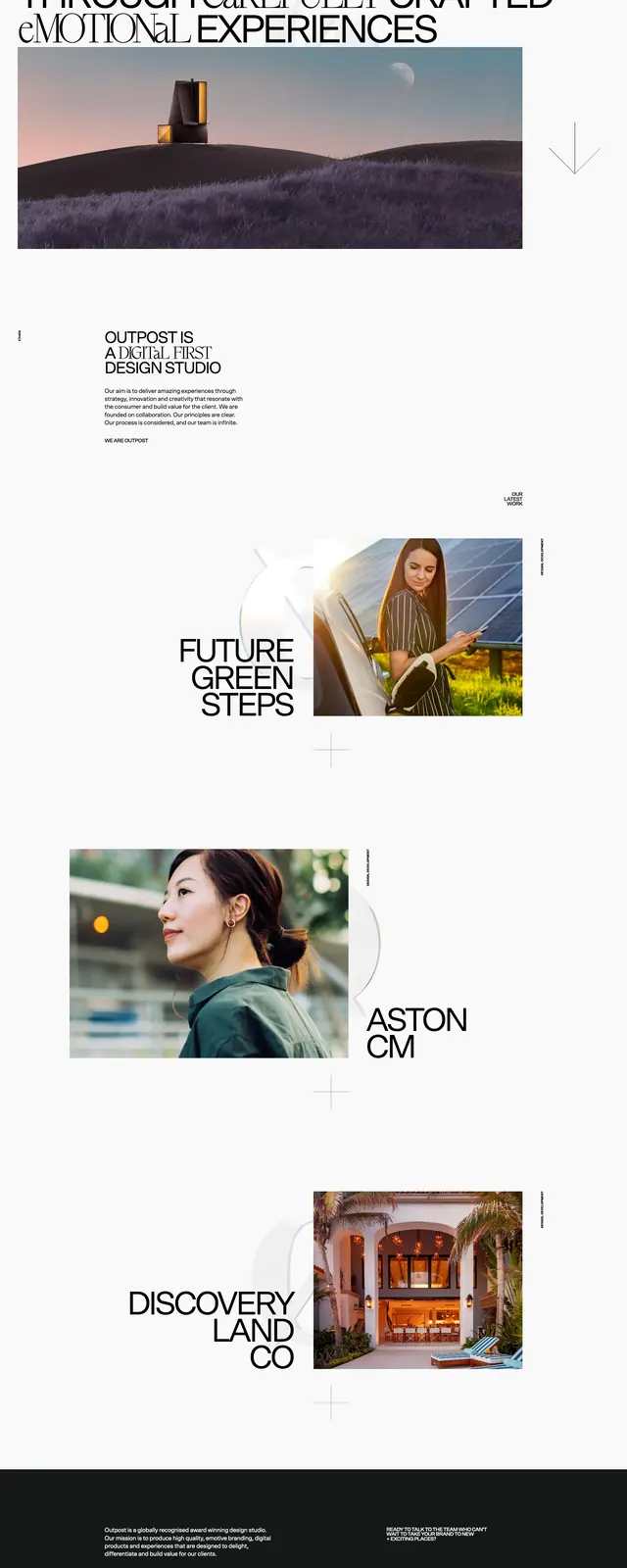
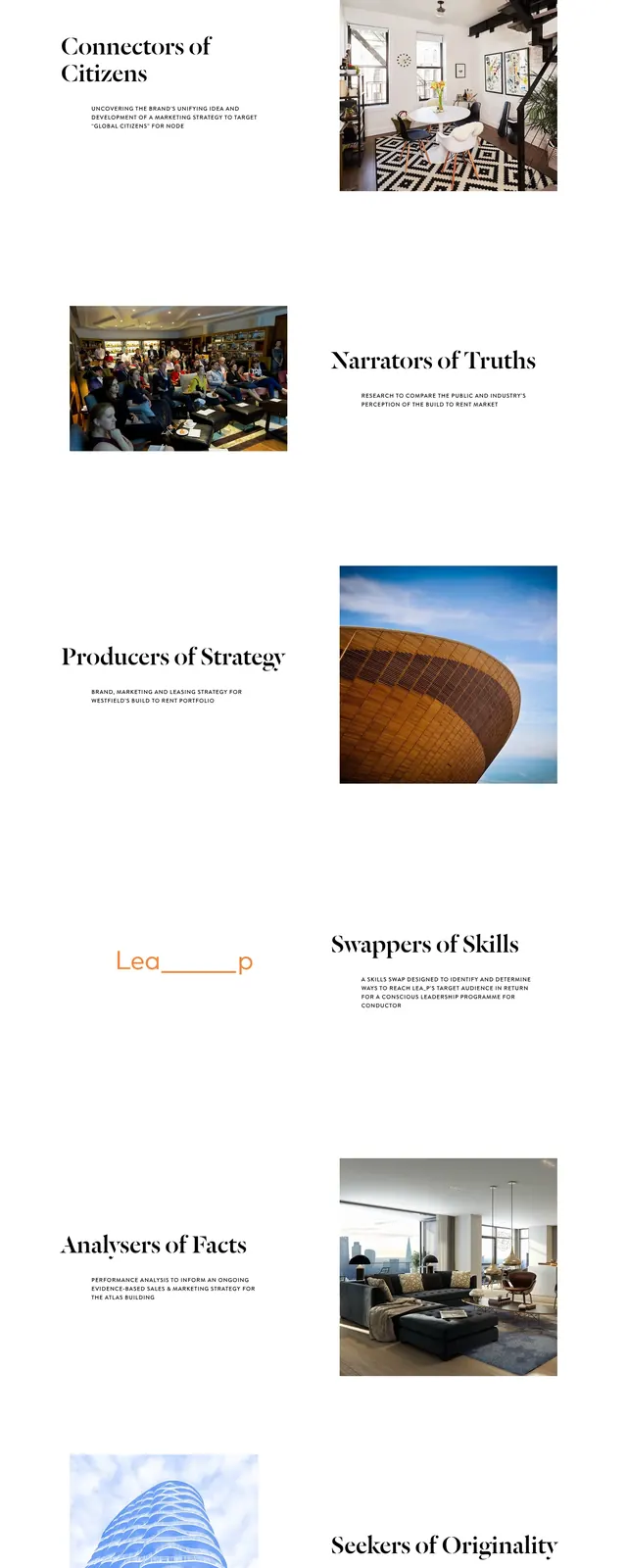
A minimal, editorial landing page for Conductor London with oversized serif headlines, generous white space, and staggered project/image pairings.
Summary
A minimal, editorial landing page for Conductor London with oversized serif headlines, generous white space, and staggered project/image pairings.
Visual description
The page opens with a sparse top navigation, a centered wordmark, and a large serif hero headline set over a faint radiating line graphic. Below, the page alternates between left-aligned text blocks and right-aligned photography in a wide, airy vertical stack. The final visible area includes a three-column footer-style contact strip with small icons, email/newsletter inputs, and social links.
Key takeaway
The main effect comes from combining museum-like white space with strong serif typography and restrained supporting UI. The alternating text-and-image rhythm makes the page feel polished without needing heavy decoration.
Reuse notes
Useful for agency, studio, or portfolio sites that want an editorial tone and premium feel. The layout works best when content is short and imagery is high quality, since the composition depends on breathing room and large type.