Preview image. Unlock full-res
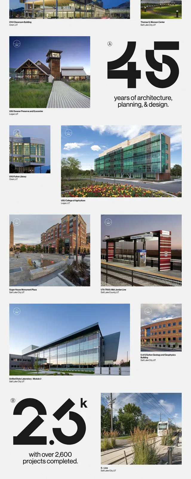
A clean architecture portfolio homepage with oversized branding, image-led project tiles, and minimal informational sections on a white background.
Summary
A clean architecture portfolio homepage with oversized branding, image-led project tiles, and minimal informational sections on a white background.
Visual description
The page opens with a small top navigation, a large CRSA wordmark, and a right-aligned tagline reading architecture, planning, and design. Below, a grid of large project photography dominates the page, with each tile carrying a small caption and location. Farther down, the layout shifts into a metrics-style statement, a services list, and a sparse footer with contact details and social icons. The overall composition uses generous white space, thin separators, and restrained black text.
Key takeaway
The strongest move is the oversized identity treatment paired with a photo-heavy portfolio grid. It feels institutional and refined without needing decorative elements.
Reuse notes
Use this pattern for architecture, design, or studio sites that need to foreground project imagery and credibility. It works best when the content includes strong photography and concise service or contact sections.